Mortality Projections for Social Security Programs in Canada: Actuarial Study No. 22
Accessibility statement
The Web Content Accessibility Guidelines (WCAG) defines requirements for designers and developers to improve accessibility for people with disabilities. It defines three levels of conformance: Level A, Level AA, and Level AAA. This report is partially conformant with WCAG 2.0 level AA. If you require a compliant version, please contact webmaster@osfi-bsif.gc.ca.
Office of the Chief Actuary
Office of the Superintendent of Financial Institutions Canada
255 Albert Street
Ottawa, Ontario
K1A 0H2
E-mail address: oca-bac@osfi-bsif.gc.ca
An electronic version of this report is available on our Web site: www.osfi-bsif.gc.ca
Table of contents
List of Tables
- Table 1 - Assumed Annual MIRs for Canada
- Table 2 - Assumed Mortality Rates for Canada
- Table 3 - Life Expectancies for Canada, without Improvements after the Year Shown
- Table 4 - Life Expectancies for Canada, with Improvements
- Table 5 - Cohort Life Expectancy Under Different MIR Scenarios
- Table 6 - Long-Term Annual MIRs - International Comparisons
- Table 7 - Assumed Mortality Rates for Males
- Table 8 - Assumed Mortality Rates for Females
- Table 9 – Period Life Expectancies at Birth, Age 65 and Age 85 in Canada
- Table 10 - Contribution to Increase in Period Life Expectancy at Age 65
- Table 11 – Leading Causes of Death in Canada, 2019
- Table 12 – Proportion of Deaths for Leading Causes of Death by Country, 2017, age group 65-74
- Table 13 – Average Historical MIRs by Gender and Age Group for various Subperiods
- Table 14 – International Comparisons of Average MIRs for Year Ending in 2018
- Table 15 – Male-Female Gap in Period Life Expectancy at Birth
- Table 16 – Education Trends in Canada, 1981-2019, Percentage of Population Aged 25 to 64
- Table 17 - Period Life Expectancy at Birth by Income Quintile 2015 - 2017
- Table 18 - Period Life Expectancy at Age 65 by Income Quintile 2015 - 2017
- Table 19 – Differences in Average Age at Death between the Highest and Lowest Income Quintiles, Both Sexes
- Table 20 – Historical Proportion of Canadians aged 15 and above that are Obese or Overweight
- Table 21 – Alcohol Consumption – 2018 or Latest Available Year
- Table 22 – Daily Smokers – 2018 or Latest Available Year
- Table 23 – Proportion of Canadian Population that is Current Smoker, Daily or Occasional by Age Group
- Table 24 - Number of Deaths Due to Opioids, Both Sexes, Canada
- Table 25 - Qualitative Longevity Indicators
- Table 26 – Canadian Pandemics over the Last 100 Years
- Table 27 - Cumulative Excess Deaths by Income Quintiles – COVID-19
- Table 28 – Age-Standardised Excess Mortality for Year 2020 by Country
- Table 29 – Estimated Impact of Increased Mortality for All Ages on Period Life Expectancy in 2020
- Table 30 - COVID-19 Possible Long-Term Impacts on Longevity
- Table 31 - Probability of Newborn Living to 90 and 100 from Birth based on Cohort Mortality Tables, Canada
- Table 32 - Probability of Living to 90 for those Aged 20, 50, and 80 in 2019
- Table 33 - Probability of living to 100 for those aged 20, 50, and 80 in 2019
- Table 34 - Reduction in Mortality Rates and MIRs Required to Reach an Expected Average Age at Death of 100
List of Charts
- Chart 1 - Male MIRs for Older Age Group, Canada
- Chart 2 - Female MIRs for Older Age Group, Canada
- Chart 3 - Convergence Algorithms: Percentage of Difference Between Initial and Ultimate MIRs Remaining During Transition Period, by the Year of Projection for Select Age Groups
- Chart 4 - Historical and Projected Annual MIRs, Males, Canada
- Chart 5 - Historical and Projected Annual MIRs, Females, Canada
- Chart 6 - Gap in Life Expectancy with Improvements at Age 65 between Males and Females in Canada
- Chart 7 - Period Life Expectancy Comparisons at Age 65, Males
- Chart 8 - Period Life Expectancy Comparisons at Age 65, Females
- Chart 9 - Distribution of Deaths in Canada by Age Group
- Chart 10 - Number of Deaths per 1,000 for Select Countries and Age Groups
- Chart 11 - Historical Mortality Rates (Ages 65-74)
- Chart 12 - Mortality Rates by Cause of Death (65-74)
- Chart 13 - Mortality Rates by Cause of Death, 65-74, Both Sexes, 2017
- Chart 14 - Historical Mortality Rates (Ages 75-84)
- Chart 15 - Mortality Rates by Cause of Death (75-84)
- Chart 16 - Mortality Rates by Cause of Death, 75-84, Both Sexes, 2017
- Chart 17 - Historical Mortality Rates (Ages 85-89)
- Chart 18 - Mortality Rates by Cause of Death (85-89)
- Chart 19 - Mortality Rates by Cause, 85-89, Both Sexes, 2017
- Chart 20 - Historical Mortality Rates (Ages 90+)
- Chart 21 - Historical Mortality Improvements
- Chart 22 - Male MIRs by Select Age Group, Canada
- Chart 23 - Female MIRs by Select Age Group, Canada
- Chart 24 - Proportion of Men and Women Living Alone by Age in 1981 and 2016
- Chart 25 – Ratio of Mortality Rates between Lowest and Highest Income Quintiles, All Ages, 1991-2006, Canada
- Chart 26 - Period Life Expectancy at Birth by Income Quintile – Males, Canada
- Chart 27 - Period Life Expectancy at Birth by Income Quintile - Females, Canada
- Chart 28 - Trends in Obesity among Children and Adolescents Aged 2–19 Years, by Age: US, 1963–1965 through 2017–2018
- Chart 29 – Historical Trend – Tobacco Usage by Sex, Canada
- Chart 30 – Trends in Federal Research by Discipline, FY 1970-2017, in Billions of Constant Fiscal Year 2019 US Dollars
- Chart 31 - CIHR Fiscal Year Investments by Primary Theme since 2000–01, in Millions of Dollars
- Chart 32 - Number of Deaths in the UK from Spanish Flu Pandemic 1918-1919
- Chart 33 - Number of Deaths in Canada – HIV
- Chart 34 - Number of COVID-19 Deaths and Number of Active Cases (as of June 30, 2021)
- Chart 35 – Number of COVID-19 Deaths in Canada by Age Group as of August 9, 2021
- Chart 36 – Number of COVID-19 Deaths by Province as of June 30, 2021
- Chart 37 - Rate of Confirmed Cases of COVID-19 per 100,000 Population by Quintile of Neighbourhood Material Deprivation and Public Health Unit Reported Week: Ontario
- Chart 38 - Rate of Confirmed Cases of COVID-19 per 100,000 Population by Quintile of Neighbourhood Diversity and Public Health Unit Reported Week: Ontario
- Chart 39 – Expected and Actual Number of Deaths in Canada in 2020
- Chart 40 - Measures of Age at Death – Males
- Chart 41 - Measures of Age at Death – Females
- Chart 42 - Evolution of the Distribution of the Expected Age at Death
- Chart 43 - Survival Curves at Birth - Males
- Chart 44 - Survival Curves at Birth - Females
- Chart 45 - Probability of Living to 90 from Given Age in 2019, Males, Cohort-Basis
- Chart 46 - Probability of Living to 90 from Given Age in 2019, Females, Cohort-Basis
- Chart 47 - Probability of Living to 100 from Given Age in 2019, Males, Cohort-Basis
- Chart 48 - Probability of Living to 100 from Given Age in 2019, Females, Cohort-Basis
- Chart 49 - Impact of Reducing Deaths Related to Malignant Neoplasms by 50% over 20 Years on Period Life Expectancy at Age 65
- Chart 50 - Impact of Removing Mortality from Malignant Neoplasms and Heart Diseases over 50 Years on Period Life Expectancy at Age 65
- Chart 51 - Impact of Removing Mortality from Top 10 Causes of Death over 75 Years on Period Life Expectancy at Age 65
- Chart 52 - Comparison of Survival Curves for Males using Different Scenarios
- Chart 53 - Comparison of Survival Curves for Females using Different Scenarios
1. Executive Summary
1.1 Purpose
This is the twenty-second actuarial study to be published by the Office of the Chief Actuary (OCA). The OCA is responsible for conducting statutory triennial actuarial valuations for the Canada Pension Plan (CPP) and the Old Age Security (OAS) program. The most recent actuarial reports are the 30th Actuarial Report on the CPP as at 31 December 2018 (CPP30) and the 16th Actuarial Report on the OAS program as at 31 December 2018 (OAS16).
Both the CPP and OAS program cover wide segments of the Canadian populationFootnote 1, and the actuarial assessments of their long-term financial status require projections of the Canadian population.
The first purpose of this study is to present an overview of the methodology and assumptions used by the OCA for projecting the mortality component of the population projections for the CPP30 and OAS16 that were in turn used to project the long-term financial status of the CPP and OAS program.
Secondly, the study presents the analysis that informs the assumption setting process for the next CPP and OAS program statutory triennial reports, which will be prepared as at 31 December 2021. This latter portion of the study is based on most recent available data and will be used for setting mortality assumptions for the next reports.
The mortality projections prepared by the OCA cover a long period of time (75 years) and the assumptions are determined by placing more emphasis on historical long-term trends than on recent short-term trends. Although the CPP30 and OAS16 reports were prepared before the onset of the COVID-19 pandemic, the next statutory reports as at 31 December 2021 will reflect the potential impacts of the pandemic on mortality in both the short and long term.
1.2 Scope
Section 2 presents an overview of the data, methodology and assumptions used in the CPP30 and OAS16. Section 3 presents the analysis of past mortality trends, including an analysis of historical mortality by different subperiods, age groups and causes of death. Section 4 presents qualitative discussions of drivers that may influence future mortality in Canada. Section 5 looks into a brief history of pandemics over the last century and provides additional information on potential impacts of the COVID-19 pandemic on future mortality rates. Section 6 compares different longevity measures and looks into probabilities of surviving to advanced ages, including illustrative scenarios. Lastly, Appendices A and B list the references used and contributors to this study, respectively.
1.3 Main Findings
Section 2: Detailed Data, Methodology and Assumptions for Most Recent CPP and OAS Reports
- For the CPP30 and OAS16, the mortality assumptions are based on the best judgement of the OCA and are developed using a combination of backward- and forward-looking approaches.
- The analysis used to develop the CPP30 mortality assumptions highlighted a recent slowdown in mortality improvement rate (MIRs) starting in 2011. This is in line with trends observed in the US and the UK.
- Life expectancies of Canadians are assumed to continue to grow, but at a slower rate than what was experienced in the 20th century. For the period 2019 to 2075, period life expectancy for male newborns is projected to increase from 80.8 years to 86.0 years. For female newborns, the increase is projected to be from 84.6 years to 89.0 years. Cohort life expectancies at birth are expected to increase from 86.9 to 90.7 for males and from 89.9 to 93.2 for females over the same period.
Section 3: Understanding the Past
- Since 1901, period life expectancy at birth increased by more than 33 years in Canada with most of the change occurring before 1950. Period life expectancy at age 65 has also increased dramatically, but in contrast to period life expectancy at birth, most of the change occurred after 1950. For the age group 85 and over, some progress was made in the last two decades, but it is much more modest than for younger age groups.
- Despite important differences by age group, over the past two decades, malignant neoplasms and heart diseases have been the two leading causes of death in Canada for both males and females.
- The analysis of historical mortality rates by causes of death shows that, over the last 40 years, mortality rates related to diseases of the heart dropped significantly for both sexes and all age groups above age 65. However, the pace of decrease has slowed down in more recent years. Although mortality rates related to malignant neoplasms have also been decreasing for most age groups, the pace of the decreases has been much lower than for heart diseases.
- Compared to the US, the UK, Sweden, Japan and France, Canada has the lowest proportion of deaths from cerebrovascular diseases. However, it lags the US in mortality from malignant neoplasms, as well as Japan and France in mortality from diseases of the heart.
Section 4: Drivers of Mortality
- There is a multitude of potential drivers of longevity, which are linked to different aspects of lifestyle, environment, healthcare systems, prevalent diseases, inequities, economy, etc. Many of these drivers are interrelated and it is not an obvious task to attribute a part of future MIRs to a specific driver.
- The structure of the Canadian population may affect future longevity. For example, if Canada maintains its current immigration practices, improvements in mortality may be expected as a result of a higher proportion of the population being born outside of Canada. On the other hand, the overall aging of the Canadian population could create a downward pressure on longevity.
- Some drivers of mortality have contributed to increases in longevity in the last few decades, and most of the gains have likely already been achieved. Examples include smoking prevalence and educational achievement.
- Similar to other countries, Canada has seen increases in prevalence of overweight and obese population over the last 30 years. In addition, over the last decade, Canada has been faced with an important increase in accidental drug poisoning deaths. Should these trends continue, they may result in a downward pressure on longevity.
- There is an important increase in funding for biomedical research. This type of research could contribute to additional medical advancements in the future. However, the timing and extent of new medical advancements that could potentially increase longevity is highly uncertain.
- Other drivers that have the potential to influence future mortality patterns include trends in inequality, crisis type events such as pandemics, economic recessions or catastrophic events, antibiotic resistance and climate change.
Section 5: Pandemics
- Over the last century, Canada faced 8 pandemics. Given that the methodology used by the OCA to develop mortality assumptions gives some weight to past trends, the ultimate mortality improvement rates assumptions would implicitly include these macro mortality events.
- Events surrounding the COVID-19 pandemic are still unfolding and the impact on short, medium and long-term mortality projections is still being assessed. Despite this, based on preliminary data and research available:
- It can be expected that COVID-19 will be a leading cause of death in 2020.
- The number of deaths were spread unevenly across age groups, household income and/or deprivation levels and provinces.
- As of December 31, 2020 and based on Statistics Canada’s data and methodology, excess deaths reported in Canada for 2020 are 5% higher than expected. Under the OCA’s preliminary estimates, as compared to 2019, this would translate into a reduction in period life expectancy for both sexes of about 0.5 years at birth and 0.4 years at age 65.
- In addition to the direct consequences of the pandemic resulting from the past COVID-19 deaths, the potential long-term impacts of indirect consequences on mortality is highly uncertain. Certain potential outcomes could lead to lower longevity while others could lead to higher longevity in the future.
Section 6: Living to Advanced Ages
- Based on period life tables, the chance of a newborn reaching age 90 has significantly increased over time, going from 4% in 1925 to 26% in 2019 for males, and from 6% to 40% for females over the same period. By 2100, it is projected that 55% of male newborns and 64% of female newborns will reach age 90.
- In 2019, on a cohort basis, about five out of ten Canadians aged 20 are expected to reach age 90, while only one out of ten is expected to live to 100.
- If mortality from the top two causes of death in Canada (malignant neoplasms and diseases of the heart) is completely removed over a period of 50 years for all ages, the expected average period age at death of a 65-year old in 2069 is projected to be about 93 years for males and 95 years for females (increase of 5 years and 6 years for males and females respectively).
- Two measures addressing the survival to very advanced ages are maximum age at death (MAX) and the maximum age at death for which there is a minimum count of 30 deaths (MAR). Over the last century, the Canadian MAX has been fairly constant through time despite significant increases in life expectancy. The highest MAX was 111 years in 2013 for males, and 117 year in 1998 for females. While a steady increase in MAR has been observed between 1921 and 2019, the MAX and MAR have been very close over the last decade or so.
2. Detailed Data, Methodology and Assumptions for Most Recent CPP and OAS Reports
The OCA prepares, among other reports, triennial statutory actuarial reports for the CPP and the OAS program. A key component of these actuarial reports is the projection of the Canadian population. A fundamental assumption underlying these projections is the mortality of the general populationFootnote 2. The statutory reports of the CPP and the OAS program are prepared on the same triennial cycle. The projections of the Canadian population in both reports, including mortality projections, are therefore identical. Given that the CPP actuarial report is prepared earlier, the assumptions are first developed for the CPP, and then used for the OAS program.
This section discusses the data, methodologies and assumptions that were used or considered for setting the general Canadian population mortality assumptions for the purpose of the CPP30, which was prepared as at 31 December 2018. The mortality rates, MIRs and resulting life expectancies are also presented, along with a sensitivity analysis and comparisons with international peers. The main focus is on the older age groups of the population, since they drive the costs of social programs when it comes to mortality.
2.1 Data Sources
The mortality assumptions developed for the CPP30 are composed of three components: the initial mortality rates and MIRs as of 2015, the annual MIRs from 2016 to 2034, and the ultimate MIRs for years 2035 and thereafter.
This subsection provides details on the data sources and methodologies used for purposes of determining historical mortality rates and related historical MIRs.
Historical Mortality Rates
The Department of Demography of Université de Montréal provided the mortality rates from the Canadian Human Mortality Database (CHMD)Footnote 3, split by age, sex, province and calendar years, for years 1921 to 2011. In addition, mortality rates by age and sex for calendar years 2012 to 2015 were derived from Statistics Canada’s Canada Life Tables (StatCan CLT). The StatCan CLT are prepared on a 3-year averaging basis, and it is assumed that the rates from each of those tables correspond to the rates for the central year of the 3-year period.
Starting Mortality Rates
Starting mortality rates for calendar year 2015 correspond to the mortality rates obtained from the StatCan CLT 2014-2016. Since mortality rates up to age 120 are used in the CPP projections, the available mortality rates up to age 110 in the StatCan CLT 2014-2016 were extended for an additional ten years of age. To do so, interpolation was applied to mortality rates from age 105 for males and age 107 for females to the assumed ultimate mortality rates at age 120 of 0.70 for males and 0.65 for femalesFootnote 4. To obtain curves consistent with rates for supercentenarians (those aged 110 and above), where such rates are assumed to reach a plateau by age 120, the StatCan CLT mortality rates curves are extended by fitting a second degree polynomial over three points. The first point corresponds to age 104Footnote 5 for Canadian males, and 106Footnote 6 for Canadian females, and the last two points correspond to ages 120 and 121. By setting the value for age 121 equal to the value for age 120, curves with a decreasing slope converging to a flat line (plateau) at age 120 were obtained.
Historical MIRs
The historical MIRs are derived from the historical mortality rates described above using the “best-fit log-linear” (BFLL) regression method. Under the BFLL method, the average annual MIRs for a given age and period are determined by fitting a least squares regression line to the logarithm of historical mortality rates. The average annual rate of mortality improvement over the period is then taken from the slope of the fitted regression line, specifically:
average MIR = 1 - eslope. This method is also commonly referred to as the “slope method”.
Starting MIRs
The 2015 starting MIRs are assumed to vary by age and sex and are set equal to the average annual rates of mortality improvement experienced over the last known 15 years (i.e. 2000 to 2015) using the BFLL method. The OCA also had access to more recent information (2016 and 2017) from the OAS program administrative data, which covers 98% of the Canadian population aged 65 and over. The annual MIRs for 2016 and 2017 for ages 65 and over were therefore projected using trends derived from this administrative data.
Charts 1 and 2 below show historical MIRs in Canada based on 15-year averages for both males and females for older age groups.
Chart 1 - Male MIRs for Older Age Group, Canada (15-Year Averages, Age-Standardized Using 2015 Population)
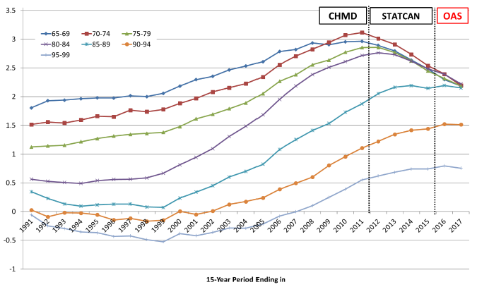
OCA calculations based on the following data sources: 1991 - 2011 from CHMD, 2012 - 2015 from StatCan CLT, 2016 - 2017 estimated by OCA using trends from OAS program administrative data.
Chart 1 Description
Line chart showing historical MIRs in Canada based on 15-year averages for males for older age groups. The Y axis shows the MIRs and the X axis shows the years from 1991 to 2017.
For age group 65-69, the MIR has increased from 1.80 to 2.96 from 1991 to 2011. It then decreased to the value of 2.48 by 2015. It reaches a projected value of 2.15 by 2017.
For age group 70-74, the MIR has increased from 1.51 to 3.12 from 1991 to 2011. It then decreased to the value of 2.54 by 2015. It reaches a projected value of 2.15 by 2017.
For age group 75-79, the MIR has increased from 1.12 to 2.86 from 1991 to 2012. It then decreased to the value of 2.45 by 2015. It reaches a projected value of 2.15 by 2017.
For age group 80-84, the MIR has increased from 0.56 to 2.76 from 1991 to 2012. It then decreased to the value of 2.48 by 2015. It reaches a projected value of 2.15 by 2017.
For age group 85-89, the MIR has decreased from 0.34 to 0.07 from 1991 to 1999. It then increased to the value of 2.14 by 2015. It reaches a projected value of 2.15 by 2017.
For age group 90-94, the MIR has decreased from 0.03 to -0.15 from 1991 to 1999. It then increased to the value of 1.44 by 2015. It reaches a projected value of 1.51 by 2017.
For age group 95-99, the MIR has decreased from -0.06 to -0.53 from 1991 to 1999. It then increased to the value of 0.75 by 2015. It reaches a projected value of 1.75 by 2017.
Chart 2 - Female MIRs for Older Age Group, Canada (15-Year Averages, Age-Standardized Using 2015 Population)
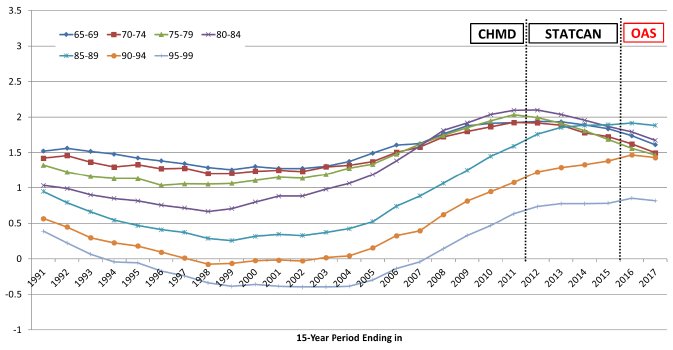
OCA calculations based on the following data sources: 1991 - 2011 from CHMD, 2012 - 2015 from StatCan CLT, 2016 - 2017 estimated by OCA using trends from OAS program administrative data.
Chart 2 Description
Line chart showing historical MIRs in Canada based on 15-year averages for females for older age groups. The Y axis shows the MIRs and the X axis shows the years from 1991 to 2017.
For age group 65-69, the MIR has increased from 1.52 to 1.93 from 1991 to 2013. It then decreased to the value of 1.87 by 2015. It reaches a projected value of 1.61 by 2017.
For age group 70-74, the MIR has increased from 1.42 to 1.93 from 1991 to 2011. It then decreased to the value of 1.72 by 2015. It reaches a projected value of 1.50 by 2017.
For age group 75-79, the MIR has increased from 1.32 to 2.03 from 1991 to 2011. It then decreased to the value of 1.69 by 2015. It reaches a projected value of 1.47 by 2017.
For age group 80-84, the MIR has increased from 1.03 to 2.10 from 1991 to 2012. It then decreased to the value of 1.89 by 2015. It reaches a projected value of 1.67 by 2017.
For age group 85-89, the MIR has decreased from 0.95 to 0.25 from 1991 to 1999. It then increased to the value of 1.89 by 2015. It reaches a projected value of 1.88 by 2017.
For age group 90-94, the MIR has decreased from 0.57 to -0.08 from 1991 to 1998. It then increased to the value of 1.38 by 2015. It reaches a projected value of 1.43 by 2017.
For age group 95-99, the MIR has decreased from 0.39 to -0.40 from 1991 to 1999. It then increased to the value of 0.78 by 2015. It reaches a projected value of 0.81 by 2017.
2.2 Methodology for Forecasting Mortality
Many methodologies exist to project mortality rates. Certain methodologies are extrapolative and rely on mathematical models that fit historical data and extrapolate past trends into the future, while others are explanatory and rely more on judgement.
Over the years, the OCA conducted research and analysis on alternative methodologies to develop mortality assumptions. As part of the exercise, the OCA looked into the methodologies used by other countries to perform long-term actuarial assessments of their social security programs. Subsection 2.2.1 below provides an overview of methodologies that are commonly used.
It is important to note that the OCA makes every effort to monitor the research and developments in the longevity field, and consults with national and international peers to improve the process of setting its best-estimate mortality assumptions. In addition, the OCA is represented on the International Actuarial Association (IAA) Mortality Forum as well as on various mortality research projects of the Canadian Institute of Actuaries.
2.2.1 Overview of Commonly Used Methodologies for Forecasting Mortality
Below is a brief non-exhaustive overview of commonly used methodologies to forecast mortality.
Continuous Mortality Investigation (CMI) Methodology (United Kingdom)
The OCA analysed the Canadian experience using methodologies that were developed by the CMI group of the Institute and Faculty of Actuaries in the United Kingdom (UK). This deterministic explanatory model is based on the assumption that current MIRs (based on historical mortality rates by age and sex) will converge (using a non-linear approach) to a single rate in the future. In addition, in developing the intermediate period MIRs assumptions, the OCA used tools that were provided by the CMI. The cohort elements of the tools were considered, but not incorporated into the OCA’s model for the CPP30.
Causes of Death Model (United States)
The United States (US) Social Security Administration has developed a model based on forecasting mortality rates by causes of death. MIRs are projected in the future based on age, sex and causes of deathsFootnote 7. For Canada, although this methodology was considered, it was not chosen due to a number of factors including lag in data reporting and lack of historical data. In addition, for a small population such as Canada, there could be too much variation in mortality rates by causes of death, especially at younger ages. Even though OCA’s methodology does not incorporate forecasting mortality rates by causes of death, historical mortality data by causes of death is still analysed by the OCA and used as a factor in determining the judgement-based ultimate MIR assumptions.
Stochastic Forecasting Models
There exists a wide variety of stochastic mortality models. Examples of well-known stochastic mortality models include the Lee Carter model, the Cairns-Blake-Dowd model including their variations of the 2 factors models or 3 factors age-period-cohort models. The main feature of such models is that they project past mortality trends into the future using time series methods. The forecasts are usually made using Monte Carlo methods. Stochastic forecasting mortality models are used by Statistics Canada as well as Retraite Québec who is responsible for conducting actuarial valuations of the Québec Pension PlanFootnote 8.
These methods place more reliance on historical data than on potential changes in trends. In addition, the results of stochastic forecasting methods can vary widely based on the selection of variables and the historical period chosen. Although not always well understood, there is still a high degree of judgement involved when using stochastic mortality models.
The OCA has used a stochastic approach in the past to assess the sensitivity to the mortality assumption. However, it was considered too complex for this purpose.
Direct Projections of Life Expectancy
This method is used by the United Nations Population Division to provide a perspective on the future evolution of the world’s population. Projections are prepared using a probabilistic model for mortality, based on 100,000 simulations from 2020 to 2100 using a projected trajectory of life expectancy in the country sampled from the estimated distributions of life expectancies. The main projected statistics are the median of the distribution of probabilistic outcomes at the 80% and 95% prediction intervals (confidence levels). A more detailed description of this approach can be found in the IAA paper - Actuarial Perspectives on World Population Prospects 2019, October 2020 (IAA, 2020).
This approach has the advantage of allowing for the application of a consistent methodology across countries, especially when data access and availability can be an issue in developing countries. However, given the purpose of the CPP actuarial reports and that data access and availability are not an issue in Canada, projecting life expectancies is not deemed to be an appropriate methodology. Rather, mortality rates are projected and life expectancies are simply the result of these mortality rates projections.
The Double-Gap Life Expectancy Forecasting Model (Pascarju et Al., 2017)
The Double Gap Life Expectation Forecasting model is a method that first forecasts female life expectancy based on an analysis of the gap between female life expectancy in a country compared with the oldest female on record in the world. Second, the country-specific male life expectancy is derived from the forecast of the gap between male and female life expectancy.
2.2.2 General Overview of CPP Methodology
For the CPP30, the mortality assumptions are based on the best judgement of the OCA and are developed using a combination of backward- and forward-looking approaches.
Mortality rates for years 2016 and thereafter are derived by applying the assumed cumulative annual MIRs to the initial 2015 mortality rates.
For purposes of projecting annual MIRs, the assumption was split into two components as follows:
- Annual MIRs by calendar year, age and sex during the transition period (2016 to 2034 for ages up to 65, and 2018 to 2034 for ages 65 and over), and
- Ultimate annual MIRs by age for the years 2035 and thereafter.
The MIRs during the transition period were developed after selecting ultimate MIRs. A transition algorithm based on a cubic function model aimed to control the speed of conversion was then used between 2015 (2017 for ages 65 and over) and the ultimate rate in 2035.
The remainder of this subsection provides more detailed information on the methodology used and trends considered in determining the CPP30 ultimate MIRs and the conversion algorithm.
Ultimate MIRs
For the year 2035 and thereafter, the ultimate annual MIRs vary by age only and not by sex or calendar year. The same ultimate rates for males and females were assumed in order to maintain a reasonable gap in life expectancies between males and females. The use of continued higher MIRs for males (as recent trends suggest in Chart 6 below), would have eventually resulted in higher life expectancies for males. However, this is not a trend contemplated at this point since, similarly to other countries, females in Canada tend to live longer than males. More analysis on mortality differences by gender is presented in Section 4.
The ultimate MIRs were derived using a combination of backward- and forward-looking approaches. For this purpose, the analysis of the Canadian experience over the period from 1925 to 2015, including the observed recent slowdown trends in MIRs for OAS beneficiaries, was combined with an analysis of the possible drivers of future mortality. As such, the projections of future MIRs are developed by first examining past mortality trends, then by identifying future mortality drivers as well as emerging patterns, and finally by applying judgement with regards to the magnitude of the impact that these factors may have on future MIRs.
When it comes to examining past mortality trends, historical data was analysed from various angles to gain a better understanding of what has driven past mortality improvements. The type of analysis that is performed by the OCA in this respect is provided in Section 3.
For the CPP30, the main conclusions of the analysis of past mortality trends were as follows:
- An analysis of historical MIRs for Canada for the 90-year period ending in 2015 was conducted. Given that the CPP projections are long-term, any projections that are to be based on historical experience should rely on a sufficiently long reference period. Over the 90-year period ending in 2015, the average MIRs in Canada were 1.0% for ages 65 and over (both sexes) and 0.7% for ages 85 and over. The analysis highlighted a recent slowdown in MIRs starting in 2011. This analysis was complemented by the OAS program administrative data, which confirmed that the slowdown continued in years 2016 and 2017. As identified in the CMI Working Paper (CMI-2018, October 2019), international peers also observed a similar slowdown in general population mortality improvements since 2011.
- A historical analysis of mortality rates by causes of death showed that “easy gains” were achieved in mortality improvements due to medical advancements that reduced mortality from diseases of the heart. As stated in the Demographic Megatrends publication (ISSA, 2017):
“Future improvements in mortality are unlikely to mirror the past simply because of the prior achievement of the “easy” gains and, perhaps more significantly, due to the causes of death having significantly changed over recent decades. The emerging causes of death will arguably be more difficult to address, most notably diabetes and cancer.”
- Heat maps of historical MIRs provided insights for trends and helped in developing assumptions for the transition period. As a result of the heat maps analysis, no discernible cohort effect was observed from the historical data for Canadian females. Therefore, no cohort component was assumed for the projections of the female MIRs for the CPP30. Instead, the female MIRs were projected solely as a function of age and calendar year. For males, although the heat maps showed that a cohort effect exists for those born between the 1930s and 1940s, it could also be observed that, as of 2015, this effect has faded. As a result of this analysis, no cohort effect was assumed for males in the CPP30.
Looking forward, it is important to assess the causes of possible future mortality improvements through an analysis of mortality drivers. The list of such drivers is broad, encompassing such areas as medical advances, environmental changes, changes in lifestyle, emergence of new communicable diseases, access to and quality of health care and long-term care, evolution of socio-economic factors, etc. It is not possible to quantify the impact of each driver on future MIRs, nor is it possible to identify them all. Based on a qualitative assessment, it was determined that some drivers have the potential to increase longevity in the future, while others have the potential to decrease it. Section 4 provides examples of the types of analysis that the OCA conducts with respect to mortality drivers and how they might influence the evolution of future mortality rates.
The assumed long-term average MIRs were determined based on the OCA’s best judgement and considered future mortality drivers as well as an analysis of historical data and trends. As a result, a 0.8% ultimate long-term MIR was selected for ages 0 to 89 from 2035 onward. For ages above 89, the ultimate improvement rate is set to reduce from 0.5% for the age group 90-94 to 0.2% for those aged 95 and older.
Transition to the ultimate rates
The development of the MIRs for the transition period and the convergence paths to the ultimate rates were determined by analysing the historical patterns. In general, the MIRs for the transition period are derived by interpolating the initial MIRs to the ultimate rates using cubic functions.
Chart 3 presents an example of patterns of convergence that were used for the age and period components of the MIRs. These patterns show the proportions of the differences between the initial and the ultimate MIRs left at each year of the transition period. Each shown pattern is defined by a fixed percentage of this difference left at the middle of the transition period, specifically 50% and 60%. It is clearly seen that the lower the percentage of the difference remaining at the middle of the transition period is, the steeper the decline is in the MIRs and thus the resulting MIRs during the transition period are lower.
Chart 3 - Convergence Algorithms: Percentage of Difference Between Initial and Ultimate MIRs Remaining During Transition Period, by the Year of Projection for Select Age Groups
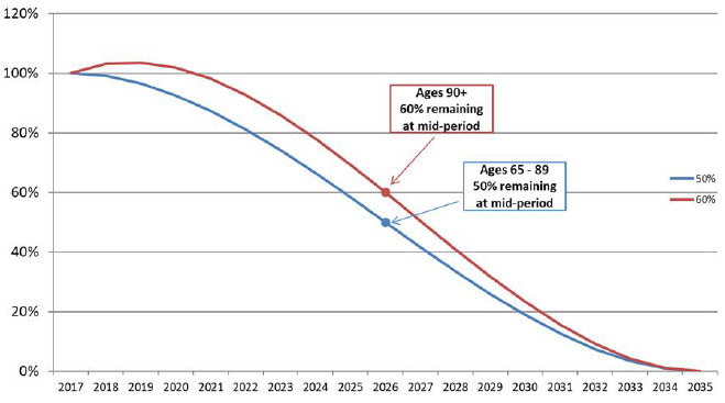
Source: CPP30 Projections, CMI Mortality Projection Model.
Chart 3 Description
Line chart showing an example of patterns of convergence that were used for the age and period components of the MIRs. The Y axis shows the percentage of difference between the initial and ultimate MIRs at any point during the transition period and the X axis shows the years of the transition period from 2017 to 2035.
For ages 65 to 89, the pattern of convergence during the transition period shows a 50% difference between the initial (2017) and ultimate (2035) rates remaining at the midpoint of the transition period.
For ages 90 and over, the difference at the mid point is 60%.
For ages 65 and over, an analysis based on 15-year moving averages indicates a downward trend in MIRs for both males and females for most age groups, with the trend more pronounced for males. It was assumed for both males and females in these age groups that the MIRs will gradually decline and that the transition will follow the pattern shown in Chart 3 with 50% (60% over age 90) of the difference between the initial (2017) and ultimate (2035) rates remaining at the midpoint of the transition period.
For the age groups under age 65, the projected mortality rates during the transition period follow a cubic function with 50% of the difference between the initial (2015) and the ultimate (2035) rates remaining at the midpoint of the transition period. In the previous triennial CPP report, a faster transition of 25% was assumed for males in the age group 30-44, due to the mortality experience of males in this age group being significantly affected by the Human Immunodeficiency Virus (HIV). However, it was concluded that the recent strong mortality rate improvements for this age group represented a recovery effect. As a result, for the CPP30, the convergence for males in the age group 30-44 was kept at 50%, the same as for other ages in the age group 0-89.
Summary for age groups 65 and over
Charts 4 and 5 present historical MIRs (based on 15-year moving averages ending in each given year) and projected MIRs for males and females respectively. The portion of the curves between the two vertical lines represents the assumed MIRs for 2016 to 2017 that were projected based on trends derived from the administrative data on OAS beneficiaries. The portion of the curves to the right of the second vertical line represents the convergence period from the initial rates to the ultimate rates using a cubic function.
Chart 4 - Historical (Moving 15-Year Average) and Projected Annual MIRs, Males, CanadaChart 4 Footnote *
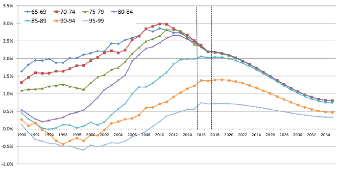
Chart 4 Footnote
- Chart 4 Footnote *
-
The MIRs correspond to the midrange age of each age group.
Chart 4 Description
Line chart showing historical MIRs in Canada based on 15-year averages, as well as projected MIRs for males for older age groups. The Y axis shows the MIRs in percentages and the X axis shows the years from 1990 to 2035. There are two vertical lines at years 2016 and 2018.
The portion of the curves between the two vertical lines represents the assumed mortality improvement rates for 2016 to 2017 that were projected based on trends derived from the administrative data on OAS beneficiaries. The portion of the curves to the right of the second vertical line represents the convergence period from the initial rates to the ultimate rates using a cubic function.
For age group 65-69, the MIR has increased from 1.63 to 2.86 from 1990 to 2010. It then decreased to the value of 2.50 by 2015. It reaches a projected value of 0.80 by 2035.
For age group 70-74, the MIR has increased from 1.32 to 2.99 from 1990 to 2010. It then decreased to the value of 2.51 by 2015. It reaches a projected value of 0.80 by 2035.
For age group 75-79, the MIR has increased from 1.09 to 2.82 from 1990 to 2011. It then decreased to the value of 2.41 by 2015. It reaches a projected value of 0.80 by 2035.
For age group 80-84, the MIR has increased from 0.54 to 2.66 from 1990 to 2012. It then decreased to the value of 2.46 by 2015. It reaches a projected value of 0.80 by 2035.
For age group 85-89, the MIR has decreased from 0.46 to 0.08 from 1990 to 1999. It then increased to the value of 1.98 by 2015. It reaches a projected value of 0.74 by 2035.
For age group 90-94, the MIR has decreased from 0.27 to -0.34 from 1990 to 1999. It then increased to the value of 1.22 by 2015. It reaches a projected value of 0.47 by 2035.
For age group 95-99, the MIR has decreased from -0.13 to -0.60 from 1990 to 1999. It then increased to the value of 0.56 by 2015. It reaches a projected value of 0.33 by 2035.
OCA calculations based on the following data sources: 1990 - 2011 from CMHD, 2012 - 2015 from StatCan CLT, 2016 - 2017 estimated by OCA using trends from Old Age Security program administrative data, 2018+ CPP30 Projections.
Chart 5 - Historical (Moving 15-Year Average) and Projected Annual MIRs, Females, CanadaChart 5 Footnote *
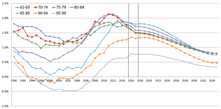
Chart 5 Footnote
- Chart 5 Footnote *
-
The MIRs correspond to the midrange age of each age group.
Chart 5 Description
Line chart showing historical MIRs in Canada based on 15-year averages, as well as projected MIRs for females for older age groups. The Y axis shows the MIRs in percentages and the X axis shows the years from 1990 to 2035. There are two vertical lines at years 2016 and 2018.
The portion of the curves between the two vertical lines represents the assumed mortality improvement rates for 2016 to 2017 that were projected based on trends derived from the administrative data on OAS beneficiaries. The portion of the curves to the right of the second vertical line represents the convergence period from the initial rates to the ultimate rates using a cubic function.
For age group 65-69, the MIR has increased from 1.80 to 1.77 from 1990 to 2012. It then decreased to the value of 1.79 by 2015. It reaches a projected value of 0.80 by 2035.
For age group 70-74, the MIR has increased from 1.54 to 2.13 from 1990 to 2011. It then decreased to the value of 1.75 by 2015. It reaches a projected value of 0.80 by 2035.
For age group 75-79, the MIR has increased from 1.55 to 1.86 from 1990 to 2011. It then decreased to the value of 1.69 by 2015. It reaches a projected value of 0.80 by 2035.
For age group 80-84, the MIR has increased from 1.00 to 2.14 from 1990 to 2011. It then decreased to the value of 1.86 by 2015. It reaches a projected value of 0.80 by 2035.
For age group 85-89, the MIR has decreased from 0.87 to 0.07 from 1990 to 1998. It then increased to the value of 1.86 by 2015. It reaches a projected value of 0.74 by 2035.
For age group 90-94, the MIR has decreased from 0.69 to -0.21 from 1990 to 1999. It then increased to the value of 1.26 by 2015. It reaches a projected value of 0.47 by 2035.
For age group 95-99, the MIR has decreased from 0.50 to -0.46 from 1990 to 1999. It then increased to the value of 0.64 by 2015. It reaches a projected value of 0.33 by 2035.
OCA calculations based on the following data sources: 1990 - 2011 from CHMD, 2012 - 2015 from StatCan CLT, 2016 - 2017 estimated by OCA using trends from Old Age Security program administrative data, 2018+ CPP30 Projections.
2.2.3 Summary of the CPP30 Mortality Assumptions
This subsection presents the mortality assumptions that were used for the CPP30. These assumptions are based on the data and methodology detailed in previous subsections and are considered best-estimate mortality assumptions, meaning that they do not include any margins for adverse deviations. They reflect the best judgement of the OCA as to the future pattern of mortality by age and sex of the Canadian population.
Table 1 shows the assumed MIRs for Canada by sex and selected age groups.
| Age | Males | Females | ||||
|---|---|---|---|---|---|---|
| 2016-2017Table 1 Footnote * | 2018-2034Table 1 Footnote * | 2035+ | 2016-2017Table 1 Footnote * | 2018-2034Table 1 Footnote * | 2035+ | |
| % | % | % | % | % | % | |
| 0 | 1.1 | 1.0 | 0.8 | 0.7 | 0.8 | 0.8 |
| 1-14 | 3.3 | 2.0 | 0.8 | 1.6 | 1.2 | 0.8 |
| 15-44 | 1.9 | 1.3 | 0.8 | 1.0 | 0.9 | 0.8 |
| 45-64 | 1.9 | 1.4 | 0.8 | 1.4 | 1.1 | 0.8 |
| 65-74 | 2.3 | 1.5 | 0.8 | 1.6 | 1.2 | 0.8 |
| 75-84 | 2.3 | 1.5 | 0.8 | 1.6 | 1.2 | 0.8 |
| 85-89 | 2.1 | 1.5 | 0.8 | 1.8 | 1.3 | 0.8 |
| 90-94 | 1.5 | 1.1 | 0.5 | 1.4 | 1.0 | 0.5 |
| 95+ | 0.5 | 0.4 | 0.2 | 0.5 | 0.4 | 0.2 |
|
Table 1 Footnotes
|
||||||
Mortality rates are derived by applying the projected MIRs of a given year to the mortality rates of the previous year. For example, the 2016 mortality rate for a given age is equal to the 2015 mortality rate for that age multiplied by one minus the 2016 age-specific MIR. Note that although historical mortality rates are only available up to 2015, the population data are available up to 2018. The starting 2015 mortality rates are therefore projected to 2018 for purposes of projecting the Canadian population in the CPP30.
Table 2 presents the assumed mortality rates for Canada by sex and selected ages. Consistent with assumed positive MIRs in the future, the projected mortality rates indicate a continued decrease over the long term.
| Age | Males | Females | ||||||
|---|---|---|---|---|---|---|---|---|
| 2019 | 2025 | 2050 | 2075 | 2019 | 2025 | 2050 | 2075 | |
| 0 | 4.56 | 4.28 | 3.48 | 2.84 | 4.13 | 3.95 | 3.23 | 2.64 |
| 10 | 0.08 | 0.07 | 0.05 | 0.04 | 0.08 | 0.07 | 0.06 | 0.05 |
| 20 | 0.56 | 0.48 | 0.37 | 0.31 | 0.27 | 0.26 | 0.21 | 0.17 |
| 30 | 0.86 | 0.80 | 0.65 | 0.53 | 0.41 | 0.39 | 0.32 | 0.26 |
| 40 | 1.18 | 1.08 | 0.87 | 0.71 | 0.73 | 0.67 | 0.54 | 0.44 |
| 50 | 2.79 | 2.56 | 2.06 | 1.69 | 1.89 | 1.78 | 1.45 | 1.19 |
| 60 | 6.51 | 5.77 | 4.58 | 3.75 | 4.28 | 3.90 | 3.13 | 2.56 |
| 65 | 10.34 | 9.18 | 7.29 | 5.96 | 6.81 | 6.21 | 4.98 | 4.08 |
| 70 | 16.77 | 14.98 | 11.92 | 9.75 | 11.19 | 10.30 | 8.31 | 6.80 |
| 75 | 27.47 | 24.54 | 19.53 | 15.98 | 18.78 | 17.34 | 14.00 | 11.45 |
| 80 | 45.68 | 40.77 | 32.44 | 26.54 | 32.13 | 29.52 | 23.78 | 19.45 |
| 85 | 77.33 | 69.10 | 55.02 | 45.01 | 56.24 | 51.15 | 41.03 | 33.57 |
| 90 | 134.88 | 122.24 | 101.81 | 87.15 | 102.53 | 93.70 | 78.33 | 67.05 |
| 100 | 341.45 | 330.34 | 305.88 | 285.34 | 298.22 | 287.87 | 266.29 | 248.40 |
|
Table 2 Source
|
||||||||
Projected period and cohort life expectancies are presented in Tables 3 and 4 respectively. Period life expectancies are based on the mortality rates of the given year and do not include any assumed MIRs after that year. For the period 2019 to 2075, period life expectancy for male newborns is projected to increase from 80.8 years to 86.0 years. For female newborns, the increase is projected to be from 84.6 years to 89.0 years.
On the other hand, cohort life expectancies take into account future mortality improvements after the given year. The projected increases in cohort life expectancies at birth are from 86.9 years in 2019 to 90.7 years in 2075 for males and from 89.9 to 93.2 years for females over the same period. Given the continuing trend toward increasing longevity, cohort life expectancies are considered to be more realistic than period life expectancies.
Life expectancies have increased considerably over the last 30 years, and this is reflected in the projected growth in the near term. Thereafter, there is a projected slowdown in life expectancy growth consistent with the lower MIRs assumed for years 2035 and thereafter. Mortality improvements have more of an impact on increasing expected lifetimes at younger ages than at older ages, since there is more time starting from the younger ages for improvements to have effect, and the improvement factors decrease with age. For instance, by 2075, mortality improvements lead to an increase in life expectancy of approximately four years for both male and female newborns.
| Age | Males | Females | ||||||
|---|---|---|---|---|---|---|---|---|
| 2019 | 2025 | 2050 | 2075 | 2019 | 2025 | 2050 | 2075 | |
| 0 | 80.8 | 81.9 | 84.2 | 86.0 | 84.6 | 85.4 | 87.3 | 89.0 |
| 10 | 71.3 | 72.4 | 74.5 | 76.3 | 75.0 | 75.8 | 77.7 | 79.3 |
| 20 | 61.4 | 62.5 | 64.6 | 66.4 | 65.2 | 65.9 | 67.8 | 69.3 |
| 30 | 51.8 | 52.9 | 54.9 | 56.7 | 55.4 | 56.1 | 57.9 | 59.5 |
| 40 | 42.3 | 43.3 | 45.3 | 47.0 | 45.6 | 46.4 | 48.1 | 49.6 |
| 50 | 32.9 | 33.9 | 35.8 | 37.4 | 36.1 | 36.8 | 38.5 | 40.0 |
| 60 | 24.1 | 25.0 | 26.8 | 28.2 | 26.9 | 27.6 | 29.2 | 30.6 |
| 65 | 20.0 | 20.8 | 22.4 | 23.8 | 22.6 | 23.2 | 24.7 | 26.0 |
| 70 | 16.1 | 16.9 | 18.3 | 19.6 | 18.4 | 19.0 | 20.4 | 21.6 |
| 75 | 12.6 | 13.2 | 14.5 | 15.7 | 14.6 | 15.1 | 16.3 | 17.4 |
| 80 | 9.4 | 10.0 | 11.1 | 12.0 | 11.1 | 11.6 | 12.6 | 13.5 |
| 85 | 6.8 | 7.2 | 8.0 | 8.7 | 8.0 | 8.4 | 9.2 | 9.9 |
| 90 | 4.6 | 4.9 | 5.4 | 5.9 | 5.5 | 5.8 | 6.3 | 6.8 |
| 100 | 2.2 | 2.2 | 2.4 | 2.5 | 2.5 | 2.5 | 2.7 | 2.8 |
|
Table 3 Footnotes
|
||||||||
| Age | Males | Females | ||||||
|---|---|---|---|---|---|---|---|---|
| 2019 | 2025 | 2050 | 2075 | 2019 | 2025 | 2050 | 2075 | |
| 0 | 86.9 | 87.4 | 89.1 | 90.7 | 89.9 | 90.3 | 91.8 | 93.2 |
| 10 | 76.7 | 77.1 | 78.8 | 80.4 | 79.8 | 80.1 | 81.6 | 83.0 |
| 20 | 66.1 | 66.5 | 68.3 | 69.9 | 69.2 | 69.6 | 71.1 | 72.5 |
| 30 | 55.7 | 56.2 | 57.9 | 59.6 | 58.8 | 59.2 | 60.7 | 62.1 |
| 40 | 45.5 | 45.9 | 47.6 | 49.2 | 48.4 | 48.8 | 50.3 | 51.8 |
| 50 | 35.4 | 35.9 | 37.5 | 39.1 | 38.3 | 38.7 | 40.2 | 41.6 |
| 60 | 25.9 | 26.3 | 27.9 | 29.3 | 28.5 | 28.9 | 30.3 | 31.7 |
| 65 | 21.4 | 21.8 | 23.3 | 24.7 | 23.9 | 24.2 | 25.6 | 26.8 |
| 70 | 17.2 | 17.6 | 19.0 | 20.2 | 19.4 | 19.8 | 21.0 | 22.2 |
| 75 | 13.4 | 13.8 | 15.0 | 16.1 | 15.3 | 15.7 | 16.8 | 17.9 |
| 80 | 10.0 | 10.4 | 11.4 | 12.3 | 11.6 | 11.9 | 12.9 | 13.8 |
| 85 | 7.1 | 7.4 | 8.2 | 8.9 | 8.3 | 8.6 | 9.4 | 10.1 |
| 90 | 4.7 | 5.0 | 5.5 | 5.9 | 5.6 | 5.9 | 6.4 | 6.8 |
| 100 | 2.2 | 2.2 | 2.4 | 2.5 | 2.5 | 2.5 | 2.7 | 2.8 |
|
Table 4 Footnotes
|
||||||||
Women have long enjoyed a higher life expectancy than men. However, advancements in medical science combined with a growing number of men shifting toward healthier living have helped men make significant gains in the last decades. The result is a reduction of the gap in life expectancy between males and females. Chart 6 shows the historical and expected difference in life expectancy at age 65 (with future improvements) between males and females in Canada. In 1966 in Canada, females aged 65 were expected to live an additional 4.4 years compared to males. This gap shrunk to 2.6 years for those aged 65 in 2015. It is expected to decrease to 2.4 years in 2025, and to continue shrinking thereafter, but at a slower pace than in the past. It is assumed that the difference in life expectancies between women and men aged 65 in 2075 will be 2.1 years.
Chart 6 - Gap in Life Expectancy with Improvements at Age 65 between Males and Females in Canada
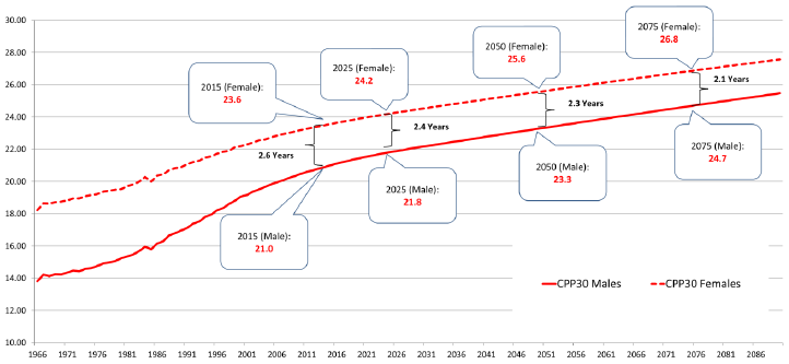
OCA calculations based on the following data sources: 1966 - 2011 from CHMD, 2012 - 2015 from StatCan CLT, 2016 - 2017 estimated by OCA using trends from OAS program administrative data, 2018+ CPP30 Projections.
Chart 6 Description
Line chart showing the historical and expected life expectancy at age 65 (with future improvements) for males and females in Canada, along with the difference in life expectancy between males and females. Y axis represents the life expectancy in number of years. X axis represents the year. The gap in life expectancy is illustrated through the area between the two lines.
Life expectancy at age 65 for males is 13.8 years in 1966, increases to 21.0 in 2015, and is projected to increase to 24.7 years in 2075.
Life expectancy at age 65 for females is 18.2 years in 1966, increases to 23.6 in 2015, and is projected to increase to 26.8 years in 2075.
The gap in life expectancy at age 65 between males and females was 4.4 years in 1966. This gap shrunk to 2.6 years for those aged 65 in 2015. It is expected to decrease to 2.4 years in 2025, to 2.3 years in 2050 and to 2.1 years in 2075.
2.3 Sensitivity of Life Expectancy to Different MIRs
While it is difficult to forecast mortality for very long periods, looking at sensitivity tests for MIRs can provide useful information as to what the future could look like under different scenarios. In previous CPP reports, a stochastic approach was used to assess the sensitivity of the mortality assumption. However, starting with the triennial CPP report preceding the CPP30, the OCA moved to a deterministic approach for ease of understanding. Further, it was deemed that using stochastic analysis based on past experience to project MIRs, especially at the older ages where future rates are highly uncertain, did not add substantial value compared to using deterministic tests.
For the sensitivity of the CPP30 mortality assumption, two deterministic scenarios were developed to compare with the best-estimate scenario. These sensitivity scenarios translated into comparing ultimate MIR assumptions of 0% (low MIRs scenario), 0.8% (best-estimate) and 1.6% (high MIRs scenario) respectively.
Under the 0% MIRs scenario, mortality is assumed to improve at a slower rate than under the best estimate scenario, reflecting that the current level of mortality improvements might not be sustainable. The values of the MIRs are gradually reduced to 0% for all ages in 2035, representing an absolute reduction of 0.8% for most age groups.
Under the 1.6% MIRs scenario, mortality is assumed to improve at a faster pace than under the best-estimate scenario. The ultimate values of the MIRs are doubled compared to the best estimate values, and correspond to 1.6% for most age groups, representing an absolute increase of 0.8%.
Table 5 compares the cohort life expectancy of the Canadian population at different points in time under the CPP30 best-estimate assumptions and the alternative scenarios.
| Age | Sex | 2025 | 2035 | 2050 | ||||||
|---|---|---|---|---|---|---|---|---|---|---|
| 0% MIR | Best-Estimate | Double MIR | 0% MIR | Best-Estimate | Double MIR | 0% MIR | Best-Estimate | Double MIR | ||
| At Birth | Males | 82.2 | 87.4 | 92.5 | 82.2 | 88.1 | 93.7 | 82.2 | 89.1 | 95.4 |
| Females | 85.6 | 90.3 | 94.9 | 85.6 | 90.9 | 96.0 | 85.6 | 91.8 | 97.4 | |
| Age 65 | Males | 21.0 | 21.8 | 22.8 | 21.0 | 22.4 | 24.0 | 21.0 | 23.3 | 25.8 |
| Females | 23.4 | 24.2 | 25.2 | 23.4 | 24.8 | 26.4 | 23.4 | 25.6 | 28.0 | |
|
Table 5 Footnotes
|
||||||||||
2.4 International Comparisons
This subsection provides a comparison of different mortality measures of the CPP30 with two selected countries: the US and the UK. The information for the US is taken from the Social Security Administration 2018 OASDI Trustees Report (SSA Trustees Report, 2018), while the information for the UK is taken from the mortality projections prepared by the Office for National Statistics (ONS) (2016-based). These data sources represent the most recent information available at the time the CPP30 was prepared.
Care should be taken when comparing mortality measures between different countries. For example, when comparing the assumed MIRs in different countries, consideration should be given to the starting mortality levels and how these two components interact with each other to influence future mortality rates. Similarly, future life expectancies are determined not only by future MIRs, but also by the current mortality rates to which these improvements are applied. It can be useful to compare life expectancies at different dates in the future to have a better understanding of the interactions. Another important caveat when comparing mortality measures between different countries is that each country has economic and cultural differences that will influence future mortality trends differently (e.g. health care, lifestyle, inequalities, etc.). An analysis by country of historical data and drivers of mortality similar to what is presented in sections 3 and 4 may be useful in getting a more complete picture.
Comparison of Life Expectancies
Charts 7 and 8 provide a comparison of period life expectancies at age 65 in Canada, the US and the UK. Based on historical experience, as of 2015, Canadian men and women have the highest life expectancy at age 65. By 2030, Canada is still projected to have the highest projected life expectancies at age 65 for both males and females. However, by 2050, because of higher assumed MIRs in the UK, the gap in life expectancy between Canada and the UK is projected to almost disappear for males and to narrow significantly for females. It is also interesting to note that the 2050 projected life expectancies for males in the US are closer to the 2020 projected life expectancies in Canada. For females, the 2050 projected life expectancies in the US are actually lower than the 2020 projected life expectancies in Canada.
Chart 7 - Period Life Expectancy Comparisons at Age 65, Males
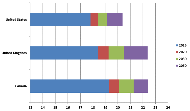
Source: OCA calculations based on the following data sources: US - The Long-Range Demographic Assumptions for the 2018 Trustees Report, Office of the Chief Actuary, Social Security Administration. UK - 2016-based period Mortality Rates (qx), UK, 1951-2205, Office of National Statistics, UK. CAN - CPP30 Projections.
Chart 7 Description
Horizontal bar chart showing a comparison of period life expectancies for males at age 65 in Canada, the US and the UK in 2015, 2020, 2030 and 2050.
Life expectancy at age 65 in the US is 17.8 in 2015 It is projected to reach 18.4 in 2020, 19.1 in 2030 and 20.4 in 2050.
Life expectancy at age 65 in the UK is 18.4 in 2015 It is projected to reach 19.3 in 2020, 20.5 in 2030 and 22.4 in 2050.
Life expectancy at age 65 in Canada is 19.3 in 2015 It is projected to reach 20.1 in 2020, 21.3 in 2030 and 22.4 in 2050.
Chart 8 - Period Life Expectancy Comparisons at Age 65, Females
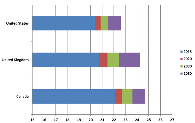
Source: OCA calculations based on the following data sources: US - The Long-Range Demographic Assumptions for the 2018 Trustees Report, Office of the Chief Actuary, Social Security Administration. UK - 2016-based period Mortality Rates (qx), UK, 1951-2205, Office of National Statistics, UK. CAN – CPP30 Projections.
Chart 8 Description
Horizontal bar chart showing a comparison of period life expectancies for females at age 65 in Canada, the US and the UK in 2015, 2020, 2030 and 2050.
Life expectancy at age 65 in the US is 20.4 in 2015 It is projected to reach 20.9 in 2020, 21.5 in 2030 and 22.6 in 2050.
Life expectancy at age 65 in the UK is 20.8 in 2015 It is projected to reach 21.5 in 2020, 22.5 in 2030 and 24.3 in 2050.
Life expectancy at age 65 in Canada is 22.1 in 2015 It is projected to reach 22.7 in 2020, 23.6 in 2030 and 24.7 in 2050.
Comparison of MIRs
Table 6 below shows the ultimate MIRs for Canada and the two selected countries. For the US, the ultimate annual MIRs are assumed to be somewhat lower than the average rate during 1900-2017. For the UK, annual rates of improvement are assumed to converge to the ultimate assumption of 1.2% per year for most ages in 2041, and remain constant at that level thereafter. MIR of 1.2% per year correspond to the average annual rate of improvement over the whole of the 20th centuryFootnote 9.
| Age | CPP30Table 6 Footnote * | US 2018 Trustees ReportTable 6 Footnote ** | UK 2016-basedTable 6 Footnote *** | |||
|---|---|---|---|---|---|---|
| (2035+, Canada) | (2042+) | (2041+) | ||||
| Male | Female | Male | Female | Male | Female | |
| % | % | % | % | % | % | |
| 0 | 0.8 | 0.8 | 1.5 | 1.6 | 1.2 | 1.2 |
| 1-4 | 0.8 | 0.8 | 1.5 | 1.6 | 1.5 | 1.8 |
| 5-9 | 0.8 | 0.8 | 1.5 | 1.6 | 0.4 | 1.5 |
| 10-14 | 0.8 | 0.8 | 1.5 | 1.6 | 2.3 | 2.0 |
| 15-19 | 0.8 | 0.8 | 0.9 | 0.9 | 1.7 | 1.4 |
| 20-24 | 0.8 | 0.8 | 0.9 | 0.9 | 1.4 | 0.8 |
| 25-29 | 0.8 | 0.8 | 0.9 | 0.9 | 1.1 | 0.8 |
| 30-34 | 0.8 | 0.8 | 0.9 | 0.9 | 1.2 | 1.1 |
| 35-39 | 0.8 | 0.8 | 0.9 | 0.9 | 1.3 | 1.2 |
| 40-44 | 0.8 | 0.8 | 0.9 | 0.9 | 1.2 | 1.2 |
| 45-49 | 0.8 | 0.8 | 0.9 | 0.9 | 1.2 | 1.2 |
| 50-54 | 0.8 | 0.8 | 1.1 | 1.1 | 1.2 | 1.2 |
| 55-59 | 0.8 | 0.8 | 1.1 | 1.1 | 1.2 | 1.2 |
| 60-64 | 0.8 | 0.8 | 1.1 | 1.1 | 1.2 | 1.2 |
| 65-69 | 0.8 | 0.8 | 0.8 | 0.7 | 1.2 | 1.2 |
| 70-74 | 0.8 | 0.8 | 0.8 | 0.7 | 1.2 | 1.2 |
| 75-79 | 0.8 | 0.8 | 0.8 | 0.7 | 1.2 | 1.2 |
| 80-84 | 0.8 | 0.8 | 0.8 | 0.7 | 1.2 | 1.2 |
| 85-89 | 0.8 | 0.8 | 0.5 | 0.5 | 1.1 | 1.1 |
| 90-94 | 0.5 | 0.5 | 0.5 | 0.5 | 1.1 | 1.1 |
| 95-99 | 0.4 | 0.4 | 0.5 | 0.5 | 1.1 | 1.1 |
| 100-104 | 0.2 | 0.2 | 0.5 | 0.5 | 1.0 | 1.0 |
| 105-109 | 0.1 | 0.1 | 0.5 | 0.5 | N/A | N/A |
| 110-114 | 0.0 | 0.0 | 0.5 | 0.5 | N/A | N/A |
| 115-119 | 0.0 | 0.0 | 0.5 | 0.5 | N/A | N/A |
| 120 | 0.0 | 0.0 | N/A | N/A | N/A | N/A |
|
Table 6 Footnotes
|
||||||
Comparison of Mortality Rates
Tables 7 and 8 compare the mortality rates in 2019, 2025 and 2050 for the three countries. Each country has developed age and gender specific mortality rates based on their experience and assumptions on future MIRs.
It can be seen that although the assumed MIRs for both males and females up to age 65 in the US are higher than the assumptions of the CPP30, the expected mortality rates in the US continue to be higher than the projected mortality rates for Canada (except for ages 0 and 100 where U.S. mortality rates are lower than Canada). This is mainly due to the fact that the current mortality rates in the U.S. are significantly higher than the Canadian ones. Current mortality rates in Canada are slightly lower than in the UK for most ages, but the projected UK mortality rates for most ages are close to the Canadian ones in 2050 due to much stronger assumed MIRs in the UK.
| Age | CPP30 | US 2018 Trustees Report Table 7 Footnote * | UK 2016-basedTable 7 Footnote ** | ||||||
|---|---|---|---|---|---|---|---|---|---|
| 2019 | 2025 | 2050 | 2019 | 2025 | 2050 | 2019 | 2025 | 2050 | |
| 0 | 4.56 | 4.28 | 3.48 | 5.71 | 5.12 | 3.37 | 3.81 | 3.34 | 2.34 |
| 10 | 0.08 | 0.07 | 0.05 | 0.09 | 0.08 | 0.05 | 0.06 | 0.06 | 0.04 |
| 20 | 0.56 | 0.48 | 0.37 | 0.92 | 0.86 | 0.71 | 0.40 | 0.32 | 0.20 |
| 30 | 0.86 | 0.80 | 0.65 | 1.51 | 1.46 | 1.20 | 0.64 | 0.55 | 0.38 |
| 40 | 1.18 | 1.08 | 0.87 | 1.98 | 1.87 | 1.47 | 1.46 | 1.38 | 1.02 |
| 50 | 2.79 | 2.56 | 2.06 | 4.68 | 4.36 | 3.32 | 2.86 | 2.58 | 1.85 |
| 60 | 6.51 | 5.77 | 4.58 | 10.92 | 10.23 | 7.45 | 7.20 | 6.45 | 4.61 |
| 65 | 10.34 | 9.18 | 7.29 | 14.80 | 13.88 | 10.73 | 11.07 | 10.00 | 7.14 |
| 70 | 16.77 | 14.98 | 11.92 | 21.47 | 20.10 | 15.94 | 17.63 | 16.08 | 11.60 |
| 75 | 27.47 | 24.54 | 19.53 | 33.43 | 31.28 | 24.92 | 29.54 | 26.40 | 19.06 |
| 80 | 45.68 | 40.77 | 32.44 | 55.11 | 51.47 | 40.18 | 50.46 | 45.35 | 32.66 |
| 85 | 77.33 | 69.10 | 55.02 | 93.99 | 90.03 | 77.25 | 90.99 | 82.08 | 59.28 |
| 90 | 134.88 | 122.24 | 101.81 | 158.85 | 153.49 | 135.17 | 159.65 | 145.23 | 106.01 |
| 100 | 341.45 | 330.34 | 305.88 | 337.78 | 326.44 | 285.77 | 390.33 | 380.02 | 292.53 |
|
Table 7 Footnotes
|
|||||||||
| Age | CPP30 | US 2018 Trustees Report Table 8 Footnote * | UK 2016-basedTable 8 Footnote ** | ||||||
|---|---|---|---|---|---|---|---|---|---|
| 2019 | 2025 | 2050 | 2019 | 2025 | 2050 | 2019 | 2025 | 2050 | |
| 0 | 4.13 | 3.95 | 3.23 | 4.83 | 4.35 | 2.86 | 3.05 | 2.66 | 1.86 |
| 10 | 0.08 | 0.07 | 0.06 | 0.08 | 0.07 | 0.05 | 0.05 | 0.05 | 0.03 |
| 20 | 0.27 | 0.26 | 0.21 | 0.35 | 0.33 | 0.27 | 0.19 | 0.16 | 0.11 |
| 30 | 0.41 | 0.39 | 0.32 | 0.70 | 0.68 | 0.55 | 0.35 | 0.33 | 0.24 |
| 40 | 0.73 | 0.67 | 0.54 | 1.24 | 1.17 | 0.91 | 0.85 | 0.80 | 0.60 |
| 50 | 1.89 | 1.78 | 1.45 | 3.11 | 2.94 | 2.24 | 1.93 | 1.74 | 1.26 |
| 60 | 4.28 | 3.90 | 3.13 | 6.28 | 5.84 | 4.26 | 4.81 | 4.39 | 3.18 |
| 65 | 6.81 | 6.21 | 4.98 | 9.11 | 8.53 | 6.72 | 7.33 | 6.73 | 4.87 |
| 70 | 11.19 | 10.30 | 8.31 | 14.36 | 13.50 | 10.92 | 11.93 | 10.98 | 8.03 |
| 75 | 18.78 | 17.34 | 14.00 | 23.86 | 22.49 | 18.27 | 20.43 | 18.58 | 13.56 |
| 80 | 32.13 | 29.52 | 23.78 | 41.21 | 38.84 | 30.80 | 36.82 | 33.67 | 24.55 |
| 85 | 56.24 | 51.15 | 41.03 | 72.20 | 69.49 | 59.97 | 70.54 | 64.23 | 47.06 |
| 90 | 102.53 | 93.70 | 78.33 | 126.96 | 123.04 | 108.74 | 133.89 | 123.84 | 91.29 |
| 100 | 298.22 | 287.87 | 266.29 | 294.17 | 285.06 | 250.96 | 358.25 | 353.53 | 275.84 |
|
Table 8 Footnotes
|
|||||||||
3. Understanding the Past
As described in the previous section, based on the OCA’s methodology, the projections of future MIRs are developed by first examining past mortality trends, then by identifying future mortality drivers as well as emerging patterns, and finally by applying judgement with regards to the magnitude of the impact that these factors may have on future MIRs.
This section will focus on the type of analysis that is performed when examining past mortality trends. It provides information on the most recent mortality data, including information gathered after the tabling of the CPP30. The focus is on the latest data on Canadian period life expectancy, mortality rates and MIRs. International comparisons are also provided. A deeper look at the main causes of death in Canada and abroad is also part of the analysis. As this study is being written, the COVID-19 pandemic is still ongoing and the full data for 2020 is not available. For these reasons, the analysis focuses on pre-pandemic data only. The potential impacts of the pandemic are discussed in Section 5.
3.1 Period Life Expectancies
The last century as well as the first two decades of the 21st century brought tremendous gains in life expectancies at all ages for both males and females. Based on mortality levels in 1921, roughly 45% of the Canadian population would have died before reaching age 65. Based on mortality levels of today, about 10% of the Canadian population is expected to die before reaching age 65. Since 1901, period life expectancy at birth increased by more than 33 years in Canada with most of the change occurring before 1950. Period life expectancy at age 65 has also increased dramatically, but in contrast to period life expectancy at birth, most of the change occurred after 1950. For the advanced ages (age group 85 and over), some progress was made in the last few decades, but it is much more modest than for younger age groups. Based on today’s mortality rates, at birth, more than 50% of people are expected to live until age 85.
Table 9 shows that the gap between female and male period life expectancies at birth increased to reach over seven years by the early-1980s. Since then, the gap has been narrowing as males have benefited from greater gains in life expectancy compared to females. Similar findings were noted at age 65. The gap between female and male life expectancies at age 85 has narrowed as well, but only more recently.
| Year | Life Expectancy at Birth | Life Expectancy at Age 65 | Life Expectancy at Age 85 | ||||||
|---|---|---|---|---|---|---|---|---|---|
| Males | Females | Difference | Males | Females | Difference | Males | Females | Difference | |
| 1901 | 47.1 | 50.1 | 3.0 | 11.0 | 12.0 | 1.0 | 3.9 | 3.8 | -0.1 |
| 1911 | 50.9 | 54.2 | 3.3 | 11.3 | 12.4 | 1.1 | 4.0 | 3.9 | -0.1 |
| 1921 | 56.0 | 58.2 | 2.2 | 13.3 | 13.9 | 0.6 | 4.4 | 4.9 | 0.4 |
| 1931 | 59.0 | 61.7 | 2.6 | 13.3 | 14.2 | 0.8 | 4.4 | 4.9 | 0.6 |
| 1941 | 62.0 | 65.7 | 3.7 | 12.8 | 14.2 | 1.3 | 4.2 | 4.6 | 0.4 |
| 1951 | 66.4 | 70.9 | 4.4 | 13.4 | 15.0 | 1.6 | 4.3 | 4.8 | 0.6 |
| 1961 | 68.4 | 74.5 | 6.1 | 13.6 | 16.3 | 2.7 | 4.6 | 5.3 | 0.6 |
| 1971 | 69.6 | 76.6 | 7.0 | 13.9 | 17.6 | 3.7 | 4.8 | 5.7 | 0.9 |
| 1981 | 72.0 | 79.1 | 7.1 | 14.7 | 19.0 | 4.3 | 5.2 | 6.5 | 1.3 |
| 1991 | 74.4 | 80.7 | 6.3 | 15.6 | 19.7 | 4.1 | 5.2 | 6.7 | 1.5 |
| 2001 | 76.9 | 81.9 | 5.1 | 16.9 | 20.4 | 3.4 | 5.4 | 6.8 | 1.3 |
| 2011 | 79.5 | 83.7 | 4.2 | 18.9 | 21.8 | 2.9 | 6.1 | 7.4 | 1.3 |
| 2019 | 80.3 | 84.4 | 4.2 | 19.6 | 22.4 | 2.7 | 6.6 | 7.9 | 1.2 |
|
Table 9 - Foootnotes
Source: Years 1901 and 1911 are taken from Statistics Canada Abridged Life Tables. Years 1921 to 2011 are taken from CHMD. Year 2019 was provided by Statistics Canada upon special request. |
|||||||||
The slowdown in the rise in life expectancy at birth is mainly due to the fact that infant and child mortality rates have declined significantly in the past. Vaccinations and other medical interventions, together with improved sanitation and overall quality of life, have all contributed substantially to reducing infant and child mortality. As a result, those at younger ages have already experienced most of the increase in life expectancy they are likely to see. Over the last decades, most of the increases in life expectancy at birth were the result of mortality improvements at older ages (individuals aged 65 and above).
This section, therefore focuses mostly on the age groups above age 65, which are more susceptible to be subject to future mortality improvements and to influence the cost of social security programs. However, in some instances, references are made to trends affecting younger age groups such as the opioid crisis.
Table 10 shows the decomposition of increases in period life expectancy at age 65 by age group for different time periods. It can be seen that the contribution to increases in life expectancy has been shifting from the 65-74 age group to the 75 and over age groups. For the twenty year period ending in 2019, roughly 40% of the increase for males is attributable to the age group 65-74, compared to roughly 70% for the twenty year period 1979-1999. For females, the increase attributable to the 65-74 age group decreased from roughly 50% to 30% respectively for the 20 year periods ending in 1999 and 2019.
| Change attributable to | 1921-1939 | 1939-1959 | 1959-1979 | 1979-1999 | 1999-2019 | |||||
|---|---|---|---|---|---|---|---|---|---|---|
| Males | Females | Males | Females | Males | Females | Males | Females | Males | Females | |
| Age Group 65-74 | -0.2 | 0.4 | 0.2 | 1.1 | 0.6 | 1.2 | 1.3 | 0.7 | 1.3 | 0.7 |
| Age Group 75-79 | -0.1 | 0.0 | 0.2 | 0.4 | 0.3 | 0.8 | 0.4 | 0.3 | 0.8 | 0.4 |
| Age Group 80-84 | -0.1 | -0.1 | 0.1 | 0.3 | 0.2 | 0.6 | 0.2 | 0.3 | 0.7 | 0.5 |
| Age Group 85-89 | 0.0 | -0.1 | 0.1 | 0.1 | 0.1 | 0.4 | 0.0 | 0.1 | 0.5 | 0.5 |
| Age Group 90+ | 0.0 | 0.0 | 0.0 | 0.0 | 0.1 | 0.2 | 0.0 | 0.0 | 0.2 | 0.4 |
| Multivariate Effect | 0.0 | 0.0 | 0.0 | -0.1 | -0.1 | -0.2 | -0.1 | -0.1 | -0.3 | -0.2 |
| Change in Life Expectancy | -0.4 | 0.2 | 0.5 | 1.8 | 1.1 | 2.9 | 1.8 | 1.3 | 3.3 | 2.3 |
| Source: OCA calculations using data for 1921 - 2011 from CHMD, for 2012 - 2015 from StatCan CLT and for 2016-2019 from StatCan special request. | ||||||||||
To better understand the past trends in mortality, this section looks at the historical data through various lenses. First, an overview of Canada’s leading causes of death and how Canada compares with international peers is presented. Then, mortality rates at different ages are analysed, including how each age group is affected by different causes of death. Finally, historical MIRs are examined, with a closer look at heat maps to visualize MIRs and help identify age, period and cohort effects.
3.2 Mortality Rates by Leading Causes of Death
The causes of death have evolved over the years with changes in lifestyle and with medical advances. The leading causes of death also vary by age since many diseases are linked to ageing. In 2019, about 201 thousand deaths were attributable to the 10 leading causes of death, accounting for 70.6% of all deaths.
Over the past two decades, malignant neoplasms and heart diseases have been the two leading causes of death in Canada for both males and females. As shown in Table 11, for the overall population and for both sexes in 2019, malignant neoplasms is the leading cause of death (responsible for about 28% of deaths), followed by heart diseases (responsible for about 19% of deaths), chronic lower respiratory diseases (5%), cerebrovascular diseases (5%), accidents (about 5%), and diabetes (2%). From 2000 to 2019, the proportion of deaths due to diseases of the heart fell from 25% to 19%, while the proportion of deaths due to malignant neoplasms over the same period decreased slightly from 29% to 28%.
| Cause of Death | Proportion of all deaths |
|---|---|
| Malignant Neoplasm | 28% |
| Diseases of the Heart | 19% |
| Chronic Lower Respiratory Diseases | 5% |
| Cerebrovascular Diseases | 5% |
| Accidents | 5% |
| Diabetes | 2% |
| Source: Statistics Canada, Table 13-10-0394-01, Leading causes of death, total population, by age group. | |
The causes of death for the whole population also vary greatly by age group. As shown in Chart 9, at younger ages, accidents and suicide are currently the most common cause of death, accounting for 48% of all deaths. For the age group 25-44, this proportion decreases to 39%, while deaths due to malignant neoplasms become more important. Accidental overdosesFootnote 10 are still a significant cause of death for this age group, which reflects the opioid crisis. Diseases of the heart become an important cause of death for the age group 45-64; however, malignant neoplasms remain the most common cause of death for this age group, accounting for 40% of deaths. For the age group 65 and above, malignant neoplasms and diseases of the heart continue to be the most common causes of death; however, there is an increase in the proportion of ‘All other causes’ which reflects comorbidities and frailties at older ages.
The largest component of ’All other causes’ in the age group 65 and over is deaths due to Mental and behavioural disorders related to unspecified dementia. Deaths in this category have been rapidly increasing over the last decade, accounting for about 10% (21,768) of deaths for ages 65 and over in 2019, compared to about 3% (4,166) in 2000. The methodology used by Statistics Canada categorizes these deaths in the “unspecified/other” cause of death category, which is not considered when ranking leading causes of death by Statistics Canada.
Chart 9 - Distribution of Deaths in Canada by Age Group (5 leading causes, 2019)
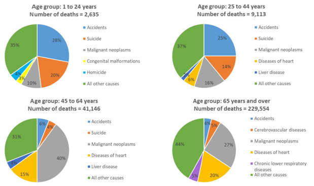
Source: Statistics Canada
Chart 9 Description
Succession of four pie charts showing the 2019 distribution of deaths by cause for the 5 leading causes of deaths in Canada by age group.
For age group 1-24, out of the 2,635 deaths in 2019, 28% were due to accidents, 20% to suicide, 10% to malignant neoplasms, 3% to congenital malformations and 4% to homicide, with the remaining 35% due to other causes of death.
For the age group 25-44, out of the 9,113 deaths in 2019, 25% were due to accidents, 14% to suicide, 16% to malignant neoplasms, 6% to diseases of the heart and 2% to liver disease, with the remaining 37% due to other causes of death.
For the age group 45-64, out of the 41,146 deaths in 2019, 40% were due to malignant neoplasms, 15% to diseases of the heart, 6% to accidents, 4% to suicide, 4% to liver disease, with the remaining 31% due to other causes of death.
For the age group 65 and above, out of the 229,554 deaths in 2019, 27% were due to malignant neoplasms, 20% to diseases of the heart, 5% to cerebrovascular diseases, 5% to chronic lower respiratory diseases, 4% to accidents, with the remaining 44% due to other causes of death.
A comparison of leading causes of death was made between Canada and a few select countries for the age group 65-74. Based on this comparison, Canada, the US, the UK and Sweden have similar rankings for the first four causes of death. However, as can be seen in Table 12, there are some important differences for some causes of deaths. For example,
-
Canada has the lowest proportion of deaths from cerebrovascular diseases, however it lags the US in mortality from malignant neoplasms, and Japan and France in mortality from diseases of the heart.
-
Although the US has the lowest proportions of deaths from malignant neoplasms, it has the highest proportion of deaths from diseases of the heart.
-
Japan has the lowest proportion of deaths from chronic lower respiratory disease. However, the proportion of deaths from influenza and pneumonia as well as from cerebrovascular diseases is higher in Japan compared to the other five countries.
-
The UK has the lowest proportion of deaths from diabetes mellitus, accidents, and nephritis, nephrotic syndrome and nephrosis.
-
For Sweden the pattern in the proportion of deaths by leading cause of deaths is similar to Canada.
It is worth noting that certain countries have made more progress regarding specific causes of death or are less prone to certain diseases because of their particular lifestyle.
| Cause of Death | Canada | US | UK | Sweden | Japan | France |
|---|---|---|---|---|---|---|
| Malignant neoplasms | 43.6% | 31.7% | 43.6% | 42.4% | 46.5% | 47.1% |
| Diseases of heart | 17.4% | 21.9% | 16.6% | 17.8% | 12.4% | 11.3% |
| Chronic lower respiratory diseases | 5.7% | 7.5% | 8.1% | 4.6% | 1.4% | 2.1% |
| Cerebrovascular diseases | 3.6% | 4.3% | 4.6% | 4.6% | 6.9% | 3.8% |
| Diabetes mellitus | 3.1% | 4.0% | 1.0% | 2.4% | 1.4% | 2.0% |
| Accidents | 2.4% | 2.8% | 1.5% | 2.4% | 3.3% | 3.2% |
| Chronic liver disease and cirrhosis | 2.0% | 1.8% | 1.7% | 1.6% | 1.7% | 2.2% |
| Influenza and pneumonia | 1.4% | 1.7% | 2.8% | 1.2% | 3.6% | 1.3% |
| Nephritis, nephrotic syndrome and nephrosis | 0.9% | 1.9% | 0.3% | 0.5% | 1.4% | 0.6% |
| Alzheimer’s Disease | 0.8% | 1.4% | 1.1% | 1.6% | 0.4% | 0.8% |
| Total Top 10 Causes of Death | 80.8% | 78.9% | 81.2% | 79.1% | 79.0% | 74.5% |
| Source: World Health Organization Mortality Database (WHO, 2021a). | ||||||
Canada currently has some of the lowest mortality rates among the selected countries. As can be seen in Chart 10, after age 85, Canada, along with France and Japan, has the lowest mortality rates.
Chart 10 - Number of Deaths per 1,000 for Select Countries and Age Groups (2017, Both Sexes)
Source: OCA calculations based on the Human Mortality Database data, 2017 (accessed in 2020).
Chart 10 Description
Bar chart comparing the 2017 number of deaths per 1,000 for both sexes per country and per age group. The countries selected are Canada, France, Japan, Sweden, the UK and the US. For each age group, there is a horizontal red line at Canada’s rate to view how Canada compares to other countries.
For age group 65 to 74, Canada has the third highest number of deaths per 1,000 (14.9). The first, second and fourth positions are occupied by the US (19.0), the UK (15.2) and France (13.3) respectively.
For age group 75 to 84, Canada has the fourth highest number of deaths per 1,000 (39.6). The first, second and third positions are occupied by the US (47.1), the UK (45.3) and Sweden (42.1) respectively.
For age group 85 to 89, Canada has the fourth highest number of deaths per 1,000 (94.6). The first, second and third positions are occupied by the UK (110.2), Sweden (109.5) and the US (97.4) respectively.
For age group 90 to 94, Canada has the fourth highest number of deaths per 1,000 (170.4). The first, second and third positions are occupied by Sweden (202.0), the UK (192.4) and the US (176.3) respectively.
For age group 95 to 99, Canada has the fourth highest number of deaths per 1,000 (305.4). The first, second and third positions are occupied by Sweden (344.9), the UK (327.0) and the US (310.6) respectively.
3.3 Historical Mortality Rates
This subsection focuses on historical mortality rates by age group for older age groups.
Ages 65-74
As shown in Chart 11, for the age group 65 to 74, mortality rates have decreased by more than 60% for men and more than 70% for women over the last 90 years ending in 2019. Most of the mortality rates reductions for men occurred between 1971 and 2011, while for women, mortality rates decreased more gradually over a period twice as long. The gap in mortality rates between men and women has therefore decreased significantly since 1971. As can be seen in Chart 11, a flattening of the mortality rates curves since 2011 implies that the improvements for this age group have somewhat stalled.
Chart 11 - Historical Mortality RatesChart 11 Footnote * (Ages 65-74)
Chart 11 Footnote
- Chart 11 Footnote *
-
Boxes apply to both sexes.
Source: 1921 - 2011 from CHMD, 2012 - 2015 from StatCan CLT and 2016 - 2019 from StatCan special request.
Chart 11 Description
Line chart showing historical mortality rates for males and females for the age group 65 to 74. The Y axis shows the historical mortality rates per thousand and the X axis shows the years from 1921 to 2019.
For males, there were 45 deaths per 1,000 in 1929. It gradually decreased to 43 deaths per 1,000 in 1959, 32 deaths per 1,000 in 1989 and 16 deaths per 1,000 in 2019.
For females, there were 43 deaths per 1,000 in 1929. It gradually decreased to 28 deaths per 1,000 in 1959, 17 deaths per 1,000 in 1989 and 11 deaths per 1,000 in 2019.
For both sexes, the mortality rates curve has flattened since 2011.
Taking a closer look at mortality rates by main causes of death for the age group 65 to 74 (Chart 12) reveals that between 1979 and 2019, mortality rates related to diseases of the heart dropped significantly for both sexes. This decrease was the result of new drugs and medical procedures. However, the pace of decrease has slowed down in the last 10 years for both men and women.
Moreover, over the same period, malignant neoplasms topped diseases of the heart as the most common cause of death. This resulted from mortality caused by malignant neoplasms decreasing less quickly than mortality from diseases of the heart. Mortality caused by malignant neoplasmsFootnote 11 has been decreasing steadily for the last 20 years for men while such decreases for women started only over the last decade. As noted in the North American Actuarial Journal “Mortality of Smoking by Gender” by S. Gutterman, 2015, a similar trend was noted in the US and is attributable to the delay in women to reduce tobacco product usage and the impact of this trend on the deaths from lung cancer. Based on a study conducted by the University of Waterloo on Historical Trends in Smoking Prevalence (Reid, JL. et Al. 2019), women in Canada also started to reduce smoking later than men.
Cerebrovascular diseases mortality rates have been declining constantly over the period 1979 to 2019. According to Mensah, G.A. et al. 2017, the decline in diseases of the heart and cerebrovascular diseases has been driven by rapid progress in both prevention and treatment, including decline in cigarette smoking, improvements in hypertension treatment and control, widespread use of statins to lower circulating cholesterol levels, and the development and timely use of thrombolysis and stents in acute coronary syndrome to limit or prevent infarction. For chronic lower respiratory diseases which are related to tobacco usage, high Body Mass Index (BMI) and socio-economic factors (British Medical Journal, Li et al. 2020), men have experienced a drop in mortality, while female rates have been mostly stable for the last two decades. Mortality rates associated with accidents have been relatively stable for both sexes since 1979.
Chart 12 - Mortality Rates by Cause of Death (65-74) Males (left) and Females (right)
Source: OCA calculations based on data provided by Statistics Canada on special request.
Chart 12 Description
Two line charts showing historical mortality rates by cause for males (left) and females (right) for the age group 65 to 74. Five causes of death are shown: diseases of the heart, malignant neoplasms, cerebrovascular diseases, chronic lower respirator disease and accidents. The Y axis shows the historical mortality rates per thousand and the X axis shows the years from 1979 to 2019.
For males, diseases of heart was the main cause of death from 1979 to 1988. The mortality rate per 1,000 for that cause of death decreased gradually from 15.6 in 1979 to 3.2 in 2019. Malignant neoplasms became the main cause of death in 1989. The mortality rate per 1,000 for that cause of death increased from 10.6 in 1979 to 11.6 in 1988. It then decreased gradually up until 2019 to the value of 6.7. Cerebrovascular diseases mortality rate per 1,000 decreased from 2.7 in 1979 to 0.6 in 2019. Chronic lower respiratory diseases mortality rate per 1,000 decreased from 1.9 in 1979 to 0.8 in 2019. Accidents mortality rate per 1,000 decreased from 0.9 in 1979 to 0.4 in 2019.
For females, diseases of heart was the main cause of death from 1979 to 1983. The mortality rate per 1,000 for that cause of death decreased gradually from 6.8 in 1979 to 1.4 in 2019. Malignant neoplasms became the main cause of death in 1984. The mortality rate per 1,000 for that cause of death increased from 5.9 in 1979 to 6.7 in 1996. It then decreased gradually up until 2019 to the value of 4.9. Cerebrovascular diseases mortality rate per 1,000 decreased from 1.9 in 1979 to 0.4 in 2019. Chronic lower respiratory diseases mortality rate per 1,000 increased from 0.5 in 1979 to 0.7 in 2019. Accidents mortality rate per 1,000 decreased from 0.5 in 1979 to 0.3 in 2019.
There are also two tables in the top right corner of each chart, that show the annual MIRs for malignant neoplasms and diseases of the heart for 4 sub-periods: 1979 to 1989, 1989 to 1999, 1999 to 2009 and 2009 to 2019. The table for males is:
| Annual MIR (Malignant Neoplasms) | Annual MIR (Diseases of Heart) | ||
|---|---|---|---|
| 1979-1989 | -0.7% | 1979-1989 | 3.2% |
| 1989-1999 | 0.7% | 1989-1999 | 3.4% |
| 1999-2009 | 2.2% | 1999-2009 | 5.6% |
| 2009-2019 | 2.2% | 2009-2019 | 1.9% |
The table for females is:
| Annual MIR (Malignant Neoplasms) | Annual MIR (Diseases of Heart) | ||
|---|---|---|---|
| 1979-1989 | -1.0% | 1979-1989 | 3.7% |
| 1989-1999 | -0.1% | 1989-1999 | 3.3% |
| 1999-2009 | 0.8% | 1999-2009 | 5.8% |
| 2009-2019 | 1.7% | 2009-2019 | 1.7% |
Chart 13 presents a comparison of mortality rates by cause of death with other countries for the age group 65 to 74. It highlights that Canada has some of the lowest mortality rates for cerebrovascular diseases, influenza and pneumonia and Alzheimer’s disease. On the other hand, Japan and France have significant lower mortality rates due to diseases of the heart and chronic lower respiratory diseases.
Chart 13 - Mortality Rates by Cause of Death, 65-74, Both Sexes, 2017
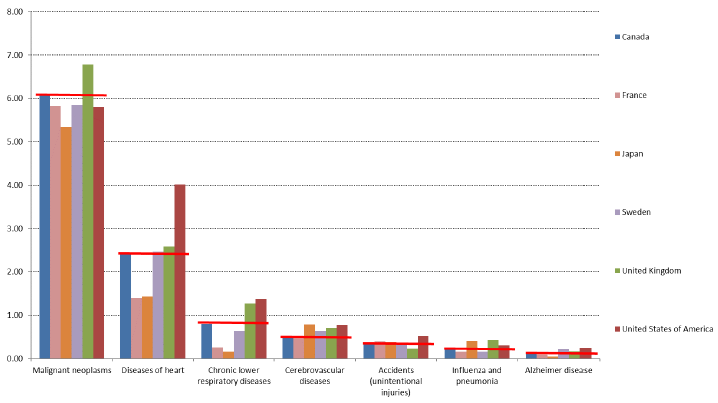
Source: OCA calculations based on World Health Organization Mortality Database (WHO, 2021a).
Chart 13 Description
Bar chart showing international comparison of 2017 mortality rates by cause of death for the age group 65 to 74. The countries selected are Canada, France, Japan, Sweden, the UK and the US. For each cause of death, there is a horizontal red line at Canada’s rate to view how Canada compares to other countries.
For malignant neoplasms, Canada has the second highest mortality rate per 1,000 (6.1). The first, third and fourth positions are occupied by the UK (6.8), Sweden (5.9) and France (5.8) respectively.
For diseases of heart, Canada has the fourth highest mortality rate per 1,000 (2.4). The first, second and third positions are occupied by the US (4.0), the UK (2.6) and Sweden (2.5) respectively.
For chronic lower respiratory diseases, Canada has the third highest mortality rate per 1,000 (0.8). The first, second and fourth positions are occupied by the US (1.4), the UK (1.3) and Sweden (0.6) respectively.
For cerebrovascular diseases, Canada has the fifth highest mortality rate per 1,000 (0.5). The first, second and third positions are occupied by Japan (0.8), the US (0.8) and the UK (0.7) respectively.
For accidents (unintentional injuries), Canada has the fourth highest mortality rate per 1,000 (0.3). The first, second and third positions are occupied by the US (0.5), France (0.4) and Japan (0.4) respectively.
For influenza and pneumonia, Canada has the fourth highest mortality rate per 1,000 (0.2). The first, second and third positions are occupied by the UK (0.4), Japan (0.4) and the US (0.3) respectively.
For Alzheimer disease, Canada has the fourth highest mortality rate per 1,000 (0.1). The first, second and third positions are occupied by the US (0.3), Sweden (0.2) and the UK (0.2) respectively.
Ages 75-84
As shown in Chart 14, for the age group 75 to 84, mortality rates have continually decreased over the last 80 years. The mortality rate reduction was about 67% for males and females over the last 80 years. It can be observed that mortality rates for males have been decreasing at a faster pace during the last two decades, thereby reducing the mortality rates gap between males and females. Similar to the age group 65-74, a flattening of the mortality rates curves can been observed over the last 10 years.
Chart 14 - Historical Mortality RatesChart 14 Footnote * (Ages 75-84)
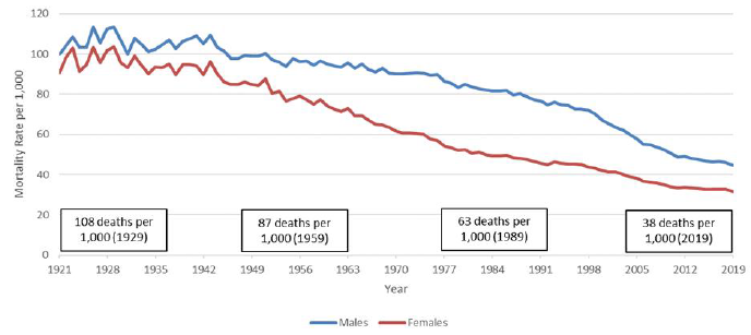
Chart 14 Footnote
- Chart 14 Footnote *
-
Boxes apply to both sexes.
Source: 1921 - 2011 from CHMD, 2012 - 2015 from StatCan CLT and 2016 - 2019 from StatCan special request.
Chart 14 Description
Line chart showing historical mortality rates for males and females for the age group 75 to 84. The Y axis shows the historical mortality rates per thousand and the X axis shows the years from 1921 to 2019.
For males, there were 113 deaths per 1,000 in 1929. It gradually decreased to 97 deaths per 1,000 in 1959, 79 deaths per 1,000 in 1989 and 45 deaths per 1,000 in 2019.
For females, there were 103 deaths per 1,000 in 1929. It gradually decreased to 77 deaths per 1,000 in 1959, 47 deaths per 1,000 in 1989 and 32 deaths per 1,000 in 2019.
For both sexes, the mortality rates curve has flattened since 2011.
Taking a closer look at mortality rates by main causes of death for the age group 75 to 84 (Chart 15) reveals that between 1979 and 2019, mortality rates related to diseases of the heart dropped significantly for both sexes. However, reductions in mortality rates from diseases of the heart have slowed down in the recent past, albeit to a lesser extent as for the 65-74 age group.
Similar to the 65-74 age group over the same period, malignant neoplasms surpassed diseases of the heart as the most common cause of death. Reductions in mortality rates from malignant neoplasms for men can be observed from the early 1990s, and these reductions have accelerated over the last two decades. For women, after 10 years of very stable mortality rates between 1999 and 2009, more recent experience points to some reductions in mortality rates.
Cerebrovascular diseases mortality rates have been declining constantly over the period 1979 to 2019 for both genders, while mortality rates associated with accidents have been relatively stable. For chronic lower respiratory diseases, men have experienced a drop in mortality, while women experienced an increase.
Chart 15 - Mortality Rates by Cause of Death (75-84) Males (left) and Females (right)
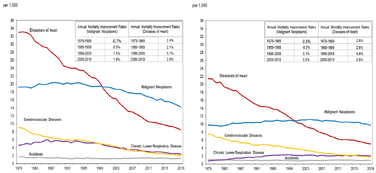
Source: OCA calculations based on data provided by Statistics Canada on special request.
Chart 15 Description
Two line charts showing historical mortality rates by cause for males (left) and females (right) for the age group 75 to 84. Five causes of death are shown: diseases of the heart, malignant neoplasms, cerebrovascular diseases, chronic lower respirator disease and accidents. The Y axis shows the historical mortality rates per thousand and the X axis shows the years from 1979 to 2019.
For males, diseases of heart was the main cause of death from 1979 to 1999. The mortality rate per 1,000 for that cause of death decreased gradually from 33.0 in 1979 to 8.5 in 2019. Malignant neoplasms became the main cause of death in 2000. The mortality rate per 1,000 for that cause of death increased from 19.2 in 1979 to 20.4 in 1988. It then decreased gradually up until 2019 to the value of 14.2. Cerebrovascular diseases mortality rate per 1,000 decreased from 9.1 in 1979 to 2.1 in 2019. Chronic lower respiratory diseases mortality rate per 1,000 decreased from 4.6 in 1979 to 2.4 in 2019. Accidents mortality rate per 1,000 decreased from 1.7 in 1979 to 1.3 in 2019.
For females, diseases of heart was the main cause of death from 1979 to 2000. The mortality rate per 1,000 for that cause of death decreased gradually from 21.5 in 1979 to 5.0 in 2019. Malignant neoplasms became the main cause of death in 2001. The mortality rate per 1,000 for that cause of death increased from 9.8 in 1979 to 11.0 in 1996. It then decreased gradually up until 2019 to the value of 9.7. Cerebrovascular diseases mortality rate per 1,000 decreased from 7.5 in 1979 to 1.7 in 2019. Chronic lower respiratory diseases mortality rate per 1,000 increased from 0.8 in 1979 to 2.1 in 2019. Accidents mortality rate per 1,000 decreased from 1.2 in 1979 to 0.9 in 2019.
There are also two tables in the top right corner of each chart, that show the annual MIRs for malignant neoplasms and diseases of the heart for 4 sub-periods: 1979 to 1989, 1989 to 1999, 1999 to 2009 and 2009 to 2019. The table for males is:
| Annual MIR (Malignant Neoplasms) | Annual MIR (Diseases of Heart) | ||
|---|---|---|---|
| 1979-1989 | -0.7% | 1979-1989 | 2.4% |
| 1989-1999 | 0.5% | 1989-1999 | 2.1% |
| 1999-2009 | 1.1% | 1999-2009 | 5.1% |
| 2009-2019 | 1.9% | 2009-2019 | 2.8% |
The table for females is:
| Annual MIR (Malignant Neoplasms) | Annual MIR (Diseases of Heart) | ||
|---|---|---|---|
| 1979-1989 | -0.8% | 1979-1989 | 2.8% |
| 1989-1999 | -0.5% | 1989-1999 | 2.6% |
| 1999-2009 | 0.1% | 1999-2009 | 4.9% |
| 2009-2019 | 0.9% | 2009-2019 | 2.8% |
Chart 16 shows international comparison of mortality rates by cause of death for the age group 75 to 84. It highlights that Canada has some of the lowest mortality rates for cerebrovascular diseases and Alzheimer’s disease. Japan and France have significantly lower mortality rates due to diseases of the heart and chronic lower respiratory diseases.
Chart 16 - Mortality Rates by Cause of Death, 75-84, Both Sexes, 2017
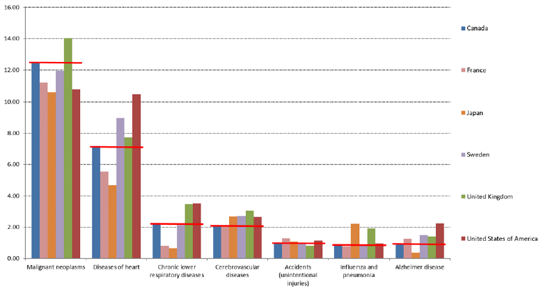
Source: OCA calculations based on World Health Organization Mortality Database (WHO, 2021a).
Chart 16 Description
Bar chart showing international comparison of 2017 mortality rates by cause of death for the age group 75 to 84. The countries selected are Canada, France, Japan, Sweden, the UK and the US. For each cause of death, there is a horizontal red line at Canada’s rate to view how Canada compares to other countries.
For malignant neoplasms, Canada has the second highest mortality rate per 1,000 (12.4). The first, third and fourth positions are occupied by the UK (14.0), Sweden (11.9) and France (11.2) respectively.
For diseases of heart, Canada has the fourth highest mortality rate per 1,000 (7.2). The first, second and third positions are occupied by the US (10.4), Sweden (9.0) and the UK (7.7) respectively.
For chronic lower respiratory diseases, Canada has the third highest mortality rate per 1,000 (2.3). The first, second and fourth positions are occupied by the US (3.5), the UK (3.5) and Sweden (2.1) respectively.
For cerebrovascular diseases, Canada has the sixth highest mortality rate per 1,000 (2.1). The first, second and third positions are occupied by the UK (3.1), Sweden (2.7) and Japan (2.7) respectively.
For accidents (unintentional injuries), Canada has the fourth highest mortality rate per 1,000 (1.0). The first, second and third positions are occupied by France (1.3), the US (1.1) and Japan (1.1) respectively.
For influenza and pneumonia, Canada has the fourth highest mortality rate per 1,000 (0.9). The first, second and third positions are occupied by Japan (2.2), the UK (1.9) and the US (1.0) respectively.
For Alzheimer disease, Canada has the fifth highest mortality rate per 1,000 (0.9). The first, second and third positions are occupied by the US (2.2), Sweden (1.5) and the UK (1.4) respectively.
Ages 85-89
As can be seen in Chart 17, mortality rates for the 85 to 89 age group have shown considerable improvements over the last 80 years. Over that period, mortality rates were reduced by half for both males and females. There seems to be a stabilization in the mortality rates in the last five years or so. Males’ mortality rates decreased more significantly in the last two decades, resulting in a reduced gap between male and female rates.
At older ages it becomes more difficult to realize gains in mortality since death may result from simultaneous multiple medical conditions. Achieving improvements for one cause of death might not translate in direct improvement since comorbidity may limit potential gains and individuals will instead gradually die of other causes.
Chart 17 - Historical Mortality RatesChart 17 Footnote * (Ages 85-89)
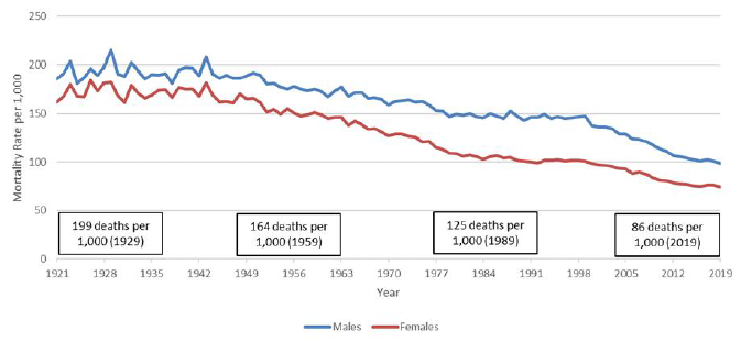
Chart 17 Footnote
- Chart 17 Footnote *
-
Boxes apply to both sexes.
Source: 1921 - 2011 from CHMD, 2012 - 2015 from StatCan CLT and 2016 - 2019 from StatCan special request.
Chart 17 Description
Line chart showing historical mortality rates for males and females for the age group 85 to 89. The Y axis shows the historical mortality rates per thousand and the X axis shows the years from 1921 to 2019.
For males, there were 215 deaths per 1,000 in 1929. It gradually decreased to 176 deaths per 1,000 in 1959, 145 deaths per 1,000 in 1989 and 98 deaths per 1,000 in 2019.
For females, there were 183 deaths per 1,000 in 1929. It gradually decreased to 152 deaths per 1,000 in 1959, 102 deaths per 1,000 in 1989 and 74 deaths per 1,000 in 2019.
For both sexes, the mortality rates have stabilized since around 2014.
Similar to other age groups, mortality rates by main causes of death for the age group 85 to 89 (Chart 18) reveal that between 1979 and 2019, mortality rates for diseases of the heart dropped significantly for both sexes.
Moreover, in the last 10 years, malignant neoplasms topped diseases of the heart as the most common cause of death for men. For women, diseases of the heart remain the top cause of death, but by a very slim margin as compared to malignant neoplasms. This resulted from the combination of mortality caused by malignant neoplasms being somewhat stable and significant decreases in mortality caused by diseases of the heart. Cerebrovascular diseases mortality rates have been declining constantly over the period 1979 to 2019 for both sexes, and for women, cerebrovascular diseases went from the second cause of death to the third cause of death.
Chart 18 - Mortality Rates by Cause of Death (85-89) Males (left) and Females (right)
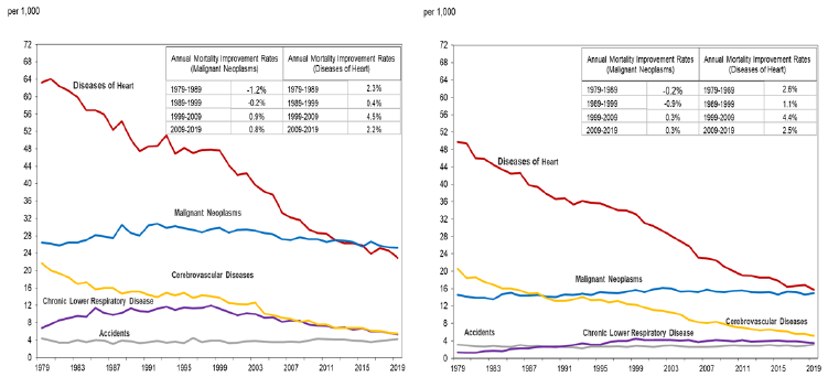
OCA calculations based on data provided by Statistics Canada on special request.
Chart 18 Description
Two line charts showing historical mortality rates by cause for males (left) and females (right) for the age group 85 to 89. Five causes of death are shown: diseases of the heart, malignant neoplasms, cerebrovascular diseases, chronic lower respirator disease and accidents. The Y axis shows the historical mortality rates per thousand and the X axis shows the years from 1921 to 2019.
For males, diseases of heart was the main cause of death from 1979 to 2015. The mortality rate per 1,000 for that cause of death decreased gradually from 63.3 in 1979 to 22.9 in 2019. Malignant neoplasms became the main cause of death in 2016. The mortality rate per 1,000 for that cause of death increased from 26.5 in 1979 to 30.8 in 1992. It then decreased gradually up until 2019 to the value of 25.3. Cerebrovascular diseases mortality rate per 1,000 decreased from 21.7 in 1979 to 5.5 in 2019. Chronic lower respiratory diseases mortality rate per 1,000 decreased from 6.8 in 1979 to 5.3 in 2019. Accidents mortality rate per 1,000 decreased from 4.4 in 1979 to 4.1 in 2019.
For females, diseases of heart is the main cause of death since 1979. The mortality rate per 1,000 for that cause of death decreased gradually from 49.8 in 1979 to 15.8 in 2019. Malignant neoplasms mortality rate per 1,000 increased from 14.6 in 1979 to 15.0 in 2019. Cerebrovascular diseases mortality rate per 1,000 decreased from 20.5 in 1979 to 5.2 in 2019. Chronic lower respiratory diseases mortality rate per 1,000 increased from 1.4 in 1979 to 3.6 in 2019. Accidents mortality rate per 1,000 remained stable at around 3.1 from 1979 to 2019.
There are also two tables in the top right corner of each chart, that show the annual MIRs for malignant neoplasms and diseases of the heart for 4 sub-periods: 1979 to 1989, 1989 to 1999, 1999 to 2009 and 2009 to 2019. The table for males is:
| Annual MIR (Malignant Neoplasms) | Annual MIR (Diseases of Heart) | ||
|---|---|---|---|
| 1979-1989 | -1.2% | 1979-1989 | 2.3% |
| 1989-1999 | 0.2% | 1989-1999 | 0.4% |
| 1999-2009 | 0.9% | 1999-2009 | 4.5% |
| 2009-2019 | 0.8% | 2009-2019 | 2.2% |
The table for females is:
| Annual MIR (Malignant Neoplasms) | Annual MIR (Diseases of Heart) | ||
|---|---|---|---|
| 1979-1989 | -0.2% | 1979-1989 | 2.6% |
| 1989-1999 | -0.9% | 1989-1999 | 1.1% |
| 1999-2009 | 0.3% | 1999-2009 | 4.4% |
| 2009-2019 | 0.3% | 2009-2019 | 2.5% |
Chart 19 presents international comparison of mortality rates by cause of death for the age group 85 to 89. It highlights that as one advances in age, multiple causes of death can often interact and the data become somewhat less reliable or are simply missing. For this reason, data for France was not included.
The comparison with other countries shows that Canada has lower mortality rates for diseases of the heart than Sweden and the US. Canada also has lower mortality rates from cerebrovascular diseases when compared to the other countries. However, amongst compared countries, Canada has the highest mortality rate for malignant neoplasms after the UK. It is interesting to note that while Japan has quite low mortality rates from heart diseases, the mortality rates from influenza and pneumonia are at least twice as high if compared to Canada, Sweden and the US.
Chart 19 - Mortality Rates by Cause, 85-89, Both Sexes, 2017
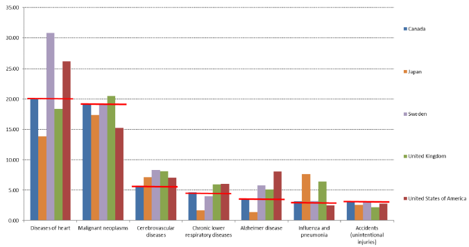
Source: OCA calculations based on World Health Organization Mortality Database (WHO, 2021a). Data for France is unavailable.
Chart 19 Description
Bar chart showing international comparison of 2017 mortality rates by cause of death for the age group 85 to 89. The countries selected are Canada, Japan, Sweden, the UK and the US. For each cause of death, there is a horizontal red line at Canada’s rate to view how Canada compares to other countries.
For diseases of heart, Canada has the third highest mortality rate per 1,000 (20.0). The first, second and fourth positions are occupied by Sweden (30.8), the US (26.2) and the UK (18.4) respectively.
For malignant neoplasms, Canada has the second highest mortality rate per 1,000 (19.3). The first, third and fourth positions are occupied by the UK (20.5), Sweden (19.1) and Japan (17.4) respectively.
For cerebrovascular diseases, Canada has the fifth highest mortality rate per 1,000 (5.8). The first, second and third positions are occupied by Sweden (2.7), the UK (2.7) and Japan (7.2) respectively.
For chronic lower respiratory diseases, Canada has the third highest mortality rate per 1,000 (4.7). The first, second and fourth positions are occupied by the US (6.0), the UK (6.0) and Sweden (4.0) respectively.
For Alzheimer disease, Canada has the fourth highest mortality rate per 1,000 (3.6). The first, second and third positions are occupied by the US (8.1), Sweden (5.8) and the UK (5.1) respectively.
For influenza and pneumonia, Canada has the fourth highest mortality rate per 1,000 (3.1). The first, second and third positions are occupied by Japan (7.7), the UK (6.4) and Sweden (3.2) respectively.
For accidents (unintentional injuries), Canada has the highest mortality rate per 1,000 (3.2). The second, third and fourth positions are occupied by Sweden (3.1), the US (2.8) and Japan (2.6) respectively.
Ages 90 and Older
For the mortality rates of the oldest age group, data quality is a major concern and much uncertainty exists. However, as shown in Chart 20, the mortality rates for this age group have been decreasing over the last 70 years, albeit to a lesser extent than for other age groups. Over the last 70 years, mortality rates have decreased by 34% for males and 41% for females. The gap in mortality rates between males and females increased over time until the 1980s, then stabilized until the late 1990s and slightly decreased thereafter.
Chart 20 - Historical Mortality RatesChart 20 Footnote * (Ages 90+)
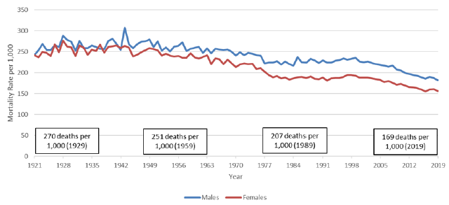
Chart 20 Footnote
- Chart 20 Footnote *
-
Boxes apply to both sexes.
Source: 1921 - 2011 from CHMD, 2012 - 2015 from StatCan CLT and 2016 - 2019 from StatCan special request.
Chart 20 Description
Line chart showing historical mortality rates for males and females for the age group 90 and over. The Y axis shows the historical mortality rates per thousand and the X axis shows the years from 1921 to 2019.
For males, there were 278 deaths per 1,000 in 1929. It gradually decreased to 257 deaths per 1,000 in 1959, 229 deaths per 1,000 in 1989 and 182 deaths per 1,000 in 2019.
For females, there were 262 deaths per 1,000 in 1929. It gradually decreased to 246 deaths per 1,000 in 1959, 185 deaths per 1,000 in 1989 and 156 deaths per 1,000 in 2019.
At older ages, people often have comorbidities such that the attribution of death to a particular cause becomes more difficult and may sometimes be inaccurate. As a result graphs of causes of death and international comparison are not presented.
3.4 Historical MIRs
This subsection analyses historical data and trends in MIRs.
MIRs for any given age, sex and calendar year may be regarded as a combination of age, year, and cohort components or effects. Heat maps are useful in analysing past MIRs and decomposing them between these components. Chart 21 presents heat maps of MIRs based on 15-year moving averages ending in the given years by age for Canadian males and females. Age effects are seen as horizontal bands or patterns, calendar year effects as vertical patterns, and cohort effects as diagonal ones.
Looking at these heat maps, it can be seen that, for example, the age effect is present for both sexes at the very young ages. Improvements in mortality for males between the ages of 5 and 20 were and continue to be very strong. However, females of this age group have seen a slowdown in improvements since around 2012. A significant calendar year effect is seen for females aged less than 45 in the 1950s and early 1960s as a result of improvements in maternity care and safe access to abortion services. The MIRs during that decade were close to 5% per year. The chart also shows that there is no discernible cohort effect observed from the historical data for Canadian females. For males, we can note that a cohort effect exists for those born between the 1930s and 1940s, but that it has faded.
Although there has been a substantial reduction in mortality rates over time, there have been periods with low or even negative mortality improvements (i.e. little change or deterioration in mortality). Furthermore, these periods have been more evident for males than females. In the 1970s, males in their 20s experienced negative mortality improvements due to fatal accidents. A more recent deterioration in mortality rates was observed in the 1990s for males aged late 20s to early 40s, and was due to increasing mortality from AIDS. This trend reverted in the early 2000s for this age group since important medical breakthroughs helped to reduce the number of deaths from AIDS. However, in the last few years, there has been a deterioration in mortality rates for males and females aged 20 to 45 largely related to the ongoing opioid crisis. This deterioration was confirmed by Statistics Canada’s publication (Changes in life expectancy by selected causes of death, 2017), and further documented by the Special Advisory Committee on the Epidemic of Opioid Overdoses (Opioid- and Stimulant-related Harms in Canada, June 2021). This is an emerging trend that is discussed in more details in Section 4.
Chart 21 - Historical Mortality Improvements (15-Year Averages)
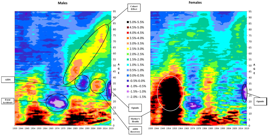
Source: 1939 - 2011 from CHMD, 2012 - 2015 from StatCan CLT and 2016 - 2019 from StatCan special request.
Chart 21 Description
Heat maps showing 15-year moving averages of improvement rates ending in the given years by age for Canadian males and females. The Y axis shows the age attained in the given calendar year from 0 to 95, and the X axis shows the calendar year from 1939 to 2019. The 15-year average improvement rates are depicted using a color code with a different color for each 0.5% interval ranging between a -2.0% to -1.5% interval (light purple) to a 5.0% to 5.5% (black).Age effects are seen as horizontal bands or patterns, calendar year effects as vertical patterns, and cohort effects as diagonal ones.
The age effect is present for both sexes at the very young ages (dark colors at younger ages for all years).
Improvements in mortality for males between the ages of 5 and 20 were and continue to be very strong (dark colors for all years). However, females of this age group have seen a slowdown in improvements since around 2012 (dark colors for all years up to 2012 and moving to lighter colors thereafter).
There is a significant calendar year effect for females aged less than 45 in the 1950s and early 1960s (vertical dark colors for these ages between the 1950s and early 1960s). This is identified as being due to improvements in mother’s health.
There is no discernible cohort effect observed from the historical data for Canadian females (no obvious diagonal trend). For males, there is a cohort effect for those born between the 1930s and 1940s, but it has faded (obvious diagonal trend between early 1980s and mid 2010s for attained ages 35 and 85 respectively).
In the 1970s, males in their 20s experienced negative mortality improvements due to fatal accidents (purple mass). A more recent deterioration in mortality rates was observed in the 1990s (purple a blue mass) for males aged late 20s to early 40s, and was due to increasing mortality from AIDS. In the last few years, there has been a deterioration in mortality rates for males and females aged 20 to 45 largely related to the ongoing opioid crisis (purple and blue mass).
Heat maps are very useful in identifying past patterns in MIRs and any cohort effects. They can therefore be used as an efficient tool to analyse and understand past experience and to develop assumptions for the transition period. However, heat maps may be difficult to interpret, and due to the amount of information they are capturing in one image, the overall trends in MIRs may be hard to identify. To assist with analysing trends in MIRs, it can also be useful to look at the evolution of MIRs by age group through time and at historical averages based on different subperiods.
Charts 22 and 23 below show the evolution of historical MIRs over the last 50 years for males and females in older age groups based on 15-year moving averages. For the 65-74, 75-84 and 85-89 age groups, the charts indicate an important slowdown in the MIRs in the more recent years. The 90+ age group data also points to a slowdown, but to a lesser extent than for younger age groups. An analysis based on a 10-year moving average (not shown) for the 90+ age groups reveals a more pronounced recent slowdown.
Chart 22 - Male MIRs by Select Age Group, Canada (15-Year Averages, Age-Standardized Using 2015 Population)
OCA calculations from the following data sources: 1969 - 2011 from CHMD, 2012 - 2015 from StatCan CLT and 2016 - 2019 from StatCan special request.
Chart 22 Description
Line chart showing the evolution of historical MIRs over the last 50 years for males in older age groups based on 15-year moving averages. The Y axis shows the MIRs and the X axis shows the years from 1969 to 2019.
For age group 65-74, MIRs are at -0.04% in 1969, increase gradually to 3.04% in 2011, and decrease to 1.82% in 2019.
For age group 75-84, MIRs are at 0.34% in 1969, increase gradually to 0.89% in 1987, decrease to 0.82% in 1993, increase again to 2.80% in 2012 and slowdown by decreasing to 1.80% in 2019.
For age group 85-89, MIRs are at 0.43% in 1969, increase gradually to 0.89% in 1984, decrease to 0.09% in 1994, increase again to 2.19% in 2014 and slowdown by decreasing to 1,93% in 2019.
For age group 90+, MIRs are at 0.24% in 1969, increase gradually to 1.00% in 1981, decrease to -0.24% in 1999 and increase again to 1.33% in 2019.
Chart 23 - Female MIRs by Select Age Group, Canada (15-Year Moving Averages, Age-Standardized Using 2015 Population)
OCA calculations from the following data sources: 1969 - 2011 from CHMD, 2012 - 2015 from StatCan CLT and 2016 - 2019 from StatCan special request.
Chart 23 Description
Line chart showing the evolution of historical MIRs over the last 50 years for females in older age groups based on 15-year moving averages. The Y axis shows the MIRs and the X axis shows the years from 1969 to 2019.
For age group 65-74, MIRs are at 1.56% in 1969, decrease gradually to 1.23% in 1999, increase to 1.93% in 2012 and decrease to 1.35% in 2019.
For age group 75-84, MIRs are at 1.45% in 1969, decrease gradually to 1.83% in 1998, increase to 2.07% in 2011 and decrease to 1.21% in 2019.
For age group 85-89, MIRs are at 0.95% in 1969, increase to 1.73% in 1984, decrease gradually to 0.26% in 1999, increase to 1.89% in 2016 and decrease to 1.59% in 2019.
For age group 90+, MIRs are at 0.47% in 1969, increase to 1.49% in 1983, decrease gradually to -0.18% in 1999, increase to 1.25% in 2016 and decrease to 1.14% in 2019.
Table 13 compares the long-term average MIRs over the last 90 years with more recent averages. Over the last 90 years, the average MIRs for Canada for both genders were 1.0% per year for ages 65 and over and 0.7% per year for ages 85 and over. The average MIRs for the 15-year period ending in 2019 for both genders are well above the last 90-year averages, standing at 1.5% for both age groups.
Similar to many other countries, Canada has been experiencing a slowdown in mortality improvements. This slowing trend, which is highlighted in Chart 22 and Chart 23 above, is also evident when comparing the average MIRs over the last 15 years with those over the last 5 years. As shown in Table 13, over the last 5 years, the average MIRs for both sexes have slowed down to 0.8% for ages 65 and over and to 0.6% for ages 85 and over. These average MIRs are lower than the 90-year averages.
| Age Group | Last 90 Years (1930-2019) |
Last 15 Years (2005-2019) |
Last 5 Years (2015-2019) |
||||||
|---|---|---|---|---|---|---|---|---|---|
| Males | Females | Both | Males | Females | Both | Males | Females | Both | |
| 65-74 | 1.1 | 1.5 | 1.3 | 1.8 | 1.4 | 1.6 | 1.1 | 1.0 | 1.1 |
| 75-84 | 0.9 | 1.3 | 1.1 | 1.8 | 1.2 | 1.5 | 1.0 | 0.7 | 0.8 |
| 85-94 | 0.6 | 0.9 | 0.8 | 1.8 | 1.5 | 1.6 | 0.8 | 0.4 | 0.6 |
| 95-99 | 0.3 | 0.4 | 0.4 | 0.9 | 0.9 | 0.9 | 0.8 | 0.8 | 0.8 |
| 65+ | 0.9 | 1.1 | 1.0 | 1.8 | 1.3 | 1.5 | 1.0 | 0.6 | 0.8 |
| 85+ | 0.6 | 0.8 | 0.7 | 1.7 | 1.4 | 1.5 | 0.8 | 0.5 | 0.6 |
| Source: OCA calculations from the following data sources: 1930 - 2011 from CHMD, 2012 - 2015 from StatCan CLT and 2016 - 2019 from StatCan special request. | |||||||||
Comparisons with international peers from 2004 to 2018 (15 years) and from 2014 to 2018 (5 years) shown in Table 14 lead to similar conclusions. Countries like France, Sweden, the UK and the US have also witnessed a recent slowdown in mortality improvements for all ages after age 65, while Japan experienced a milder slowdown only for the age group 65 to 74. As stated in the CMI Briefing Note on Working Paper 119 (CMI-2018, March 2019), “The observed slowdown in general population mortality improvements since 2011 has continued into 2018. There is a growing consensus that the slower mortality improvements observed in the general population since around 2011 represents a new trend rather than a ‘blip’.”
| Age Group | Canada | US | UK | France | Japan | Sweden | ||||||
|---|---|---|---|---|---|---|---|---|---|---|---|---|
| 15-Year Average | 5-year Average | 15-Year Average | 5-year Average | 15-Year Average | 5-year Average | 15-Year Average | 5-year Average | 15-Year Average | 5-year Average | 15-Year Average | 5-year Average | |
| 65 to 74 | 1.7% | 0.7% | 1.3% | 0.4% | 2.2% | 0.7% | 1.4% | 0.2% | 1.7% | 1.4% | 1.8% | 1.1% |
| 75 to 84 | 1.6% | 0.6% | 1.4% | 0.6% | 2.2% | 0.7% | 2.3% | 1.2% | 1.9% | 2.2% | 1.7% | 1.3% |
| 85 to 89 | 1.9% | 0.6% | 1.8% | 1.1% | 1.4% | 0.3% | 1.7% | 1.1% | 1.2% | 1.6% | 1.2% | 0.7% |
| 90 to 94 | 1.4% | 0.5% | 1.4% | 2.2% | 0.9% | 0.5% | 1.1% | 0.5% | 0.6% | 1.1% | 0.7% | 0.3% |
| 95 to 99 | 0.9% | 0.9% | 1.1% | 1.9% | 0.4% | 0.1% | 0.6% | 0.1% | 0.1% | 0.6% | 0.3% | 0.0% |
| Source: OCA calculations based on StatCan special request and Human Mortality Database data for other countries. | ||||||||||||
4. Drivers of Mortality
There is a multitude of drivers of longevity, which are linked to different aspects of lifestyle, environment, healthcare systems, prevalent diseases, inequities, economy, etc. Some drivers are influenced by country specifics, while others are dependent on medical advancements and global trends.
This section provides a closer look at some drivers that can influence future mortality levels in Canada. International comparisons are also provided. Although international comparisons must be interpreted with caution, they can be useful in assessing strengths and opportunities for Canada in the future. The list of drivers in this section is non-exhaustive and has been divided into three parts: population characteristics, socio-economic factors, and health. It should be noted that many of these drivers are interrelated and it is not an obvious task to attribute a part of MIRs to a specific driver. Therefore, this section focuses on the discussion of the qualitative impacts.
4.1 Population Characteristics
Age and Gender
Two of the most important drivers of mortality are age and gender. It is customary for demographers, statisticians, actuaries and other professionals dealing with longevity to present analyses that are based on these two variables.
Aging is one of the biggest drivers of mortality, as evidenced by mortality rates increasing exponentially with age. This exponential relationship, which is often taken as a defining feature of biological aging or senescence, is found in different populations of humans as well as in a range of other organisms (Ledberg A. 2020). As a result of biological aging, the occurrence of many diseases increases with age, leading to higher death rates at older ages.
As per the CPP30 population projections, by 2031, Canada’s baby boomersFootnote 12 will all be above age 65 and seniors will constitute 23% of the population. The aging of such an important cohort may have several impacts on future mortality improvements.
First, as stated in the Demographic Megatrends publication (ISSA, 2017), aging populations may result in significant shifts in the exposure of older people to certain diseases. Two notable examples are cancers and Alzheimer’s disease. In the UK, more than 75 per cent of all people diagnosed with cancer are older than age 60 (Jones, G. 2015). Further, based on World Health Organization (WHO) data, between 2000 and 2011, mortality rates from Alzheimer’s for ages 85 to 89 doubled in several European countries. While mortality rates from Alzheimer’s are still low in Canada, the aging of the Canadian population might bring more exposure to this disease.
Further, the aging of baby boomers may result in an increase in the number of elderly requiring prolonged periods of intensive care. This could increase pressure on healthcare costs, and if the healthcare system is not prepared for such a change, it could lessen future mortality improvements at older ages. In addition, it should be noted that according to Statistics Canada’s Health Report on health adjusted life expectancy by Bushnik, T. et Al., 2018, healthy life expectancy does not progress at the same pace as life expectancy. Living longer while in poor health could also create pressure on the healthcare systems.
As for gender, females tend to live longer than males. According to Scientific American article: “Why is life expectancy longer for women than it is for men?” some of the reasons are linked to biology (e.g. hormones and genetic factors), while others are linked to behaviors (e.g. men are more prone to have riskier jobs and lifestyles) – Zarulli, V. et Al. 2018. For example, according to the Center for Disease Control and Prevention, in the US, men are almost two times more likely to binge drink than women.
As highlighted in Chart 6 of Section 2, the gap in life expectancy between Canadian men and women has decreased over time. Between 1966 and 2015, the gap in life expectancy at age 65 reduced from 4.4 years to 2.6 years, with women having higher life expectancies. Despite these past reductions, it is expected that women will continue to have higher life expectancies than men and that a smaller gap will persist in the future. This is consistent with projections from the ONS in the UK and from the SSA in the US, which also assume women will continue to live longer than men in the future.
Table 15 compares the male-female gap in period life expectancy at birth in 2020 in Canada with international peers. Based on the data from the World Population Data Sheet, Canada is in the middle of the pack along with Sweden and the UK, while the US, France and Japan have a bigger gap.
| Countries | Life Expectancy Males | Life Expectancy Females | Male-Female Life Expectancy Gap |
|---|---|---|---|
| Canada | 80 | 84 | 4 |
| France | 80 | 86 | 6 |
| Iceland | 81 | 84 | 3 |
| Japan | 81 | 87 | 6 |
| Netherland | 80 | 83 | 3 |
| Sweden | 81 | 85 | 4 |
| Switzerland | 82 | 85 | 3 |
| UK | 79 | 83 | 4 |
| US | 76 | 81 | 5 |
| Source: Population Reference Bureau, World Population Data Sheet, 2020. | |||
Proportion Married/Living Arrangements
Another potential driver of longevity is the marital status (including individuals in a common-law union). Based on available data from the OAS program, this is especially true for men. According to the OCA study, Old Age Security Program Mortality Experience Study No. 17, an analysis based on OAS beneficiaries (2013 data) shows that at age 65, single males experienced mortality rates that are twice the mortality rates for married beneficiaries. The impact on females is lower.
Based on the above study, for both males and females, the period life expectancies at age 65 of married beneficiaries are higher than those of single beneficiaries. In 2013, the difference in period life expectancies at age 65 was 3.5 years for married males compared to singles. For females, the difference in period life expectancy at age 65 was 2.2 years in favor of the ones married. However, it should be noted that people living alone at older ages include widows/ers. As shown in CPP30, CPP survivor beneficiaries have higher mortality than the general population. For example in 2019, the difference in period life expectancy at age 65 between male survivors and the general population is 1.5 years. The difference for females is 1.0 years. Therefore, the analysis of population mortality trends by marital status must be interpreted with caution so that the ‘widow effect’ is well understood and considered. Nevertheless, the life expectancy gap between single and married individuals is higher than the gap between survivors and the general population. This points to additional reasons that may explain this difference in mortality. The lower mortality for married individuals may be related to better socio-economic situations of married individuals, and to the fact that a spouse provides physical and emotional support that has a positive impact on general health and well-being.
For both sexes, the difference in mortality between married and single beneficiaries reduces as age increases due to smaller sample population.
In order to analyse the evolution of the proportion of married individuals, one-person households, i.e. individuals living alone, are being used as a proxy for marital statusFootnote 13. Chart 24 presents the proportion of individuals living alone in 1981 and 2016. It can be seen, that there is an increase in the proportion of one-person households for people of working age (area in the rectangular frame).
Chart 24 - Proportion of Men and Women Living Alone by Age in 1981 and 2016
Source: Statistics Canada, Living alone in Canada, Insights on Canadian Society, 2019.
Chart 24 Description
Line chart showing the proportion of individuals living alone by age in 1981 and 2016 for both sexes. The Y axis shows the proportion living alone and the X axis shows the ages, ranging from 15 to 85+. There is also a rectangular frame to emphasize ages that are within the core working ages.
Between 1981 and 2016, there is an increase in the proportion of one-person households for people of working age (area in the rectangular frame).
The proportion of men living alone in 1981 increases from 0% to 10% between the ages of 15 and 25. It then decreases to 6% by age 45 and increases gradually to 24% by ages 85+.
The proportion of men living alone in 2016 increases from 0% to 15% between the ages of 15 and 30. It then decreases to 12% by age 43 and increases gradually to 27% by ages 85+.
The proportion of women living alone in 1981 increases from 0% to 9% between the ages of 15 and 25. It then decreases to 5% by age 45 and increases gradually to 45% by ages 85+.
The proportion of women living alone in 2016 increases from 0% to 10% between the ages of 15 and 28. It then decreases to 7% by age 42 and increases gradually to 55% by ages 85+.
As per Statistics Canada’s study “Insights on Canadian Society – Living alone in Canada” Tang, J. et Al. 2019, this trend is similar to other countries which also experienced a significant increase in the number of one-person households. For example, one-person households were the most prevalent household type in 2011 in several Nordic countries (such as Finland, Estonia and Norway), as well as in Germany (OECD, 2011a). In Japan, one-person households are the fastest-growing household type (Gordon, 2012).
Looking at the underlying data, one may assume that an increase in the proportion of current single working age population could create an upward pressure on the overall mortality of seniors in the future; however, this conclusion may be an oversimplification. For example, marital status and living arrangements are part of a broader picture reflecting overall socio-economic status. Caution is therefore needed when looking at this factor and underlying trends in isolation.
Place of Birth (Born in Canada or Outside Canada)
An analysis of OAS beneficiaries’ data conducted by the OCA highlights that immigrants have lower mortality rates and a longer life expectancy than individuals born in Canada (OCA study, Old Age Security Program Mortality Experience Study No. 17). Based on this analysis, in 2013, mortality rates at age 65 for individuals born in Canada are about 55% higher than for individuals born outside of Canada, with gradual convergence as age increases. This translates into differences in 2013 period life expectancy at age 65 of roughly 2 years, diminishing to about 0.5 years by age 85. More granular analysis of the CPP/QPP in this respect can be found in Trends in Canadian Mortality by Pension Level: Evidence from the CPP and QPP (Wen J., 2020).
The lower mortality of immigrants may be explained by the “healthy immigrant effect” (Vang, Z., 2015) that results from several factors, including medical and employability screening prior to entry to Canada as well as cultural and lifestyle characteristics.
First, people in poor health are less likely to migrate to another country. In addition, all potential immigrants to Canada are subject to medical screening. Moreover, immigrants to Canada are partially selected on the basis of employability, which would imply a certain status of health. Lastly, cultural and lifestyle characteristics of immigrants may also contribute to their relative better health and increased longevities.
Mortality rates are, thus, likely to be affected by the level of immigration to Canada. As the total fertility rate in Canada has fallen significantly since the late 1950s to below replacement level, immigration has represented an increasing portion of the growth of the population. Immigration has therefore contributed to increasing life expectancies in Canada.
Looking into the future, it is expected that Canada will continue to rely on immigration to sustain its population growth. Based on the CPP30, all population growth in Canada is expected to come from migration starting in 2039. If Canada maintains its current immigration practices (medical and employability screening), a downward pressure on mortality rates may be expected as a result of a higher proportion of the population being born outside of Canada.
4.2 Socio-Economic Factors
Socio-economic factors can significantly affect how long an individual lives. As per the Canadian Medical Association Journal (Shahidi, 2020) research, there are significant differences in mortality by level of household income and education. The discussion below addresses these two socio-economic factors in isolation. However, these factors are highly correlated. For example, a higher level of education may command a higher income. However, it is important to note that many caveats exist; for example, some highly skilled workers are highly paid without necessarily having a post-secondary degree.
Level of Education
Studies have shown a strong correlation between the level of education and longevity. Based on a recent Health Report by Statistics Canada, Life expectancy differs by education and income levels (2020), period life expectancy at age 25 in 2011 for men with a university degree is 7.8 years higher than for those with less than a secondary education. This difference is 6.7 years for women.
The level of education can also have a ripple effect on other factors that may affect mortality levels of Canadians. For example, education affects the profession, employment sector and income. Higher levels of education can help support a strong research workforce, which can translate in technological and medical advancements, thereby bringing better health practices and improving longevity.
Table 16 shows that very important progress was made over the last few decades to improve educational attainments of the Canadian population. This resulted in a reduction of the proportion of Canadians who do not graduate from high school from 39% in 1981 to about 8% in 2019.
The current pandemic has significantly impacted the educational system. This could impact a large cohort of children ranging today from ages 5 to 16 who will be the first generation to have a significant portion of eLearning. There will be a need to monitor research to see if a cohort impact will be seen in the years to come.
Canada has a population that has a higher level of education than its peers. According to data on adult education level from the Organisation for Economic Co-operation and Development (OECD, 2021d), Canada only has 8.1% of its population in the lower education category, compared to 9.9% in the US and 19.9% in the UK. Canada also has one of the largest percentage of its population in the higher education category (59.4% compared to 48.3% in the US and 47.2% in the UK). It is also interesting to note that a higher proportion of females have a tertiary education in 2019 when compared to males (65.5% for women compared to 53.2% for men).
| Education Level/Year | 1981 | 1990 | 1995 | 2000 | 2005 | 2010 | 2015 | 2019 |
|---|---|---|---|---|---|---|---|---|
| Not completing secondary level | 39.0 | 31.0 | 24.9 | 19.3 | 14.8 | 11.7 | 9.6 | 8.1 |
| Tertiary | 23.2 | 28.0 | 34.5 | 40.1 | 46.0 | 50.3 | 55.2 | 59.4 |
| Source: OECD data, (OECD, 2021d), https://data.oecd.org/eduatt/adult-education-level.htm. | ||||||||
In summary, over the last 40 years, Canada's population saw an important decrease in the number of individuals with less than a secondary education. However, this decreasing trend has slowed down over the last two decades. In addition, compared to other OECD countries, Canada has one of the lowest percentage of the population with less than secondary degree. Thus, while most likely the increased educational attainment has contributed to the overall reduction in mortality rates in Canada over the last decades, it is not clear if this trend will continue in the future.
Income
There is a well documented link between the level of income and health. As presented in a clinical survey by Finkelstein, M. (2018), similar conclusions are observed in other countries. Mortality rates differ by level of income for most causes of death. As shown in Table 17, in 2015-17, the difference in period life expectancy at birth in Canada between the highest and lowest income quintiles was 5.8 years for men and 3.2 years for women. As shown in Table 18, these differences reduce by age 65 to 2.7 years for men and 1.0 years for women.
| At birth | |||||||
|---|---|---|---|---|---|---|---|
| All income groups | Income Q1 (lowest) | Income Q2 | Income Q3 | Income Q4 | Income Q5 (highest) | Difference Between Q5 and Q1 | |
| Both sexes | 82.1 | 79.2 | 81.8 | 82.6 | 82.9 | 83.7 | 4.5 |
| Males | 80.0 | 76.3 | 79.4 | 80.5 | 81.2 | 82.1 | 5.8 |
| Females | 84.1 | 82.0 | 84.2 | 84.6 | 84.7 | 85.2 | 3.2 |
| Source: Statistics Canada, https://www150.statcan.gc.ca/t1/tbl1/en/cv.action?pid=1310037001. | |||||||
| At age 65 | |||||||
|---|---|---|---|---|---|---|---|
| All income groups | Income Q1 (lowest) | Income Q2 | Income Q3 | Income Q4 | Income Q5 (highest) | Difference Between Q5 and Q1 | |
| Both sexes | 21.0 | 20.0 | 21.1 | 21.3 | 21.2 | 21.6 | 1.6 |
| Males | 19.5 | 17.9 | 19.4 | 19.8 | 20.0 | 20.6 | 2.7 |
| Females | 22.3 | 21.6 | 22.5 | 22.6 | 22.3 | 22.6 | 1.0 |
| Source: Statistics Canada, https://www150.statcan.gc.ca/t1/tbl1/en/cv.action?pid=1310037001. | |||||||
Chart 25 highlights the health inequalities in Canada between the lowest and the highest income quintile by comparing the ratio of mortality rates for selected causes of death. A significant health disadvantage for the lowest income quintile is observed. For example, mortality rates of the lower quintile group due to diabetes, smoking or suicide are more than double the rates of the highest income quintile group. Mortality rates related to alcohol or drug related diseases are also disproportionately higher for the lowest income quintile group.
Chart 25 – Ratio of Mortality Rates between Lowest and Highest Income Quintiles, All Ages, 1991-2006, Canada
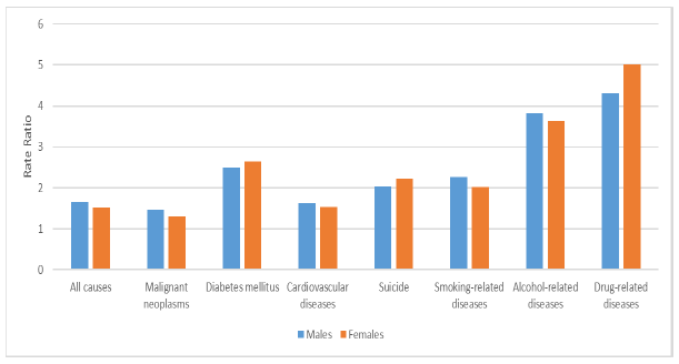
Source: (Tjepkema, M., 2013), Health Reports, Vol. 24, no. 7, pp. 14-22, July 2013 • Statistics Canada, Catalogue no. 82-003-X Cause specific mortality by income adequacy in Canada: A 16-year follow-up study • Research Article.
Chart 25 Description
Bar chart showing the health inequalities between the lowest and the highest income quintile by comparing the ratio of mortality rates between the lowest and highest income quintile for selected causes of death for both males and females.
For all causes, the mortality rates ratio between the lowest and highest income quintile is about 1.5 for both sexes.
Mortality rates of the lower quintile group due to diabetes, smoking or suicide are more than double the rates of the highest income quintile group. Alcohol or drug-related diseases are also disproportionately higher for the lowest income quintile group, with ratios close to 4 for alcohol-related diseases and above 4 for drug-related diseases.
Table 19 presents the difference in period life expectancy between the highest and lowest income quintile for selected countries. The shown measures do not align perfectly since they were derived from different data sources. Nevertheless, it is possible to draw the conclusion that in Canada, difference between longevity of the highest and lowest income quintile is low compared to international peers.
| Countries (measures change between countries) | Average Age at Death: Lowest Income Quintile | Average Age at Death: Highest Income Quintile | Difference |
|---|---|---|---|
| CanadaTable 19 Footnote * (2015-2017) | 79.2 | 83.7 | 4.5 |
| FranceTable 19 Footnote * (2012-2016) | 77.3 | 85.4 | 8.1 |
| SwedenTable 19 Footnote ** (2007) | 77.3 | 85.4 | 8.1 |
| UKTable 19 Footnote * (2017-2019) | 77.4 | 84.4 | 7.0 |
| USTable 19 Footnote *** (2010) | 77.2 | 90.4 | 13.2 |
|
Table 19 Footnotes
|
|||
An important consideration for population mortality projections is the trend in differences in mortality by income (i.e. how have the differences between quintiles evolved over time). Charts 26 and 27 show that, over the last 20 years in Canada, period life expectancy at birth increased for all income groups both for men and women. At the same time, it can be seen, that over the last 15 years, the increases in period life expectancy for males and females in the lowest income quintile have stalled.
Chart 26 - Period Life Expectancy at Birth by Income Quintile – Males, Canada
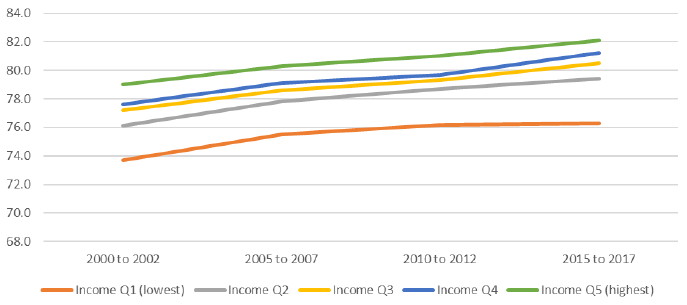
Source: Statistics Canada. https://www150.statcan.gc.ca/t1/tbl1/en/cv.action?pid=1310037001.
Chart 26 Description
Line chart showing period life expectancy at birth for males by income quintile for 5 income quintiles (income quintile 1 which is the lowest to income quintile 5 which is the highest). The Y axis shows the period life expectancy at birth and the X axis shows four subperiods: 2000 to 2002, 2005 to 2007, 2010 to 2012 and 2015 to 2017.
Period life expectancy at birth increased for all income groups both for men and women. Over the last 15 years, the increases in period life expectancy for males and females in the lowest income quintile have stalled.
For the lowest income group, income Q1, life expectancy is 73.7 years for subperiod 2000 to 2002, 75.5 for subperiod 2005 to 2007, 76.2 for subperiod 2010 to 2012 and 76.3 for subperiod 2015 to 2017.
For income Q2, life expectancy is 76.1 years for subperiod 2000 to 2002, 77.8 for subperiod 2005 to 2007, 78.7 for subperiod 2010 to 2012 and 79.4 for subperiod 2015 to 2017.
For income Q3, life expectancy is 77.2 years for subperiod 2000 to 2002, 78.6 for subperiod 2005 to 2007, 79.3 for subperiod 2010 to 2012 and 80.5 for subperiod 2015 to 2017.
For income Q4, life expectancy is 77.6 years for subperiod 2000 to 2002, 79.1 for subperiod 2005 to 2007, 79.7 for subperiod 2010 to 2012 and 81.2 for subperiod 2015 to 2017.
For the highest income group, income Q5, life expectancy is 79.0 years for subperiod 2000 to 2002, 80.3 for subperiod 2005 to 2007, 81.0 for subperiod 2010 to 2012 and 82.1 for subperiod 2015 to 2017.
Chart 27 - Period Life Expectancy at Birth by Income Quintile - Females, Canada
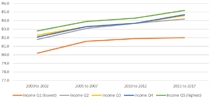
Source: Statistics Canada. https://www150.statcan.gc.ca/t1/tbl1/en/cv.action?pid=1310037001.
Chart 27 Description
Line chart showing period life expectancy at birth for females by income quintile for 5 income quintiles (income quintile 1 which is the lowest to income quintile 5 which is the highest). The Y axis shows the period life expectancy at birth and the X axis shows four subperiods: 2000 to 2002, 2005 to 2007, 2010 to 2012 and 2015 to 2017.
Period life expectancy at birth increased for all income groups both for men and women. Over the last 15 years, the increases in period life expectancy for males and females in the lowest income quintile have stalled.
For the lowest income group, income Q1, life expectancy is 80.2 years for subperiod 2000 to 2002, 81.6 for subperiod 2005 to 2007, 81.9 for subperiod 2010 to 2012 and 82.0 for subperiod 2015 to 2017.
For income Q2, life expectancy is 81.8 years for subperiod 2000 to 2002, 83.1 for subperiod 2005 to 2007, 83.7 for subperiod 2010 to 2012 and 84.2 for subperiod 2015 to 2017.
For income Q3, life expectancy is 82.3 years for subperiod 2000 to 2002, 83.3 for subperiod 2005 to 2007, 83.7 for subperiod 2010 to 2012 and 84.6 for subperiod 2015 to 2017.
For income Q4, life expectancy is 82.1 years for subperiod 2000 to 2002, 83.3 for subperiod 2005 to 2007, 83.7 for subperiod 2010 to 2012 and 84.7 for subperiod 2015 to 2017.
For the highest income group, income Q5, life expectancy is 82.8 years for subperiod 2000 to 2002, 83.9 for subperiod 2005 to 2007, 84.3 for subperiod 2010 to 2012 and 85.2 for subperiod 2015 to 2017.
It should be noted that depending on the measure used for the socio-economic level and the target population, conclusions on the extent and evolution of inequalities in mortality can vary. For example, as shown in the OCA study, Old Age Security Program Mortality Experience Study No. 17, while there is an increase in the differences between period life expectancies of OAS beneficiaries with and without Guaranteed Income Supplement (means-tested benefit)Footnote 14 at age 65, this trend is more moderate than as shown in Charts 26 and 27.
Crisis type events such as catastrophic events linked to climate change, economic recessions or pandemics may contribute to increases in inequalities or temporary imbalances if certain subsets of the population are more affected. However, government responses such as the Canada Emergency Response Benefit (CERB) may offset some impacts of catastrophic events. Remaining temporary imbalances might affect negatively short-term MIRs for affected groups.
Mortality improvement gains can be potentially made by reducing gaps in mortality by socio-economic level. However, it is a complex topic that is outside the scope of this study.
4.3 Health
One of the most straightforward drivers of longevity for a country is the general health of its population. The general health of a country’s population can be assessed using different metrics. In this section, we analyse obesity and overweight prevalence, tobacco usage, alcohol consumption and drug usage. All these factors are associated with more than one health condition.
Obesity and Overweight Prevalence
Based on information from the WHO (WHO, 2021b), worldwide obesity has nearly tripled since 1975. Obesity and overweight in populations are an important driver of reduced life expectancy. The OECD study “Heavy Burden of Obesity” (OECD, 2019a) projects that obesity and overweight related diseases will cost the Canadian population 3 years of life by 2050. This compares to an average loss of 2.7 years across 52 OECD countries.
In order to compare countries and regions, obesity and overweight are commonly assessed through the Body Mass Index (BMI). The OECD study associates a BMI index of 25 or higher to higher incidence risk of chronic diseases, cardiovascular diseases, diabetes and cancers. Based on OECD data, in 2018, 29.4% of the Canadian population aged 15 and over were categorized as obese and another 24.4% as overweight, bringing the proportion of the Canadian population aged 15 and over with increased health risks due to excess weight to 53.8%. This can be compared to 66.2% in the US, 63.3% in the UK, 49.9% in Sweden, 46.1% in France and 26.7% in Japan. These differences in obese and overweight proportions could explain some country-specific differences in mortality rates and can impact future mortality improvement rates. For example, the gap in the proportion of obese or overweight population between Canada and Japan is 27%. Does it mean that that there is potential for improvement for Canada in respect to this metric or will there always be differences driven by a respective country’s environment?
As shown in Table 20 below, the proportion of obese or overweight Canadians aged 15 and above climbed from 48.2% in 2005 to 53.8% in 2018. However, this trend has been apparent from the late 1980s (Twells et Al., 2014).
| 2005 | 2010 | 2015 | 2016 | 2017 | 2018 | |
|---|---|---|---|---|---|---|
| Proportion Obese or Overweight | 48.2% | 50.6% | 52.4% | 53.1% | 53.8% | 53.8% |
|
Table 20 Footnotes
|
||||||
In order to understand future impacts of obesity on seniors, it is useful to analyse the evolution of obesity rates in children. Historically, no comprehensive information for obesity prevalence by age group in Canada was collected. However, as per Public Health Agency of Canada’s publication Trends and projections of obesity among Canadians (Bancej, C., 2015), the proportion of obesity in Canadians aged 18 or lower more than doubled over 25 years from 6.3% in 1978/79 to 13.3% in 2004Footnote 15. More recent data, from the same source, for years 2007-2013 suggest that obesity prevalence rates have stabilized between 11.6% and 14.3%. While the US reality is different from Canada’s, it is interesting to look at Chart 28 (Fryar CD et Al., 2020) showing the evolution of the prevalence of obesity among children in the US. Similarly to Canada, an important increase in the number of obese kids has been noted since the 1970s with a more recent stabilization at around 20%.
Chart 28 - Trends in Obesity among Children and Adolescents Aged 2–19 Years, by Age: US, 1963–1965 through 2017–2018
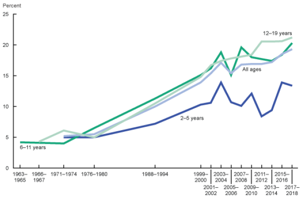
Source: Fryar CD, Carroll MD, Afful J. Prevalence of overweight, obesity, and severe obesity among children and adolescents aged 2–19 years: US, 1963–1965 through 2017–2018. NCHS Health E-Stats. 2020.
Chart 28 Description
Line chart showing the evolution of the prevalence of obesity among children in the US for different age groups. The Y axis shows the percentage obese and the X axis shows various sub-periods between 1963 and 2018.
For age group 2-5, the prevalence of obesity was 5% in 1971, 14% in 2003, 12% in 2009 and 13% in 2017.
For age group 6-11, the prevalence of obesity was 4% in 1963, 19% in 2003, 18% in 2009 and 20% in 2017.
For age group 12-19, the prevalence of obesity was 5% in 1966, 17% in 2003, 18% in 2009 and 21% in 2017.
In Canada, an important share of the gains realized in mortality over the last 50 years was related to cardiovascular diseases and diseases of the heart. According to the Canadian Public Health Association and their article Decline in deaths from coronary heart disease and stroke, Canada increased prevention, improved diagnosis, treated high blood pressure, controlled levels of lipids and better managed individuals with cardio vascular diseases. However, these past mortality improvements may be subject to downward pressures as a result of the increase in obesity and overweight prevalence rates, especially as cohorts of more obese and overweight individuals age.
At the same time, Canada has been targeting overweight and obesity through policies related to the food industry. For example, in October 2016, Health Canada launched a Healthy Eating Strategy (2016) that covered a variety of components such as the revision of Canada’s Food Guide and restrictions on unhealthy food marketing for children. This trend will need to be monitored since according to a new study from Dalhousie University (Agri-Food Analytics Lab, 2021), from the start of the COVID-19 pandemic, 42.3% of Canadians indicated that they have gained weight.
In summary, successful policies in respect of reducing obesity and overweight could have positive effects on future longevity. However, given current trends, obesity and overweight have a potential to have a negative effect on future longevity, especially with the aging of more obese and overweight cohorts.
Tobacco Usage and Alcohol Consumption
Tobacco usage and alcohol consumption are linked to many diseases responsible for worsening longevity such as diseases of the heart, cancer and liver diseases. Changes in behaviours in tobacco usage and alcohol consumption can, therefore, have an impact on longevity. This subsection provides information and statistics for Canada and selected countries.
In terms of alcohol consumption in Canada, an important decrease happened between the 1980s to about 1996. According to OECD data on Alcohol Consumption (OECD, 2021b), annual alcohol consumption in Canada decreased from 10.8 litres of alcohol per person in 1981 to 7.2 in 1996. The consumption eventually increased to around 8.2 litres and has been fairly stable for the last ten years. Given the relative stability in alcohol consumption over the years and current absence of newer policy actions aimed at the reduction of consumption, material impacts on longevity due to changes in behaviours are not anticipated. However, this trend needs to be monitored since a recent report of the Canadian Institute of Health Research, Alcohol Consumption and the COVID-19 Pandemic: Synthesizing Knowledge for Policy Action (Shield K. et Al. 2020) indicated that 23% of respondents to a survey reported increasing their consumption of alcohol since the start of the COVID-19 pandemic compared to 12% who reported drinking less. As shown in Table 21, Canada’ alcohol consumption is comparable to other countries. According to OECD Data on Alcohol Consumption (OECD, 2021b), the OECD country with the lowest alcohol consumption is Turkey (1.4 litres per capita per year) which is probably related to cultural characteristics of this country.
| Canada | France | Japan | Sweden | UK | US | |
|---|---|---|---|---|---|---|
| Alcohol Consumption (Liters per Adult per Year) | 8.2 (2018) |
11.6 (2018) |
7.2 (2018) |
7.2 (2018) |
9.8 (2018) |
8.9 (2017) |
| Source: OECD data (OECD, 2021b): https://data.oecd.org/healthrisk/alcohol-consumption.htm. | ||||||
In terms of tobacco usage in Canada, the current level stands at 11% of the population, which is closest to levels observed in the US and in Sweden. This contrasts with the levels seen in France, Japan and the UK. According to the OECD Data on Daily Smokers (OECD, 2021c), the country with the lowest tobacco usage is Mexico (7.6% in 2017).
| Canada | France | Japan | Sweden | UK | US | |
|---|---|---|---|---|---|---|
| Tobacco Usage | 11.3 | 25.4 | 17.8 | 10.1 | 16.6 | 10.3 |
| Source: OECD data (OECD, 2021c), https://data.oecd.org/healthrisk/daily-smokers.htm#indicator-chart. | ||||||
Looking at historical trends in Canada (Chart 29), tobacco usage has been declining continuously over time. The reduction in tobacco usage in Canada has contributed to lowering mortality due to a variety of diseases linked to smoking (such as diseases of the heart and lung cancer). The Canadian public policy on tobacco was effective and will continue to impact future generations. Health Canada’s Tobacco Strategy (Canada Tobacco Strategy, 2021) based on government policy aims at reducing tobacco use to less than 5% by year 2035.
Chart 29 – Historical Trend – Tobacco Usage by Sex, Canada (% of Population, Age 15+)
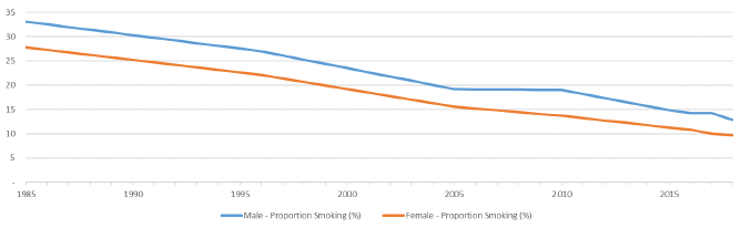
Source: Health risks - daily smokers - OECD Data (OECD, 2021c).
Chart 29 Description
Line chart showing the historical proportion of Canadians age 15 and above consuming tobacco for both sexes. The Y axis shows the proportion smoking and the X axis shows the years from 1985 to 2018.
Tobacco usage has been declining continuously over time.
33.1% of males were smoking in 1985. This proportion decreases to 12.8% in 2018.
27.8% of females were smoking in 1985. This proportion decreases to 9.7% in 2018.
Table 23 shows that, recently, the decrease in the proportion of Canadians using tobacco products is consistent across all age groups. A more pronounced decrease is noted between 2018 and 2019 for individuals aged 12 to 49. This decrease somewhat coincides with the introduction and popularity of the e-cigarettes. It remains to be seen if this is the effect of substitution of smoking by vaping.
| Both Sexes (Percent) | |||||
|---|---|---|---|---|---|
| 2015 | 2016 | 2017 | 2018 | 2019 | |
| Total, 12 years and over | 17.7 | 16.9 | 16.2 | 15.8 | 14.8 |
| 12 to 17 years | 4.1 | 3.6 | 3.5 | 3.2 | 2.5 |
| 18 to 34 years | 22.1 | 21.1 | 19.2 | 19.2 | 17.2 |
| 35 to 49 years | 19.5 | 18.9 | 18.6 | 18.2 | 16.9 |
| 50 to 64 years | 21.0 | 20.1 | 19.5 | 18.4 | 18.4 |
| 65 years and over | 9.8 | 9.5 | 9.8 | 9.7 | 9.1 |
| Source: Statistics Canada data - Health characteristics, annual estimates (www.statcan.gc.ca). | |||||
Considering the important decrease in smoking prevalence and the fact that all ages continue to reduce their smoking, it may be expected that limited additional mortality improvements would occur in the future.
In general, two new trends have the potential to replace smoking in Canada: e-cigarettes and the consumption of cannabis.
- According to the report from the University of Waterloo on Tobacco use in Canada (Reid JL et Al., 2019), e-cigarettes gained some popularity with the younger age groups. It should be noted that e-cigarettes do not eliminate the nicotine addiction. In 2017, 15.4% of Canadians aged 15 and older (4.6 million Canadians) reported having tried an e-cigarette; however very few reported using them daily (about 1%). Although e-cigarettes are presumably healthier than cigarettes, they are not without health harm, and their long-term effects on health are still unknown.
- The consumption of cannabis is also gaining ground since it was legalised in Canada in October 2018. According to Statistics Canada’s Health Report “What has changed since cannabis was legalized?“ (Rotermann, M., 2020), cannabis use increased between 2018 and 2019, in particular among individuals aged 25 and older (13.1% to 15.5%) and among males (17.5% to 20.3%). Once again, the long-term effect of the consumption of cannabis is uncertain.
It will be important to monitor behavior trends and potential health impacts related to e-cigarettes and cannabis consumption over the next several years.
Drug Use
Over the last decade, Canada has been faced with an important increase in accidental drug poisoning deaths. Canada is not alone; international peers are facing the same challenge. According to the OECD (OECD, 2019b), opioid-related deaths have increased by about 20% since 2011, with large increases in the US, Sweden, Canada, England and Wales, and Lithuania. On average, across 25 OECD countries for which data are available, there were 26 opioid-related deaths per million inhabitants in 2016. However, death rates were over five times higher in the US (131 opioid-related deaths), followed closely by Canada (120). In the US, almost 400 000 people died from an opioid overdose between 1999 and 2017, with the opioid crisis contributing to the first decline in American period life expectancy at birth over half a century.
Opioids overdose is a relatively new cause of death, and it is a subset of accidental drug poisoning deaths. It is more prevalent in the 25 to 49 age group and among men. According to Statistics Canada data on “Changes in Life Expectancy by selected Causes of Death”, 2017, opioid-related deaths led to a loss of period life expectancy at birth in Canada in 2017 of 0.11 years for males and 0.02 years for females. As shown in Table 24, the number of deaths due to opioids has increased significantly between 2016 and 2020 (from 2.8 thousand to 6.2 thousand), with a significant increase in 2020. According to Special Advisory Committee on the Epidemic of Opioid Overdoses (Opioid- and Stimulant-related Harms in Canada, June 2021) this is believed to be a collateral impact of the pandemic.
| Year | Number of Deaths |
|---|---|
| 2016 | 2,825 |
| 2017 | 3,916 |
| 2018 | 4,389 |
| 2019 | 3,830 |
| 2020 | 6,214 |
| Source: https://health-infobase.canada.ca/src/doc/SRHD/UpdateDeathsJune2021.pdf. | |
Although this is an important trend that needs to be monitored closely in the future, the impact on retirement social security programs is not expected to be material given that it affects mostly younger age groups with quite low mortality rates.
Climate change
Experts agree that climate change will have impacts on human health and longevity. According to the WHO (Climate Change and Health, Fact Sheet, February 2018), between 2030 and 2050, climate change is expected to cause approximately 250,000 additional deaths per year from malnutrition, malaria, diarrhoea and heat stress, with developing countries being the hardest hit. In Canada, Health Canada has conducted some research on the potential impact of climate change on health and has published ad hoc reports over the years, with the most recent one dating back to 2008. Health Canada is also currently leading the development of a report entitled, Health of Canadians in a Changing Climate: Advancing our Knowledge for Action, which is expected to be available later in 2021.
Climate change could have an impact on human health in different ways. Some examples are potential impacts on human welfare, migration of diseases, increased frequency and severity of catastrophic events, and of cold or heat waves. Canada is a vast country and the different regions can be affected differently. Costal regions may be affected by natural disasters such as storms, while continental regions may be affected by hotter or colder extreme temperatures. The extreme scenarios might happen more often as the climate evolves. These extreme events may also affect some types of agriculture.
Air quality coming from human activity or from climate extremes such as wild fires might have health implications (increase in disease related to air quality); however, these implications are not well understood and difficult to quantify. The increased mortality risk in Canada coming from degradation of air quality due to human activity would be more likely concentrated in metropoles where air quality could fluctuate and areas closer to larger polluting industries.
Around the globe, the risk of excess mortality in areas where sea levels rise or where dry seasons could extend over longer periods might threaten some populations. However, most likely, there would be a limited mortality risk in Canada related to rising sea levels since less than one percent of the population would need to be relocated, and the rise of the sea level would happen over many years.
In general, it is expected that the climate change will have a negative impact on mortality in many countries. Different subsets of the population will also be affected differently (e.g. wealthier individuals will most likely be less affected, older and younger could be more affected). However, it is not clear to which extent climate change will have a material impact on the mortality of the Canadian population over the next few decades. At this point, it is even more difficult to quantify the long-term impact on mortality that is associated with the long-term nature of climate change; more data and research will be needed. Catastrophic climate events on the other hand, such as the heat wave of 2018 in Quebec and 2021 in British Columbia, could be monitored more easily. The overall impact of climate change will also depend on Canada’s policy to transition towards a carbon neutral economy and the ability to adapt to greener technologies.
Medical advancements
The funding of biomedical research over the last decades has increased significantly in many countries. For example, Chart 30 shows that since the turn of the 21st century, the US has considerably increased its funding in the biomedical field of research.
Chart 30 – Trends in Federal Research by Discipline, FY 1970-2017, in Billions of Constant Fiscal Year 2019 US DollarsChart 30 Footnote *
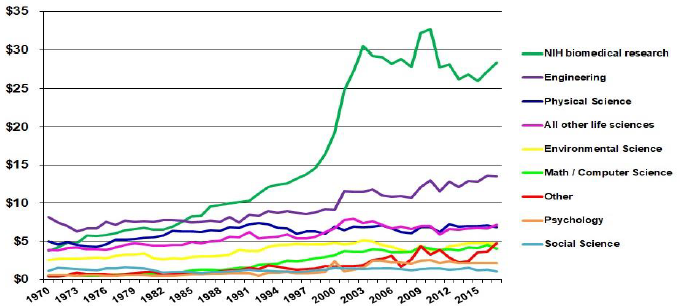
Chart 30 Footnote
- Chart 30 Footnote *
-
“Other” includes research not classified (includes basic research and applied research, excludes development and R&D facilities). Life sciences are split into National Institute of Health (NIH) support for biomedical research and all other agencies’ support for life sciences.
Source: NSF Federal Funds for Research and Development series, Constant-dollar conversions based on OMB’s GDP deflators Ⓒ 2019 AAAS.
Chart 30 Description
Line chart showing evolution in federal research by discipline. The Y axis shows the amount in billions of constant US dollars and the X axis shows the years from 1970 to 2017.
Federal funding in biomedical research increased from close to 5 billion dollars in 1970 to around 15 billion dollars in 2000 and close to 30 billion dollars in 2017.
Federal funding of other fields such as engineering, physical science, environmental science, math, computer science, psychology and social science has grown but not as much as for the biomedical field. The field with the second highest growth is physical science, which grew from about 8 billion in 1970 to about 13 billion in 2017.
Chart 31 shows that similar trends are observed in Canada where funding for biomedical research has increased significantly since 2000, and corresponds currently to about half the funding provided by the Canadian Institutes of Health Research (CIHR).
Chart 31 - CIHR Fiscal Year Investments by Primary Theme since 2000–01, in Millions of DollarsChart 31 Footnote *
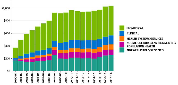
Chart 31 Footnote
- Chart 31 Footnote *
-
Due to rounding, figures may not reconcile with other published information.
Excludes operating expenditures and partner contributions.
Primary theme designation is determined by the grantee at the time of application.
Source: Canadian Institute of Health Research (CIHR), 2018, https://cihr-irsc.gc.ca/e/50218.html.
Chart 31 Description
Bar chart showing the Canadian Institutes of Health Research fiscal year Investments by primary theme from 2000 to 2018 in millions of dollars.
Funding for biomedical research has increased from close to 200 million dollars in 2000-01 to over 400 million dollars in 2017-18.
A number of major medical innovations over the last decade could contribute to reducing mortality in the future, such as:
- 3D printing of body parts (ear, bones, cornea, skin tissues)
- Cure for Hepatitis C
- Opioid dependence treatment
- HIV vaccine development
- Stem cell research to treat a multitude of diseases
- CRISPRFootnote 16 gene editing
- Targeted cancer therapies
- Robot assisted surgeryFootnote 17.
The timing of new medical advancements that could potentially reduce mortality is highly uncertain. At the same time, new treatment protocols, drugs, and surgical improvements are made every year, and it can be foreseen that medical advancements will continue. The question on the extent to which these new treatments will contribute to the reduction in mortality will also depend on accessibility to the general population. For example, statin drugs were widely available to the population and contributed to lowering heart diseases significantly over the last 30 years.
Further, even if these medical advancements will have an impact to lessen mortality rates for certain causes of death, there is a question on whether, at older ages, these causes of death will be substituted by others and to what extent. Often at older ages, the reduction in mortality from some diseases results in deaths from some other causes. For example, reducing deaths from heart diseases at advanced ages may lead to increases in deaths from cancer or Alzheimer. Illustrative scenarios of the impact on life expectancy resulting from the removal of certain causes of death are presented in Section 6.
There is also a multitude of research aimed at exploring the possibility to push human body cells’ survival beyond what is currently possible by lessening the natural decay of the cells. This trend needs to be monitored given that successful implementation of such type of research could lead to significant mortality improvements at older ages.
Antibiotic Resistance
According to the WHO (WHO, 2020) antibiotic resistance is one of the biggest threats to global health, food security, and development today. Antibiotic resistance can lead to longer hospital stays, higher medical costs and increased mortality. The issue relates to misusage or overuse of antibiotics as well as poor infection prevention and control. Health Canada (Antibiotic (antimicrobial) resistance, 2018) monitors antibiotic use and antibiotic resistance to prevent a scenario where antibiotics would become ineffective. Medical advancements and public health policies will hopefully attenuate the risk of antibiotic resistance. However, the potential severity of an antibiotic resistance event could have a downward impact on mortality improvements.
4.4 Qualitative indicators for Canada
Table 25 provides a high-level summary of the drivers discussed in this section along with their potential directional impact on the future longevity of the Canadian population.
| Potential to Increase Longevity | Potential to Reduce Longevity | |
|---|---|---|
| Population Characteristics | ||
| Age / Gender | Aging of the Canadian population could add pressure on health systems. | |
| Proportion Married | Although this indicator can be difficult to interpret on its own, an increase in one-person households at older ages may put some downward pressure on longevity. | |
| Place of birth | Some improvements may be expected in the case of increased immigration inflows. | |
| Socio-Economic Factors | ||
| Level of education | No expected impact. | No expected impact. |
| Income | Potential to increase longevity if income gap decreases. | Potential to decrease longevity if income gap widens. |
| Health | ||
| Obesity and Overweight | Improvements in longevity could be possible in the future if successful policies to reduce the number of obese and overweight people are implemented. | The aging of more obese and overweight cohorts could impact longevity negatively. More negative impact may occur if the number of obese and overweight people increases further. |
| Tobacco Usage, Alcohol Consumption and Drug Usage | Further reduction usage and consumption could help prevent a long list of diseases. Tobacco usage is following a downward trend. | The COVID-19 pandemic might have increased usage and consumption of alcohol and drugs and possibly erased recent gains. |
| Climate Change | Could have a long-term negative impact. | |
| Medical advancements | Possible gains in the next decades from medical advancements. | |
| Antibiotic Resistance | The potential severity of an antibiotic resistance event could have a downward impact on mortality improvements. | |
Projecting future mortality rates is a very difficult task since the timing and the magnitude of the impact of the potential drivers and trends can play an important role, and these factors are extremely uncertain. This highlights the importance of performing sensitivity testing with various scenarios to understand the potential impact of the emerging longevity trends on social security programs.
5. Pandemics
The COVID-19 pandemic caught everyone by surprise; the world was not prepared for a pandemic of this amplitude, and Canada was no different. However, it was not because Canada never faced a pandemic. As shown in Table 26, there were at least eight pandemicsFootnote 18,Footnote 19 in the last 100 yearsFootnote 20 in Canada (Bailey, P. 2008), and COVID-19 is the third pandemic since 2000. The estimated death rates shown in Table 26, which by themselves are not an indicator of the deadliness of a pandemic, vary significantly from one pandemic to the other.
| Pandemic Referenced Name | # Infected in Canada | Death Toll | Total Death Rate (Deaths/Population) |
|||||||
|---|---|---|---|---|---|---|---|---|---|---|
| COVID-19 2019 | 1,415,284Table 26 Footnote * | 26,294Table 26 Footnote * | 0.07% | |||||||
| H1N1 Flu Pandemic 2009 | 8,000 | 428 | 0.001% | |||||||
| SARS Pandemic 2002-2003 | 438 | 44 | 0.0001% | |||||||
| HIV pandemic 1981-present | 89,110Table 26 Footnote ** | 26,000Table 26 Footnote *** | N/A | |||||||
| Influenza Pandemic 1968 | N/A | 4,000 | 0.02% | |||||||
| Influenza Pandemic 1957-58 | N/A | 7,000 | 0.04% | |||||||
| Polio pandemic 1953-1955 | 9,000 | 500 | 0.003% | |||||||
| Spanish flu 1918-1919 | 1,460,000 | 50,000 | 0.6% | |||||||
|
Table 26 Footnotes
|
||||||||||
In analysing past mortality improvement trends, the previous mortality studies used to develop mortality assumptions for Canadian social security programs implicitly included the above-mentioned pandemics. Given that the methodology to develop mortality assumptions gives some weight to past trends, the ultimate mortality improvement rates assumptions would also include these macro mortality events to some extent.
The pandemics referred to in Table 26 are described below, in chronological order. This helps to understand the commonality of these events and the particular aspects that make some of them unique.
Spanish Flu of 1918
The Spanish flu (influenza strain) first cases started at the end of World War I. The first outbreaks of the disease occurred in the spring of 1918. The virus travelled back and forth between Europe and North America on the ships carrying troops fighting in the First World War. These troops then introduced the disease in Asia and Africa. The Spanish flu eventually killed approximately 50 million people worldwide (estimates range from 20 to 100 million). In Canada, about 1.5 million people were infected and 50,000 people died (Goldenberg, S., 2018)Footnote 21. Chart 32 (Taubenberger, J. K., 2006) shows the distribution of the number of deaths in the UK through the pandemic period (data for Canada is not available). It can be seen that this pandemic had three well defined waves. One of the particularities of the Spanish Flu was the rapid infection of individuals aged 20 to 45 years old. This contrasts with other pandemics where the elderly or the infants were more prone to contracting the virus (or those with reduced immunity).
Since at that time no vaccines existed, the main emphasis was put on sanitary measures to contain the spread of the virus. Throughout Canada, different sanitary measures were adopted, including limiting gatherings, mandatory face masks in public, and fines for public coughing, sneezing or spitting. A high correlation was noted between outcomes and quality and timing of the public health response in each city. In the aftermath of the 1918 pandemic, Canada’s Department of Health was created in 1919.
Chart 32 - Number of Deaths in the UK from Spanish Flu Pandemic 1918-1919
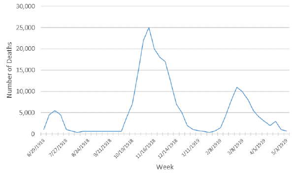
Source: (Taubenberger, J. K., 2006) CDC Emerging Infectious Diseases - Vol. 12, No. 1, January 2006.
Chart 32 Description
Line chart showing the number of deaths in the UK during the Spanish Flu pandemic period. The Y axis shows the number of deaths and the X axis shows weeks between June 29, 1918 and May 3, 1919.
The graph shows three well defined waves with three peaks.
During the peak of the first wave, in July 1918, there were approximately 5,000 deaths. The peak of the second wave was reached in November 1918 with approximately 25,000 deaths. The third wave peaked at around 10,000 deaths in March 1919.
Polio 1953-1955
Polio is a virus that attacks the central nervous system and that can leave infected patients (often young ones) partially or fully paralyzed. Although it is believed to have started in the 1920s, the polio pandemic culminated in 1953 with over 9,000 cases and 500 deaths in Canada (Cuthbertson, R., 2020). While the polio was a very different pandemic from COVID-19 (with different nature of virus and different age groups affected), many parallels can be drawn. During the polio outbreak, social distancing was encouraged and schools, playgrounds and movie theatres were closed. Public health authorities provided daily briefings on new cases, and families of infected people were quarantined. Government health officials tried to recruit medical personnel out of retirement to help manage the pandemic and the large numbers of patients. There was also a race to produce an efficient vaccine and to get hold of special medical equipment (iron barrel – known as the “iron lung”) to help the survival of patients. The polio pandemic was finally controlled with the arrival of a polio vaccine in 1955.
Influenza Pandemic of 1957-1958
The virus H2N2 is an influenza strain that spread quickly around the globe with first cases reported in 1956. This was the second of three influenza pandemics of the 20th century (Spanish flu 1918 and 1968 Influenza) (Rodgers, K., 2020). The first wave affected mainly children returning to school, while the second wave affected mostly elderly persons and was more deadly. It also marked the first time that international efforts supported the development of a vaccine to counter a worldwide pandemic. The rapid response and availability of antibiotics to treat secondary complications limited the spread and mortality of the H2N2 virus. This virus is believed to have killed over 7,000 Canadians over the course of 1957-1958 (Dickin J., 2017).
Influenza pandemic of 1968
The influenza pandemic of 1968 was caused by a H3N2 strain that was believed to have mutated from the 1957 influenza pandemic (Britannica, 2020). The pandemic happened in two waves, with the second wave resulting in a greater number of deaths than the first one. The groups most at risk were infants and elderly persons. As many as 4,000 Canadians died during this pandemic (Dickin J., 2017). The virus is still in circulation today and is a part of the main stream of seasonal influenza.
HIV pandemic 1981-presentFootnote 22,Footnote 23
Although different from other types of viruses because of how it is transmitted, HIV has been considered one of the worse pandemics worldwide, infecting more than 75 million people and killing over 32 million (Bailey, P., 2008). As of today, there is still no definite cure for the virus. Since Canada reported its first case in 1982, close to 90,000 Canadians have been infected and more than 26,000 have died (Rodier, D., 2017).
As shown in Chart 33, over the last twenty years, the number of people dying from the disease reduced significantly due to important medical progress that were made in treating HIV patients.
Chart 33 - Number of Deaths in Canada – HIV
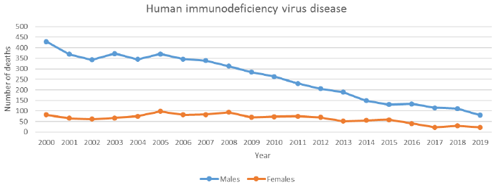
Source: Statistics Canada.
Chart 33 Description
Line chart showing the number of people in Canada dying from HIV from 2000 to 2019. The Y axis shows the number of deaths and the X axis shows the years between 2000 and 2019.
Over the last twenty years, the number of people dying from the disease reduced significantly.
For males, the number of deaths from HIV in 2000 was 429. It decreased to 80 in 2019.
For females, the number of deaths from HIV in 2000 was 82. It decreased to 23 in 2019.
SARS Pandemic 2002-2003
This pandemic was characterized by an outbreak of severe acute respiratory syndrome (SARS) which was identified as the first coronavirus. The virus was aggressive in the sense that it was able to overcome the human body’s defense mechanism. The virus rapidly spread around the globe through international travel, but was contained in Canada with quarantine measures. The outbreak was limited to a few Canadian cities, and infected individuals were mostly interconnected through hospital settings where patients were treated. In total, 438 people were infected and 44 died in Canada (Bailey, P., 2008).
H1N1 Flu Pandemic 2009
The WHO declared a pandemic for the H1N1 Flu in June 2009. Most Canadians contracted the H1N1 flu during the summer of 2009, in contrast with the normal flu season that usually occurs during the colder months. By October of the same year, Health Canada approved a vaccine for H1N1 and a vast campaign resulted in the vaccination of between 13.5 and 15 million Canadians (Baker, N., 2020). A second wave of the virus followed during the winter months, but the vaccination campaign may have prevented the third wave of H1N1 in Canada. Over 8,000 people were infected in Canada and 428 died from the virus. Canada spent more than 2 billion dollars to protect its citizens and contain this pandemic. A great part of the preparedness to this pandemic was attributed to the lessons learned from the SARS pandemic.
COVID-19 Pandemic
This second known strain of coronavirus, believed to have originated in China in 2019, has spread rapidly around the globe. The WHO declared the COVID-19 outbreak a global pandemic on March 11, 2020, and as of the date of writing this study, the pandemic is still ongoing.
The international efforts to contain the virus so far have been colossal. The Canadian and many other governments imposed drastic measures of social distancing going as far as closing international borders. Yet more, governments implemented never seen before monetary responses to prevent the economic collapse of their countries, and massive investments were made in medical materials and in research to find a vaccine rapidly. Every continent was affected, and global efforts were made to participate in finding a cure or an effective vaccine against the virus. In Canada, the elderly, marginalized communities, First Nations, and people with medical history were the most affected during the first two waves.
As can be seen in Chart 34, the Canadian experience so far can be split between three waves. During the first wave of the virus in the spring of 2020, Québec was the province that was the most affected with 6,240Footnote 24 deaths, while Canada’s total deaths stood at 8,795Footnote 24 (O’Brien, K., et Al., 2020). Ontario was the second hardest hit province during the first wave.
By the end of the first wave in mid-summer 2020, reliability and capacity surrounding testing improved significantly. As the number of positive cases started to climb during the second wave, in the fall of 2020, new records for the number of cases were broken in every province. Alberta, Ontario and Québec were hit hard, each reaching more than a thousand new cases each day at the culminating point in January 2021. The number of deaths also started to climb again during the second wave. Unlike the first wave, where the virus was mostly spreading in long-term care homes and older age groups, the virus started spreading through younger age groups at public and private gatherings, as well as in the schools.
A race to vaccinate the population started early in January 2021 in hopes to lessen the possible following waves. A third wave started early March 2021 fueled by new variants, and culminated around mid-April 2021. Although less deadly than the first two waves, the third wave spread among the younger generation not yet vaccinated. As per Public Health Agency of Canada Statement (PHAC, 2021b), as of August 5, 2021, more than 81% of the eligible population (ages 12+) received at least one dose and more than 69% received two doses of vaccine. As the situation continues to evolve, there is still a lot of uncertainty surrounding the development of this pandemic as the contagiousness and death rates associated with the variants are still uncertain.
Chart 34 - Number of COVID-19 Deaths and Number of Active Cases (as of June 30, 2021)
Source: Public Health Agency of Canada (PHAC, 2021a). https://www.canada.ca/en/public-health/services/diseases/2019-novel-coronavirus-infection.html.
Chart 34 Description
Line chart showing the number of deaths and number of active cases due to COVID-19 from March 2020 to June 2021. The Y axis shows the number of deaths (left axis) and the number of active cases (right axis). The X axis shows the months between March 2020 and June 2021.
The graph shows three well defined waves with three peaks.
During the first wave, the number of deaths peaked at 1,184 in the week of May 2020, and the number of active cases peaked at 243,254 in the week of June 2020.
During the second wave, the number of deaths peaked at 1,137 in January 2021, and the number of active cases peaked at 574,429 in January 2021.
During the third wave, the number of deaths peaked at 350 in April 2021, and the number of active cases peaked at 606,984 in April 2021.
As of June 30, 2021, the number of deaths attributable to COVID-19 amounted to 26,294. It can be expected that COVID-19 will be the third leading cause of death in 2020 (after cancer and heart diseases) once the number of deaths by cause are compiled and published by Statistics Canada. As shown by Chart 35, the number of deaths varied by age group, with individuals above age 60 being more affected. Throughout Canada, the number of deaths were also spread unevenly. Chart 36 shows the number of deaths by province for each province with more than 100 deaths. It can be seen that Québec, a less populous province than Ontario, stands out for the most deaths.
Chart 35 – Number of COVID-19 Deaths in Canada by Age Group as of August 9, 2021
Source: Government of Canada (GoC, 2021) - Health-InfoBase COVID-19 daily epidemiology update as of August 9, 2021.
Chart 35 Description
Bar chart showing the number of COVID-19 deaths in Canada by age group as of August 9, 2021. The number of deaths varied by age group, with individuals above age 60 being more affected.
There were 17,047 deaths for age group 80+, 5,397 for age group 70-79, 2,573 for age group 60-69, 1,001 for age group 50-59, 344 for age group 40-49, 148 for age group 30-39, 66 for age group 20-29 and 15 for age group 0-19.
Chart 36 – Number of COVID-19 Deaths by Province as of June 30, 2021Chart 36 Footnote *
Chart 36 Footnote
- Chart 36 Footnote *
-
Provinces with at least 100 deaths.
Source: Government of Canada (GoC, 2021a) - Health-InfoBase COVID-19 daily epidemiology update.
Chart 36 Description
Bar chart showing the number of COVID-19 deaths by province as of August 9th 2021.
There were 11,210 deaths in Quebec, 9,168 in Ontario, 1,140 in Manitoba, 568 in Saskatchewan, 2,301 in Alberta and 1,754 in British Columbia.
Early documentation of the COVID-19 pandemic (Décarie, Y. and Michaud, P.-C., 2020) indicated that poorer neighborhoods might be hit harder by the virus. The Canadian Vital Statistics Database (CVSD, 2020) has linked the postal code information with each death. Information on household income quintile of the neighborhood was used to look at excess mortalityFootnote 25,Footnote 26. Table 27 shows the cumulative number of excess deaths by income quintiles for Québec and British Columbia during the first wave of the pandemicFootnote 27.
| Income Quintile | Québec | British Columbia |
|---|---|---|
| Q1(lowest) | 1,115 | 223 |
| Q2 | 890 | 160 |
| Q3 | 887 | 193 |
| Q4 | 654 | 114 |
| Q5 (highest) | 573 | 105 |
| Total | 4,209 | 795 |
|
Table 26 Footnotes
|
||
It can be seen that excess mortality is higher in lower income neighborhoods. In both provinces, more than 25% of the excess deaths are associated with the first (lowest) income quintile compared to less than 15% for the higher quintile. This difference can be, in part, explained by working and living conditions that leave people more exposed to the virus. It may also reflects a more general health disparity observed not only during the pandemic (Woolf and Braveman, 2011; Frohlich et al., 2006).
Public Health Ontario published similar findings as of May 18, 2021, where they measured the incidence of COVID-19 based on a neighborhood’s level of material deprivation. The neighborhoods were assessed in respect of the ability of individuals and communities to access and attain basic material needs. The characteristics considered included income, quality of housing, educational attainment and family structure. The rate of confirmed cases was significantly higher among neighborhoods with a high level of material deprivation (higher quintiles) (Chart 37). The rate of confirmed cases in the fifth quintile (high deprivation) was about 60% higher than in the first quintile (low deprivation) during the second wave, and about 40% higher during the third wave. Even more notable dispersions are observed by comparing the number of cases between the neighborhoods with different levels of diversity, as measured through an ethnic concentration index (Chart 38). The neighbourhoods with more ethnic diversity experienced a rate that is about 4 times higher than the least diversified neighbourhoods.
Chart 37 - Rate of Confirmed Cases of COVID-19 per 100,000 Population by Quintile of Neighbourhood Material Deprivation and Public Health Unit Reported Week: OntarioChart 37 Footnote *
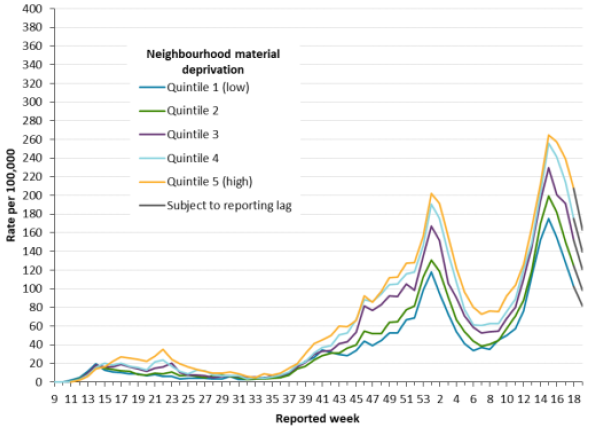
Chart 37 Footnote
- Chart 37 Footnote *
-
Neighbourhood material deprivation is measured using the material deprivation dimension of the Ontario Marginalization Index. The material deprivation dimension uses Canadian census data on income, quality of housing, educational attainment and family structure characteristics to assess the ability of individuals and communities to access and attain basic material needs. Only weeks with more than 10 cases by public health unit reporting date are included (starting in week 9). Include cases with reported dates ranging from weeks 9 (February 23 10 29, 2020) to week 19 (May 9 to 15, 2021).
Source: CCM, Ontario Marginalization Index, COVID-19 in Ontario: Focus on May 9, 2021 to May 15, 2021 (publichealthontario.ca).
Chart 37 Description
Line chart showing the rate of confirmed cases of COVID-19 per 100,000 population (Y axis) by quintile of neighbourhood material deprivation and public health unit reported week (X axis) in Ontario.
The rate of confirmed cases was significantly higher among neighborhoods with a high level of material deprivation (higher quintiles).
The rate of confirmed cases in the fifth quintile (high deprivation) was about 60% higher than in the first quintile (low deprivation) during the second wave, and about 40% higher during the third wave.
Chart 38 - Rate of Confirmed Cases of COVID-19 per 100,000 Population by Quintile of Neighbourhood Diversity and Public Health Unit Reported Week: OntarioChart 37 Footnote *
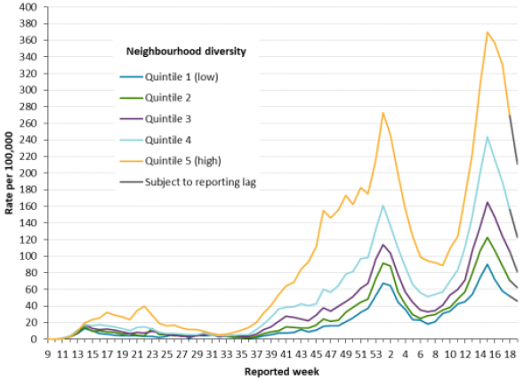
Chart 38 Footnote
- Chart 38 Footnote *
-
Neighbourhood diversity is measured using the ethnic concentration dimension of the Ontario Marginalization Index. The ethnic concentration dimension is based on the proportion of non-white and non-Indigenous residents and/or the proportion of immigrants that arrived in Canada within the past five years. Only weeks with more than 10 cases by public health unit reporting date are included (starting in week 9). Include cases with reported dates ranging from weeks 9 (February 23 to 29, 2020) to week 19 (May 9 to 15, 2021).
Source: CCM, Ontario Marginalization Index, COVID-19 in Ontario: Focus on May 9, 2021 to May 15, 2021 (publichealthontario.ca).
Chart 38 Description
Line chart showing the rate of confirmed cases of COVID-19 per 100,000 population (Y axis) by quintile of neighbourhood diversity and public health unit reported week (X axis) in Ontario.
The neighbourhoods with more ethnic diversity experienced a rate that is about 4 times higher than the least diversified neighborhoods.
The full impact of this pandemic on the Canadian mortality is not easy to measure. The next subsections will discuss potential short-term and longer-term impacts of the COVID-19 pandemic.
COVID-19 - Short-Term Impacts
Although the official data to measure the impact on 2020 mortality rates are not yet available, these rates are expected to be higher than in the recent past. This will translate into a decrease in period life expectancy for 2020, especially at older ages. For 2021, there is still a lot of uncertainty given that the pandemic is still ongoing and the emergence of new variants. However, mortality rates for 2021 are still expected to be higher than pre-pandemic levelsFootnote 28.
Despite the incomplete data and uncertainty, there is some information available that can help assess potential short-term impacts of COVID-19 on mortality.
One measure that is available and provides some degree of reliability in assessing the potential impact on short-term period life expectancy is the concept of excess mortality. The excess mortality corresponds to the difference between the number of deaths from all causes during a crisis and the number of deaths that is expected under regular circumstances.
Statistics Canada has been publishing weekly provisional data on the 2020 adjusted number of deaths in Canada and excess mortality. Chart 39 shows the expected and actual number of deaths by week in 2020 based on Statistics Canada’s data and methodology. The orange line shows the expected number of deaths and the blue line shows the actual number of deaths. The two dotted lines show the lower and upper bound prediction of the expected number of deaths based on Statistics Canada’s methodology. The difference between the blue and orange lines represents excess deaths.
Chart 39 – Expected and Actual Number of Deaths in Canada in 2020
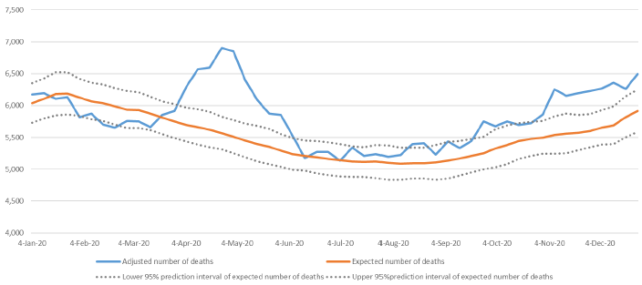
Source: Statistics Canada.
Chart 39 Description
Line chart showing the expected and actual number of deaths by week in 2020 based on Statistics Canada’s data and methodology. The Y axis shows the number of deaths and the X axis shows the time from January 4, 2020 to December 4, 2020.
There are two dotted lines showing the lower and upper bound prediction of the expected number of deaths based on Statistics Canada’s methodology, a line showing the expected number of deaths and a line showing the actual number of deaths.
The actual number of deaths is less than expected for the first three months of 2020.
From April 2020 to June 2020, the actual number of deaths are significantly higher than expected.
From July 2020 to October 2020, the actual number of deaths are mostly within the upper confidence level for the expected number of deaths.
From November 2020 to December 2020, the number of death are higher than expected, but to a much lesser extent that during April to June period.
Based on Statistics Canada’s data and methodology, deaths reported in Canada for 2020 are about 5% higher than expected for the year ending December 31, 2020. Excess deaths include deaths that are not necessarily attributable to COVID-19. For example, many provinces have seen increases in the number of opioid-related deaths in 2020.
The analysis of excess deaths for multiple countries (Parildar U., Perera R., Oke J. 2021) points to excess mortality of about 6% in 2020 for Canada. This analysis allows a comparison of Canada with other countries based on a common methodologyFootnote 29. Table 28 shows that Canada’s excess mortality is low in comparison to the countries analysed, with Sweden and Germany being the only two countries with lower excess mortality.
| Country | Age-Standardised Excess Mortality for 2020Table 28 Footnote ** |
|---|---|
| Canada | 6.0% |
| England & Whales | 10.5% |
| France | 6.7% |
| GermanyTable 28 Footnote *** | 3.3% |
| Italy | 8.7% |
| Spain | 12.9% |
| Sweden | 1.5% |
| US | 12.9% |
|
Table 28 Footnotes
|
|
Findings from preliminary research in the UK (Cairn et Al., 2020) on deaths that occurred during the first wave of the pandemic indicate that COVID-19 death rates appeared to be proportional to all-cause mortality. A more recent study conducted in the US (Goldstein, J.R., 2020) also points to a similar conclusion, stating that the increase in mortality by age from COVID-19 strongly resembles the age pattern of all-cause mortality. These conclusions can be very helpful in assessing the impact of the pandemic on short-term mortality rates. An approximate impact can be calculated by applying a simple multiple to current mortality rates across all ages, and deriving the resulting period life expectancy.
Table 29 provides the impact a pandemic could have on period life expectancy at birth and age 65 under the assumption that the death rates are proportional to all-cause mortality. For example, if 2020 mortality rates were 5% higher compared to 2019 mortality rates, the period life expectancy at birth would decrease by 0.54 years for males and by 0.49 years for females between 2019 and 2020. The respective estimated decreases in period life expectancy at age 65 are about 0.4 for both sexes. For illustration purposes, Table 29 also shows the impact using different increases in mortality rates. Based on recent estimates published by Statistics Canada (Dion, P., 2021), COVID-19 contributed to an estimated reduction in life expectancy at birth of 0.41 years in 2020 in Canada. These estimates are lower than presented in Table 29 due to methodological differences and the fact that they are based only on deaths that were recorded as COVID-19 which were lower than the overall excess deaths in 2020.
The impact of pandemics is also often expressed as the total number of years of life lost and can be assessed over a country’s full population. As shown in Table 29, if 2020 mortality rates were 5% higher compared to 2019 mortality rates, this would represent a loss of 19.4 million years of life in Canada.
| Scenario (2020 rates compared to 2019 rates) |
Period Life Expectancy at Birth | Years of Life Lost Per Person | Total Canadian Years of Life Lost | Period Life Expectancy at Age 65 | Years of Life Lost Per Person | |||||
|---|---|---|---|---|---|---|---|---|---|---|
| Male | Female | Male | Female | Male | Female | Male | Female | Male | Female | |
| No IncreaseTable 29 Footnote * | 80.26 | 84.41 | - | - | - | - | 19.64 | 22.36 | - | - |
| 5% Increase | 79.71 | 83.92 | 0.54 | 0.49 | 10,108,436 | 9,288,052 | 19.26 | 21.99 | 0.38 | 0.37 |
| 10% Increase | 79.20 | 83.45 | 1.06 | 0.96 | 19,780,439 | 18,168,803 | 18.90 | 21.63 | 0.74 | 0.73 |
| 15% Increase | 78.70 | 83.00 | 1.56 | 1.41 | 29,055,586 | 26,679,682 | 18.55 | 21.29 | 1.09 | 1.07 |
| 25% Increase | 77.76 | 82.15 | 2.49 | 2.26 | 46,548,164 | 42,717,479 | 17.92 | 20.65 | 1.72 | 1.71 |
| 50% Increase | 75.69 | 80.27 | 4.57 | 4.13 | 85,279,842 | 78,177,372 | 16.56 | 19.29 | 3.08 | 3.07 |
| 100% Increase | 72.33 | 77.24 | 7.93 | 7.17 | 148,034,265 | 135,581,430 | 14.51 | 17.21 | 5.13 | 5.15 |
|
Table 29 Footnotes
|
||||||||||
How the pandemic will unfold over the next several months will also have an impact on the short to medium-term mortality rates (beyond 2020). Definitely, the speed and effectiveness of the rollout of Canada’s vaccination program will play a major role. There are also other factors, such as new variants of the virus and effectiveness of existing vaccines.
Medium to Long-Term Impacts
Looking beyond short-term impacts on mortality, the uncertainty is even higher. Considering only the direct consequences of the pandemic resulting from the actual COVID-19 deaths, the impact on future mortality rates and MIRs will depend on the underlying health of those who died from COVID-19 compared to the general population. If the individuals who died from COVID-19 already had low life expectancies as a result of frailties and pre-existing conditions, then a so called “harvesting effect” may take place. Under harvesting effect, it is expected that a period of excess mortality is compensated by subsequent reductions in mortality. It is too soon to assess any potential harvesting effect in Canada - it may take a few years until data is available.
In addition to the direct consequences of the pandemic, the potential impacts of indirect consequences cannot be underestimated. As shown in Table 30, certain potential outcomes could lead to lower longevity while others could lead to higher longevity in the future.
| Lower longevity |
|---|
|
| Higher Longevity |
|
At this point, it is still too early to fully understand and estimate the impact that the pandemic will have on both short and long-term mortality rates. It will take years until the effects are known. It is important to develop scenarios as to how the pandemic could evolve and impact mortality rates in the short, medium and long term. For example, Club Vita prepared different possible longevity scenarios, based on four potential post-COVID-19 realities (ClubVita, 2021). These scenarios highlight that there is still much uncertainty surrounding the development of this pandemic. Until data emerge, and there is a better understanding of the virus, it is anticipated that periodic adjustments will need to be made to assumptions regarding the future mortality over the next several years.
Pandemics are not uncommon events, and it is likely that they will continue to occur in the future. One could hope that the world will be better prepared to the subsequent pandemic; however, the impact of these events can fall in the Grey SwanFootnote 30 category. These events are very unlikely, but known, and it seems that it is very difficult to prepare for such events. Pandemics often present a virus with new characteristics for which current medicine has no readily available tools.
6. Living to Advanced Ages
Mortality rates across all ages fell dramatically during the 20th century and the first two decades of the 21st century, leading to an unprecedented increase in life expectancy at birth (and at all ages) for both men and women in Canada. There have been a number of reasons for the drop in mortality rates, including access to medical care, immunizations, antibiotics, medical innovations, improvement in sanitary conditions, clean water supply, and improvements in the standard of living and education.
However, while living to older ages (i.e. to 90 plus years) is more common in the 21st century, it is still not attainable for the majority of the population. As shown in Table 9 of Section 3 and based on data from Statistics Canada, period life expectancy at birth in Canada in 2019 is 80.3 for males and 84.4 for femalesFootnote 31. Based on the same data, the probability at birth of attaining age 90 is 26% for men and 40% for women.
With aging, the human body becomes more fragile and more susceptible to diseases or viruses. As discussed in Section 4, the occurrence of diseases is an important consequence of aging. Looking forward, while medical and technological breakthroughs may delay the aging process and result in increased probabilities of living to older ages, there are a lot of uncertainties in this respect.
This section focuses on the potentials of living to older ages and reaching ages 90 and beyond, as well as on different measures of longevity. All projections in this section are based on CPP30 mortality assumptions, with the exception that the starting mortality rates in certain cases were updated based on the latest mortality data provided by Statistics Canada.
6.1 Measures of Longevity
The concept of longevity has evolved through time similarly to the definition of what is considered to be living to older ages. Although there is no concrete definition for the generic word ‘elderly’, as a convention, a person aged 65 or more is often referred to as elderly. However, in Canada, given that period life expectancy at age 65 in 2019 is 19.6 years for men and 22.4 years for women, age 65 might not be perceived as very old. Older ages are also commonly referred to as the ages within the last period of the human life cycle, an age band that is close to and around the life expectancy. To understand Canadian longevity, this subsection presents analysis of different measures of longevity, as well as distribution of ages at death.
Mortality can be analysed in different ways. For the CPP valuation, the base mortality rates, MIRs as well as the resulting period and cohort life expectancies are the main measures used. However, other measures can provide important information on longevity. Additional measures that can be useful to analyse mortality and/or survival of populations are presented below.
-
Expected median age at death and life expectancy: The expected median age at death is the age by which half of the population is expected to die, meaning that the probability of surviving to this age is 50%. This measure is different from the more common longevity measure of life expectancy (expected average age at death)Footnote 32.
Both the expected median age at death and life expectancy can be measured on a cohort and period basis and at different ages. Based on 2019 Canadian life tables, the period life expectancy at birth is 80.3 for males and 84.4 for females, with 61% and 62% of males and females respectively who are expected to survive to that age. This compares to the period expected median age at death of 83 for males and 87 for females, with 50% of people who are expected to survive from birth to that age.
Comparing the evolution of expected median and average ages at death can sometimes be useful to analyse mortality patterns by age. For example, and as shown in Charts 40 and 41, the gap between the expected period median age at death and life expectancy at birth narrowed significantly between 1920 and 1950. This is the result of improvements in infant mortality and eradication of some children diseases through vaccinations, and the fact that improvements in mortality at younger ages have a stronger impact on life expectancy than on median age at death. Since 1950, the two measures have been following a similar pattern.
-
Mode age at death: The mode age at death corresponds to the most common age at death, i.e. it is the age at which there are the most deaths. This measure is based on actual observations and can be useful in analysing the age at death from certain diseases, and how it has progressed over time. As shown by Charts 40 and 41, the mode age before 1977 was zero. This means that despite significant improvements in infant mortality, the highest number of deaths was occurring during the first six months of newborns life.
-
Omega: When building a mortality table, omega is the ultimate age to which individuals can survive. The probability of dying at age omega is equal to 1.0, which means that no individuals are expected to survive past this age. The omega can vary from one mortality table to the next. For example, the omega used by Statistics Canada is currently 110 while the omega used in the CPP30 is 120. Given that omega varies from one mortality table to the next, it is not shown in Charts 40 and 41 below.
-
Maximum Age at Death (MAX): The MAX is the age at death of the oldest deceased individual reported each year. As shown in Charts 40 and 41, the MAX has been fairly constant through time despite significant increases in expected median, expected average and mode ages at death. According to Wikipedia and based on the list of Canadian supercentenarians (individuals living past age 110), the highest MAX is 111 years in 2013 for males, and 117 years in 1998 for females. International peers also had very few individuals living past age 110.
-
Maximum Age Reported at Death (MAR) - minimum count of 30: The maximum age for which there are at least 30 individual deaths in a given year. This measure, as compared with MAX, aims to exclude outliers. As a result, it is less volatile. This measure provides an insight on how maximum life span has progressed through time. As seen in Charts 40 and 41, between 1921 and 2019, there has been a steady increase in the MAR from 95 years to 104 years for males, and from 97 to 105 years for females.
Chart 40 - Measures of Age at Death – MalesChart 40 Footnote *
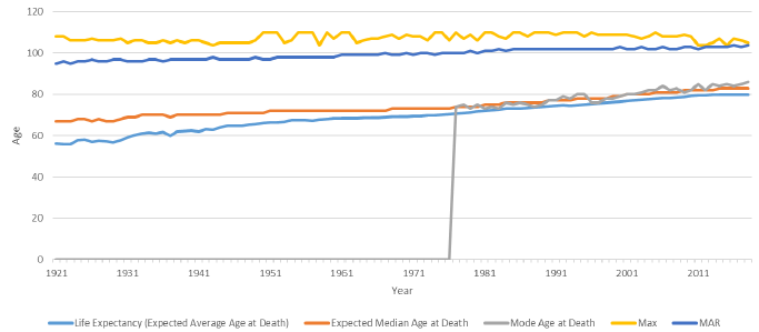
Chart 40 Footnote
- Chart 40 Footnote *
-
Measured at birth. Calculations done on a period basis where applicable.
Source: OCA calculations using data for 1921 - 2011 from CHMD, 2012 - 2019 from Statistics Canada.
Chart 40 Description
Line chart showing various measures of age at death for males. The Y axis shows the age at death and the X axis shows the years from 1921 to 2019.
The life expectancy (expected average age at death) increased from 56.0 in 1921 to 80.3 in 2019.
The expected median age at death increased from 67.0 in 1921 to 83.0 in 2019.
The mode age before 1977 was zero. It then increased from 74.0 to 88.0 between 1977 and 2019.
The maximum age at death (MAX) has been fairly constant between 1921 and 2019, varying between 104.0 and 110.0.
Between 1921 and 2019 there has been a steady increase in the maximum age reported at death (MAR) from 95 years to 104 years for males.
Chart 41 - Measures of Age at Death – FemalesChart 41 Footnote *
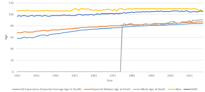
Chart 41 Footnote
- Chart 41 Footnote *
-
Measured at birth. Calculations done on a period basis where applicable.
Source: OCA calculations using data for 1921 - 2011 from CHMD, 2012 - 2019 from Statistics Canada.
Chart 41 Description
Line chart showing various measures of age at death for females. The Y axis shows the age at death and the X axis shows the years from 1921 to 2019.
The life expectancy (expected average age at death) increased from 58.2 in 1921 to 84.4 in 2019.
The expected median age at death increased from 68.0 in 1921 to 87.0 in 2019.
The mode age before 1977 was zero. It then increased from 84.0 to 90.0 between 1977 and 2019.
The maximum age at death (MAX) has been fairly constant between 1921 and 2019, varying between 105.0 and 110.0.
Between 1921 and 2019 there has been a steady increase in the maximum age reported at death (MAR) from 97 years to 105 years for females.
6.2 Distribution of Ages at Death
Charts 40 and 41 showed how different measures of age at death have changed through time. It is also interesting to consider how the expected distribution of ages at death has evolved. Chart 42 shows the progression of the age range over which 70% of deaths are expected to occur. For example, based on 1925 period life tables, 70% of males were expected to die between the ages of 12 and 84, with 15% dying before the age of 12 and another 15% dying after the age of 84.
As can be seen, the lower bound age increased significantly for both sexes between 1925 and 1950 due to substantial reductions in infant and child mortality. The upper bound age on the other hand only increased by one year for men (from 84 to 85) and by 3 years for women (from 85 to 88) over the same period. Chart 42 also shows that the age range over which 70% of deaths are expected to occur has narrowed and shifted to the right (older ages) over time. CPP30 projects this trend to continue in the future albeit at a slower pace. For example, when looking at the lower and upper age bounds, the difference has decreased from 27 years for females in 1975 to 23 years in 2019, and it is expected to reduce further to 20 years by 2100. Similarly, for males, the difference between the lower and upper age bounds went from 30 years in 1975 to 26 years in 2019, and it is expected to reduce further to 22 years by 2100. The narrowing of the age range over which 70% of deaths occur is the result of a combination of factors, including the changing age structure of the population, more rapid mortality reductions at younger ages due to specific causes of death and the difficulty in decreasing mortality at very old ages.
Chart 42 - Evolution of the Distribution of the Expected Age at Death (15th to 85th percentile)
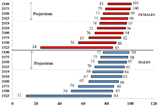
Source: OCA calculations using data for 1925 - 2011 from CHMD, 2012 - 2019 from Statistics Canada, 2020+ from CPP30 Projections.
Chart 42 Description
Horizontal bar chart showing the progression of the age range over which 70% of deaths are expected to occur (for males and females). Progression is shown for historical years (1925 to 2018) and projected years (2019 to 2100).
Based on 1925 period life tables, 70% of males were expected to die between the ages of 12 and 84, and 70% of females were expected to die between the ages of 24 and 85.
By 1950, the lower bound age had increased significantly for both sexes (from 12 to 50 for males and from 24 to 56 for females). The upper bound age on the other hand only increased by one year for men (from 84 to 85) and by 3 years for women (from 85 to 88) over the same period.
It also shows that the age range over which 70% of deaths are expected to occur has narrowed and shifted to the right (older ages) over time. By 2100, it is expected that 70% of deaths are expected to occur between the ages of 77 and 99 for males and between the ages of 81 and 101 for females.
6.3 Living to Advanced Ages
This subsection considers probabilities of surviving to advanced ages. The presented analysis covers the survival curves at birth using the period mortality tables as well as the probabilities of survival to ages 90 and 100 as based on the cohort mortality tables.
Period survival curves
A period survival curve at birth shows the probability of a newborn reaching a given age as based on the mortality rates of a given year. Charts 43 and 44 below show the period survival curves at birth for Canadian men and women at different points in time as based on the historical mortality tables and the projections of CPP30. The “squaring” of the survival curves over time from 1925 to 2019 occurred since gains in life expectancy have been greater at the younger ages than at the older ages, while the maximum age that can be attained has remained at about 120 years. Based on projections from CPP30, the squaring of the curves is expected to continue through 2100 but to a lesser extent. The omega of 120 years is consistent with the fact that few individuals have ever lived beyond age 110.
The charts illustrate that the probabilities of a newborn reaching a very advanced age are quite low. In particular, the probability of surviving from birth to ages beyond 110 is practically zero based on the CPP30 assumptions.
As indicated in the charts by the intersection of the vertical lines at age 90 with the survival curves, the probability of reaching age 90 has substantially increased over time. Based on the period life tables of 1925, males had a probability of 4% of reaching age 90. By 2019, this figure had increased to 26%, and by 2100 it is projected to reach 55%. For females, the probability of reaching age 90 was 6% in 1925, increased to 40% by 2019, and is projected to reach 64% by 2100. Overall, probabilities of surviving to older ages have increased over the last century, and based on the projections of CPP30 this trend is expected to continue in the future but at a slower pace.
Chart 43 - Survival Curves at Birth - Males (Based on Period Life Tables)
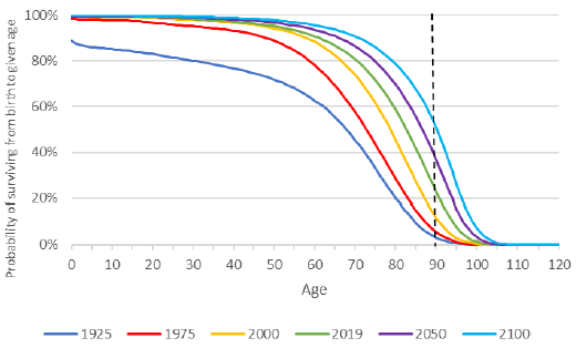
Source: OCA calculations using data for 1925- 2011 from CHMD, 2012 - 2019 from Statistics Canada, 2020+ from CPP30 Projections.
Chart 43 Description
Line chart showing the survival curves at birth for Canadian men at different points in time as based on the historical mortality tables and the projections of CPP30. The Y axis shows the probability of surviving from birth to a given age and the X shows the given age from 0 to 120.
The chart illustrates that the probabilities of a newborn reaching a very advanced age are quite low. In particular, the probability of surviving from birth to ages beyond 110 is practically zero based on the CPP30 assumptions.
As indicated in the charts by the intersection of the vertical lines at age 90 with the survival curves, the probability of reaching age 90 has substantially increased over time. Based on the period life tables of 1925, males had a probability of 4% of reaching age 90. By 2019, this figure had increased to 26%, and by 2100 it is projected to reach 55%.
Chart 44 - Survival Curves at Birth - Females (Based on Period Life Tables)
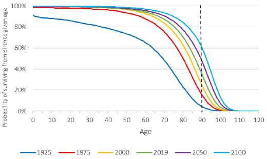
Source: OCA calculations using data for 1925 - 2011 from CHMD, 2012 - 2019 from Statistics Canada, 2020+ from CPP30 Projections.
Chart 44 Description
Line chart showing the survival curves at birth for Canadian women at different points in time as based on the historical mortality tables and the projections of CPP30. The Y axis shows the probability of surviving from birth to a given age and the X shows the given age from 0 to 120.
The chart illustrates that the probabilities of a newborn reaching a very advanced age are quite low. In particular, the probability of surviving from birth to ages beyond 110 is practically zero based on the CPP30 assumptions.
As indicated in the chart by the intersection of the vertical lines at age 90 with the survival curves, the probability of reaching age 90 has substantially increased over time. Based on the period life tables, females had the probability of reaching age 90 was 6% in 1925. This probability increased to 40% by 2019 and is projected to reach 64% by 2100.
Probabilities of surviving to age 90 or 100
The following calculations are produced using cohort mortality, i.e. future mortality improvements are taken into account. For complete cohorts, historical mortality rates are used. For cohorts with living members, a combination of historical mortality rates and rates as projected using CPP30 assumptions is used.
Table 31 shows the probabilities of living to 90 and 100 from birth for select years since 1925 for both males and females.
A Canadian male born in 2019 has a 54% chance at birth of reaching age 90, which is 1.3 times higher than a male born in 1975 and 3.9 times higher than a male born in 1925. In comparison, a Canadian female born in 2019 has a 64% chance at birth of reaching age 90, which is 1.2 times higher than a female born in 1975 and 2.3 times higher than a female born in 1925. The projected probability to reach 90 from birth has been increasing by about 3 percentage points every ten years since 1965.
A Canadian male born in 2019 has an 11% chance of reaching age 100 compared to a 1% chance in 1925, while for females the probability went from 4% in 1925 to 18% in 2019.
| Year of birth | Probability of Newborn Living to | |||
|---|---|---|---|---|
| Age 90 | Age 100 | |||
| Male | Female | Male | Female | |
| 1925 | 14% | 28% | 1% | 4% |
| 1935 | 21% | 35% | 2% | 6% |
| 1945 | 28% | 41% | 3% | 7% |
| 1955 | 33% | 45% | 4% | 9% |
| 1965 | 37% | 49% | 5% | 10% |
| 1975 | 41% | 52% | 6% | 11% |
| 1985 | 44% | 55% | 7% | 13% |
| 1995 | 47% | 58% | 8% | 14% |
| 2005 | 50% | 60% | 9% | 16% |
| 2015 | 53% | 63% | 11% | 17% |
| 2019 | 54% | 64% | 11% | 18% |
|
Table 31 Footnotes
|
||||
The remainder of this subsection compares the probability of surviving to ages 90 and 100 from a given age in 2019 for four countries: Canada, the US, the UK and Sweden. All calculations are based on cohort mortality tables.
The calculations for the US are based on mortality assumptions used in the Long-Range Demographic Assumptions for the 2020 Trustees Report of the Office of the Chief Actuary, Social Security Administration (SSA Trustee Report, 2020). The calculations for the UK are based on 2018-based historical and projected mortality rates available on the website of the UK Office for National Statistics 1951-2113. The calculations for Sweden are based on Statistics Sweden, Death Rates 1960 - 2120.
Differences in probabilities of living to age 90 or 100 between countries depend on differences in current mortality rates and in assumed future mortality improvements:
- In the short term (until 2030), projected mortality rates for younger ages (below age 50) are higher in Canada compared to those in the UK and Sweden. On the other hand, short-term projected mortality rates for older ages (above 50) are lower in Canada than in the UK and the US. Sweden has mortality rates that are lower than Canada until about age 85. After age 85, Canada has mortality rates that are significantly lower, which explains why Canadians have a much higher chance of living to age 90 and 100.
- Assumed future MIRs for Canada are lower than the ones assumed for the UK and Sweden. For the UK and Sweden, the assumed MIRs are significantly higher, especially at older ages.
- The differences in probabilities of living to 90 or 100 are greater at age 20 than at age 50, since calculations at younger ages include longer periods of projected mortality rates.
Table 32 shows the probabilities of living to 90 for those aged 20, 50 and 80 in 2019 in Canada, the US, the UK and Sweden. Canadian males aged 80 in 2019 are projected to have a 48% chance of living another 10 years to age 90 (59% for Canadian females).
| Age in 2019 | Probability of Living to Age 90 – Based on Cohort Life Expectancy | |||||||
|---|---|---|---|---|---|---|---|---|
| Canada | US | UK | Sweden | |||||
| Male | Female | Male | Female | Male | Female | Male | Female | |
| 20 | 49% | 59% | 34% | 45% | 47% | 57% | 59% | 67% |
| 50 | 42% | 53% | 28% | 39% | 36% | 46% | 44% | 54% |
| 80 | 48% | 59% | 38% | 48% | 39% | 48% | 41% | 52% |
|
Table 32 Footnotes
|
||||||||
Charts 45 and 46 show that Canadians aged between 60 and 67 in 2019 are projected to have the lowest probability of reaching age 90. This probability is higher for younger ages due to the projected decreases in mortality rates. On the other hand, for older age groups the probabilities of living to 90 increase since only individuals who have already reached older ages are considered.
Chart 45 - Probability of Living to 90 from Given Age in 2019, Males, Cohort-Basis
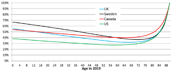
Source: OCA calculations based on the following data sources: US - The Long-Range Demographic Assumptions for the 2020 Trustees Report, Office of the Chief Actuary, Social Security Administration. UK - 2018-based period Mortality Rates (qx), UK, 1951-2113, Office of National Statistics, UK. Sweden - Statistics Sweden, Death Rates 1960 - 2120. CAN – CHMD, Statistics Canada, and CPP30 Projections.
Chart 45 Description
Line chart showing the probability of reaching age 90 from any given age in 2019 for Canadian males. It also shows the same probability for the UK, Sweden and the US. The Y axis shows the probability of reaching age 90 from any given age in 2019 and the X shows the given age from 0 to 90.
In 2019, the probability for a Canadian male of reaching age 90 is 53.8% at birth. This probability decreases to 48.8% at age 20, 43.8% at age 40 and 40.1% at age 60. It reaches its lowest point at age 63 with a probability of 39.9%. Thereafter, it increases to 40.7% at age 70, 48.1% at age 80 and 87.5% and at age 89.
The chart also shows that Canada fares pretty well compared to the UK, Sweden and the US. Only Sweden has better probabilities of reaching age 90 and this applies only to males aged 0 to 58.
Chart 46 - Probability of Living to 90 from Given Age in 2019, Females, Cohort-Basis
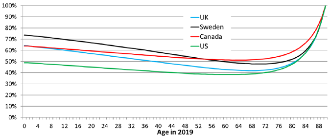
Source: OCA calculations based on the following data sources: US - The Long-Range Demographic Assumptions for the 2020 Trustees Report, Office of the Chief Actuary, Social Security Administration. UK - 2018-based period Mortality Rates (qx), UK, 1951-2113, Office of National Statistics, UK. Sweden - Statistics Sweden, Death Rates 1960 - 2120. CAN – CHMD, Statistics Canada, and CPP30 Projections.
Chart 46 Description
Line chart showing the probability of reaching age 90 from any given age in 2019 for Canadian females. It also shows the same probability for the UK, Sweden and the US. The Y axis shows the probability of reaching age 90 from any given age in 2019 and the X shows the given age from 0 to 90.
In 2019, the probability for a Canadian female of reaching age 90 is 63.8% at birth. This probability decreases to 59.4% at age 20, 54.8% at age 40 and 51.4% at age 60. It reaches its lowest point at age 63 with a probability of 51.2%. Thereafter, it increases to 51.9% at age 70, 58.6% at age 80 and 90.5% and at age 89.
The chart also shows that Canada fares pretty well compared to the UK, Sweden and the US. Only Sweden has better probabilities of reaching age 90 and this applies only to females aged 0 to 54.
Table 33 shows the probabilities of living to 100 for those aged 20, 50 and 80 in 2019 in Canada, the US, the UK and Sweden. Canadian males aged 80 in 2019 are projected to have a 5% chance of living another 20 years to age 100 (10% for Canadian females).
| Age in 2019 | Probability of living to age 100 – Based on Cohort Life Expectancy | |||||||
|---|---|---|---|---|---|---|---|---|
| Canada | US | UK | Sweden | |||||
| Male | Female | Male | Female | Male | Female | Male | Female | |
| 20 | 9% | 15% | 5% | 9% | 9% | 13% | 5% | 10% |
| 50 | 6% | 11% | 3% | 6% | 4% | 7% | 2% | 6% |
| 80 | 5% | 10% | 3% | 6% | 3% | 4% | 1% | 4% |
|
Table 33 Footnotes
|
||||||||
Charts 47 and 48 show that the probability of a Canadian reaching age 100 is much smaller than the probability of reaching age 90 (Charts 45 and 46). Canadians aged between 68 and 76 in 2019 are projected to have the lowest probability of reaching age 100. This probability is higher for younger ages due to the projected decreases in mortality rates. On the other hand, for older age groups the probabilities of living to 100 increase since only individuals who have already reached older ages are considered.
Chart 47 - Probability of Living to 100 from Given Age in 2019, Males, Cohort-Basis
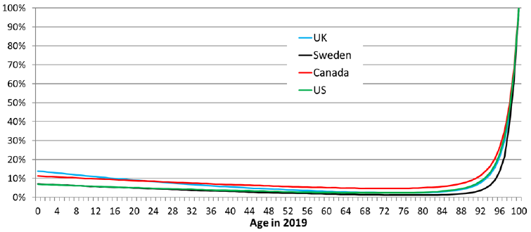
Source: OCA calculations based on the following data sources: US - The Long-Range Demographic Assumptions for the 2020 Trustees Report, Office of the Chief Actuary, Social Security Administration. UK - 2018-based period Mortality Rates (qx), UK, 1951-2113, Office of National Statistics, UK. Sweden - Statistics Sweden, Death Rates 1960 - 2120. CAN – CHMD, Statistics Canada, and CPP30 Projections.
Chart 47 Description
Line chart showing the probability of reaching age 100 from any given age in 2019 for Canadian males. It also shows the same probability for the UK, Sweden and the US. The Y axis shows the probability of reaching age 100 from any given age in 2019 and the X shows the given age from 0 to 100.
In 2019, the probability for a Canadian male of reaching age 100 is 11.3% at birth. This probability decreases to 8.8% at age 20, 6.8% at age 40 and 5.2% at age 60. It reaches its lowest point at age 68 with a probability of 4.8%. Thereafter, it increases to 5.1% at age 80, 8.9% at age 90 and 68.4% at age 99.
The chart also shows that Canada fares pretty well compared to the UK, Sweden and the US. Only the UK has better probabilities of reaching age 100 and this applies only to males aged 0 to 16.
Chart 48 - Probability of Living to 100 from Given Age in 2019, Females, Cohort-Basis
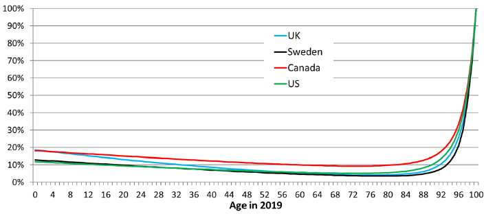
Source: OCA calculations based on the following data sources: US - The Long-Range Demographic Assumptions for the 2020 Trustees Report, Office of the Chief Actuary, Social Security Administration. UK - 2018-based period Mortality Rates (qx), UK, 1951-2113, Office of National Statistics, UK. Sweden - Statistics Sweden, Death Rates 1960 - 2120. CAN – CHMD, Statistics Canada, and CPP30 Projections.
Chart 48 Description
Line chart showing the probability of reaching age 100 from any given age in 2019 for Canadian females. It also shows the same probability for the UK, Sweden and the US. The Y axis shows the probability of reaching age 100 from any given age in 2019 and the X shows the given age from 0 to 100.
In 2019, the probability for a Canadian female of reaching age 100 is 18.1% at birth. This probability decreases to 15.0% at age 20, 12.2% at age 40 and 10.0% at age 60. It reaches its lowest point at age 71 with a probability of 9.3%. Thereafter, it increases to 9.8% at age 80, 14.5% at age 90 and 72.8% at age 99.
The chart also shows that Canadian females have higher probabilities of reaching age 100 at any given age compared the UK, Sweden and the US.
6.3.1 Quantitative Scenarios to Living to Advanced Ages
This subsection considers three types of illustrative scenarios under which the life expectancy of Canadians would be significantly increased (removing causes of death, reducing mortality rates and increasing life span).
6.3.1.1 Removing Causes of Death
This subsection illustrates the life expectancies that could be achieved if certain causes of death were eliminated, or if their mortality rates were reduced.
Removing or reducing mortality rates attributable to a specific cause of death is not a perfect representation of how mortality can improve since multiple non-dependent decrement causes could occur. One has to keep in mind that the scenarios presented are strictly for illustrative purposes in order to provide for an understanding of the magnitude of the improvements required.
Under the assumed methodology, mortality related to selected diseases is reduced or eliminated gradually over a certain period of time, while mortality for other causes of death is improved in accordance with CPP30 assumptions. It is further assumed that individuals who would have died from certain causes (e.g. diseases of the heart or malignant neoplasms) will instead gradually die of other causes over their remaining lifetimes. Finally, it is assumed that each cause of death is independentFootnote 33.
Chart 49 shows a comparison of the period life expectancies at age 65 between the CPP30 and those obtained under a scenario where deaths related to malignant neoplasms are reduced by 50% for all ages over a 20-year period while keeping MIRs for other causes of death in line with those from the CPP30. This would be equivalent to having average annual MIRs of 1.7% for males and 1.4% for females over the 20-year period for age 65 and over, compared to 1.1% and 0.9% in the CPP30. Under this scenario, the period life expectancy at 65 in 2039 would be 22.6 years for males and 24.9 years for females, compared to 21.8 and 24.1 in CPP30. This corresponds to an impact on period life expectancy of 0.8 for men and women.
Chart 49 - Impact of Reducing Deaths Related to Malignant Neoplasms by 50% over 20 Years on Period Life Expectancy at Age 65
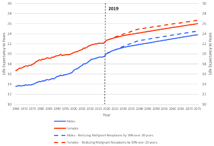
Source: OCA calculations using data for 1921 - 2011 from CHMD, 2012 - 2019 from Statistics Canada, 2020+ from CPP30 Projections and Causes of Death data from Statistics Canada.
Chart 49 Description
Line chart showing a comparison of the period life expectancies at age 65 by sex between two scenarios: the CPP30 and a scenario where deaths related to malignant neoplasms are reduced by 50% for all ages over 20 years while keeping MIRs for other causes of death in line with those from the CPP30. The Y axis shows life expectancy at age 65, and the X axis shows the years from 1965 to 2075.
From 1965 to 2019, male life expectancy at age 65 increased from 13.6 to 19.6. Female life expectancy at age 65 increased from 16.7 to 22.4 over the same period.
Under the CPP30 projections, male life expectancy at age 65 is projected to increase from 19.6 in 2019 to 23.8 in 2075. For females, it is expected to increase from 22.4 to 26.0 over the same period.
Under the scenario where mortality related to malignant neoplasms is reduced by 50% for all ages over 20 years while keeping MIRs for other causes of death in line with those from the CPP30, male life expectancy at age 65 is projected to increase from 19.6 in 2019 to 24.5 in 2075. For females, it is expected to increase from 22.4 to 26.7 over the same period.
The second scenario considers the complete removal of mortality from malignant neoplasms and diseases of the heart over a period of 50 years for all ages (Chart 50). Under this scenario, the period life expectancy at age 65 would be 28.4 years for males and 29.7 years for females after 50 years (i.e. in 2069) compared to 23.5 years for males and 23.7 years for females as projected under the CPP30 assumptions. Removing the top two causes of death in Canada for all ages would significantly increase life expectancy, but individuals aged 65 would still not attain an expected period average age at death of 100.
Chart 50 - Impact of Removing Mortality from Malignant Neoplasms and Heart Diseases over 50 Years on Period Life Expectancy at Age 65
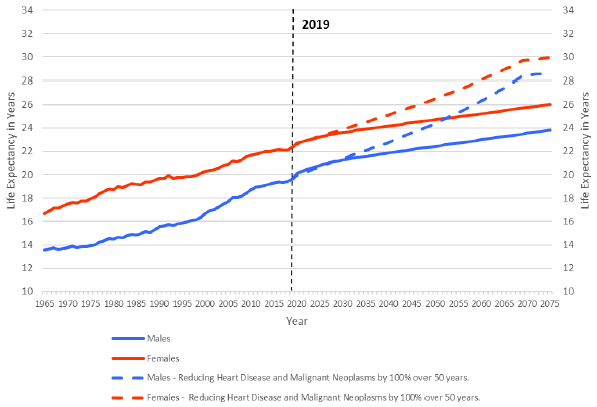
Source: OCA calculations using data for 1921 - 2011 from CHMD, 2012 - 2019 from Statistics Canada, 2020+ from CPP30 Projections and Causes of Death data from Statistics Canada.
Chart 50 Description
Line chart showing a comparison of the period life expectancies at age 65 by sex between two scenarios: the CPP30 projections and a scenario that considers the complete removal of mortality from malignant neoplasms and diseases of the heart over a period of 50 years for all ages. The Y axis shows life expectancy at age 65, and the X axis shows the years from 1965 to 2075.
From 1965 to 2019, male life expectancy at age 65 increased from 13.6 to 19.6. Female life expectancy at age 65 increased from 16.7 to 22.4 over the same period.
Under the CPP30 projections, male life expectancy at age 65 is projected to increase from 19.6 in 2019 to 23.8 in 2075. For females, it is expected to increase from 22.4 to 26.0 over the same period.
Under the scenario where mortality from malignant neoplasms and diseases of the heart is removed over a period of 50 years for all ages, male life expectancy at age 65 is projected to increase from 19.6 in 2019 to 28.7 in 2075. For females, it is expected to increase from 22.4 to 29.93 over the same period.
Under the third scenario (Chart 51), mortality from the top ten causes of death for individuals aged 65 and aboveFootnote 34 is removed over a period of 75 years. Under this scenario, the period life expectancy at age 65 would be 33.9 years for males and 34.5 years for females after 75 years (i.e. in 2094), leading to an expected period average age at death just above 100 for females aged 65 (slightly below 100 for males). Removing the top ten causes of death in Canada for all ages would increase significantly life expectancy, but might not be realistic from a medical advancements point of view.
Chart 51 - Impact of Removing Mortality from Top 10 Causes of Death over 75 Years on Period Life Expectancy at Age 65
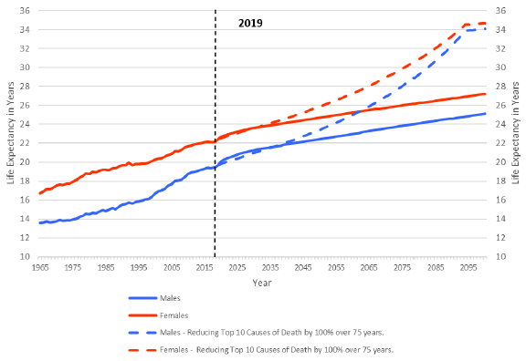
Source: OCA calculations using data for 1921 - 2011 from CHMD, 2012 - 2019 from Statistics Canada, 2020+ from CPP30 Projections and Causes of Death data from Statistics Canada.
Chart 51 Description
Line chart showing a comparison of the period life expectancies at age 65 by sex between two scenarios: the CPP30 projections and a scenario that considers removing mortality from the top ten causes of death for individuals age 65 and above over a period of 75 years. The Y axis shows life expectancy at age 65, and the X axis shows the years from 1965 to 2100.
From 1965 to 2019, male life expectancy at age 65 increased from 13.6 to 19.6. Female life expectancy at age 65 increased from 16.7 to 22.4 over the same period.
Under the CPP30 projections, male life expectancy at age 65 is projected to increase from 19.6 in 2019 to 25.1 in 2100. For females, it is expected to increase from 22.4 to 27.2 over the same period.
Under the scenario where mortality from the top ten causes of death is removed, male life expectancy at age 65 is projected to increase from 19.6 in 2019 to 34.1 in 2100. For females, it is expected to increase from 22.4 to 34.7 over the same period.
6.3.1.2 Expected Average Age at DeathFootnote 35 of 100
This subsection looks at the required reductions in mortality rates or increase in life span to reach a period expected average age at death of 100 in 2019.
Based on data from Statistics Canada, Table 34 presents the percentage reductions in the year 2019 mortality rates required to attain an expected average age at death of 100 for various given ages. These percentages are applied to all ages between the attained age in 2019 and 109 (the age limit in Statistics Canada mortality tables is 110). For example, at age 65, 2019 mortality rates would need a reduction of 84% for males and 79% for females for each age between 65 and 110 to produce in 2019 an expected age at death of 100.
Alternatively, the annual MIRs necessary over various periods to reach an expected average age at death of 100 based on projected mortality rates at the end of each period are also presented. For example, to reach an average expected age at death of 100 at age 65 in 2034, average annual MIRs of 11.5% for males and 9.9% for females for all ages over age 65 would be required over the next 15 years. This compares to annual MIRs of 2.0% and 1.5% experienced over the last 15 years (2005-2019) for males and females aged 65 and over, respectively, and to CPP30 projected MIRs of 1.2% and 1.0% for males and females, respectively, for the next 15 years. To be more realistic, required MIRs to reach an expected average age at death of 100 in 50 and 100 years were also considered. In order to reach an expected average age at death of 100 at age 65 in 2069, average annual MIRs of 3.6% for males and 3.1% for females aged 65 and over would be necessary over the next 50 years. Over the next 100 years, the average annual required MIRs for males aged 65 and over would be 1.8%, compared to 1.5% for females, which is very close to the 15-year average ending in 2019.
| Attained Age | Required Reduction in 2019 Mortality Rates for All Ages Above Attained AgeTable 34 Footnote * | Annual Average Required MIRs Over Next 15 YearsTable 34 Footnote ** | Annual Average Required MIRs Over Next 50 YearsTable 34 Footnote *** | Annual Average Required MIRs Over Next 100 YearsTable 34 Footnote **** | ||||
|---|---|---|---|---|---|---|---|---|
| Males | Females | Males | Females | Males | Females | Males | Females | |
| 0 | 86% | 81% | 12.3% | 10.5% | 3.9% | 3.3% | 1.9% | 1.6% |
| 30 | 85% | 81% | 11.9% | 10.5% | 3.7% | 3.3% | 1.9% | 1.6% |
| 60 | 84% | 79% | 11.5% | 9.9% | 3.6% | 3.1% | 1.8% | 1.5% |
| 65 | 84% | 79% | 11.5% | 9.9% | 3.6% | 3.1% | 1.8% | 1.5% |
| 80 | 79% | 74% | 9.9% | 8.6% | 3.1% | 2.7% | 1.5% | 1.3% |
|
Table 34 Footnotes
|
||||||||
Charts 52 and 53 compare the survival curves for males and females under three scenarios. The first (blue line) is the survival curve based on Statistics Canada’s 2019 mortality rates. The second scenario (red line) is based on a reduction to the 2019 mortality rates necessary to reach a period life expectancy at birth of 100 without changing omega. It is consistent with the information shown in the first row and first column of Table 34 (i.e. reductions in 2019 mortality rates across all ages of 86% for males and 81% for females). The third scenario (green line) shows that a 2019 period life expectancy at birth of 100 could be achieved through the increase in omega to age 138 and 131 for males and females respectively (the ultimate age a human can survive)Footnote 36.
Chart 52 - Comparison of Period Survival Curves for Males using Different Scenarios
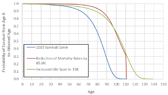
Source: OCA calculations using data from Statistics Canada.
Chart 52 Description
Line chart comparing the survival curves for males at birth under three scenarios: 2019 survival curve, reduction of mortality rates by 85.6% and increased life span to 138. The Y axis shows the probability of survival from age 0 to the attained age, and the X axis shows the attained age from 0 to 150.
Based on the 2019 survival curve, the probability of a male newborn reaching age 20 is 99.2%, reaching age 40 is 97.3%, reaching age 60 is 91.4%, reaching age 80 is 61.4% and reaching age 100 is 2.1%.
Based on a reduction of the 2019 mortality rates by 85.6%, the probability of a male newborn reaching age 20 is 99.9%, reaching age 40 is 99.6%, reaching age 60 is 98.7%, reaching age 80 is 93.3% and reaching age 100 is 59.9%.
Based on an increased life span to 138, the probability of a male newborn reaching age 20 is 99.3%, reaching age 40 is 98.2%, reaching age 60 is 95.9%, reaching age 80 is 88.6% and reaching age 100 is 61.4%.
Chart 53 - Comparison of Period Survival Curves for Females using Different Scenarios
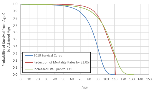
Source: OCA calculations using data from Statistics Canada.
Chart 53 Description
Line chart comparing the survival curves for females at birth under three scenarios: 2019 survival curve, reduction of mortality rates by 81% and increased life span to 131. The Y axis shows the probability of survival from age 0 to the attained age, and the X axis shows the attained age from 0 to 150.
Based on the 2019 survival curve, the probability of a female newborn reaching age 20 is 99.4%, reaching age 40 is 98.4%, reaching age 60 is 94.7%, reaching age 80 is 72.9% and reaching age 100 is 5.1%.
Based on a reduction of the 2019 mortality rates by 81%, the probability of a female newborn reaching age 20 is 99.9%, reaching age 40 is 99.7%, reaching age 60 is 99.0%, reaching age 80 is 94.2% and reaching age 100 is 59.1%.
Based on an increased life span to 131, the probability of a female newborn reaching age 20 is 99.4%, reaching age 40 is 98.8%, reaching age 60 is 97.1%, reaching age 80 is 90.9% and reaching age 100 is 62.0%.
Appendix A ― References
Agri-Food Analytics Lab (Dalhousie University) 2021. Available at:
https://cdn.dal.ca/content/dam/dalhousie/pdf/sites/agri-food/COVID%20Well%20Being%20(April%2018%202021)%20EN.pdf
Bailey, Patricia G., "Pandemics in Canada". The Canadian Encyclopedia, 2008, Historica Canada. https://www.thecanadianencyclopedia.ca/en/article/pandemic. Accessed 09 April 2021.
Baker, Nathan, and Janice Dickin, and Patricia G. Bailey, and Erin James-Abra, "H1N1 Flu of 2009 in Canada". In The Canadian Encyclopedia. Historica Canada. Article published April 14, 2020; Last Edited April 15, 2020.
https://www.thecanadianencyclopedia.ca/en/article/h1n1-flu-of-2009-in-canada
Bancej C, Jayabalasingham B, Wall RW, et al. Evidence Brief--Trends and projections of obesity among Canadians. Health Promot Chronic Dis Prev Can. 2015;35(7):109-112. doi:10.24095/hpcdp.35.7.02. Available at: https://www.ncbi.nlm.nih.gov/pmc/articles/PMC4910458/
Beck, J.D., Reidenbach, D., Salomon, N. et al. mRNA therapeutics in cancer immunotherapy. Mol Cancer 20, 69 (2021). https://doi.org/10.1186/s12943-021-01348-0
Available at: https://molecular-cancer.biomedcentral.com/articles/10.1186/s12943-021-01348-0/tables/1
Blanpain, Nathalie « L’espérance de vie par niveau de vie Méthode et principaux résultats », INSTITUT NATIONAL DE LA STATISTIQUE ET DES ÉTUDES ÉCONOMIQUES, Février 2018. Available at: https://www.insee.fr/fr/statistiques/fichier/3322051/F1801.pdf
Britannica, The Editors of Encyclopaedia. "Influenza". Encyclopedia Britannica, 22 Oct. 2020, https://www.britannica.com/science/influenza. Accessed 9 April 2021.
Bushnik, Tracey, Michael Tjepkema and Laurent Martel 2018 Health-adjusted life expectancy in Canada, Statistics Canada. Available at: https://www150.statcan.gc.ca/n1/pub/82-003-x/2018004/article/54950-eng.htm
Cairns, Andrew J. G. and Blake, David P. and Kessler, Amy and Kessler, Marsha, The Impact of COVID-19 on Future Higher-Age Mortality (May 19, 2020). Available at SSRN: https://ssrn.com/abstract=3606988 or http://dx.doi.org/10.2139/ssrn.3606988
Canadian Institutes of Health Research (CIHR), 2018. Available at: https://cihr-irsc.gc.ca/e/50218.html
Canadian Public Health Association, “Decline in deaths from coronary heart disease and stroke”. Available at: https://www.cpha.ca/decline-deaths-coronary-heart-disease-and-stroke#:~:text=disease%20and%20stroke-,Decline%20in%20deaths%20from%20coronary%20heart%20disease%20and%20stroke,death%20rate%20fell%20by%2030%25
Centers for Disease Control and Prevention. Excessive Alcohol Use is a Risk to Men's Health. Available at: https://www.cdc.gov/alcohol/fact-sheets/mens-health.htm#:~:text=Adult%20Men%20Drink%20More%20than,to%20binge%20drink%20than%20women.&text=Approximately%2022%25%20of%20men%20report,consuming%208%20drinks%20per%20binge
Challacombe L., 2021, CATIE Epidemiology of HIV in Canada. Available at: https://www.catie.ca/en/fact-sheets/epidemiology/epidemiology-hiv-canada?utm_source=google&utm_medium=cpc&utm_content=en&utm_campaign=wad+hiv+stats#hivstatistics
ClubVita, March 2021, COVID-19 Longevity Scenarios: a bump in the road or a catalyst for change? Available at: https://clubvita.ca/Collaboration/Content/pdf/Club_Vita_Canada_COVID-19_scenarios_paper_March_2021.pdf
Continuous Mortality Investigation (CMI) Briefing Note on Working Paper 119 (CMI-2018, March 2019). Available at: https://www.actuaries.org.uk/system/files/field/document/CMI%20WP119%20v01%202019-03-07%20-%20CMI%20Mortality%20Projections%20Model%20CMI_2018%20Briefing%20Note.pdf
Cuthbertson, Richard., 2020, CBC News. Available at: https://www.cbc.ca/news/canada/nova-scotia/closures-equipment-shortages-and-insights-from-canada-s-polio-invasion-1.5517204
Décarie, Yann, Pierre-Carl Michaud November 2020. Working paper: Counting the Dead: COVID-19 and Mortality in Québec and British Columbia, Chaire de recherche sur les enjeux économiques intergénérationnels. Available at: https://creei.ca/wp-content/uploads/2020/11/cahier_20_08_counting_dead_covid_19_mortality_quebec_british_columbia.pdf
Dickin, Janice et al. "Influenza (Flu) in Canada". The Canadian Encyclopedia, 01 May 2017, Historica Canada. https://www.thecanadianencyclopedia.ca/en/article/influenza. Accessed 09 April 2021.
Dion, Patrice, 2021 Reductions in Life expectancy directly associated with COVID-19 in 2020, Demographic documents Statistics Canada. Available at: https://www150.statcan.gc.ca/n1/pub/91f0015m/91f0015m2021002-eng.htm
Eriksson, Karin Hederos, Markus Jäntti, Lena Lindahl and Jenny Torssander Working Paper 8/2014 - Trends in life expectancy by income and the role of specific causes of death, Swedish Institute for Social Research (SOFI), Stockholm University. Available at: http://su.diva-portal.org/smash/get/diva2:720828/FULLTEXT01
Finkelstein, Murray. “Relationship between income and mortality in a Canadian family practice cohort.” Canadian family physician Medecin de famille canadien vol. 64,4 (2018): e181-e189. Available at: https://www.ncbi.nlm.nih.gov/pmc/articles/PMC5897086/
Fryar CD, Carroll MD, Afful J. Prevalence of overweight, obesity, and severe obesity among children and adolescents aged 2–19 years: United States, 1963–1965 through 2017–2018. NCHS Health E-Stats. 2020. Available at: https://www.cdc.gov/nchs/data/hestat/obesity-child-17-18/obesity-child.htm
Goldenberg, Susan, 2018 Killer Flu, Canada’s History. Available at: https://www.canadashistory.ca/explore/arts-culture-society/killer-flu
Goldstein, Joshua R., Ronald D. Lee, Demographic perspectives on the mortality of COVID-19 and other epidemics, Proceedings of the National Academy of Sciences Sep 2020, 117 (36) 22035-22041; DOI: 10.1073/pnas.2006392117. available at: https://www.pnas.org/content/117/36/22035
Gordon, Lydia. 2012. “Single-person households on the rise in Japan.” Market Research Blog. Euromonitor International Research. March 26.
Government of Canada (GoC, 2021), COVID-19 data available at: https://www.canada.ca/en/public-health/services/diseases/2019-novel-coronavirus-infection.html?utm_campaign=hc-sc-phm-21-22&utm_medium=sem&utm_source=ggl&utm_content=ad-text-en&utm_term=covid%2019%20in%20canada&adv=2122-0008&id_campaign=12663296824&id_source=125900518968&id_content=511624188952&gclid=EAIaIQobChMIypql_pSd8gIVempvBB1-ygRxEAMYASAAEgIIMvD_BwE&gclsrc=aw.ds#a1
Government of Canada, Opioid and Stimulant related Harms in Canada. Available at: https://health-infobase.canada.ca/substance-related-harms/opioids-stimulants/#t1Title
Government of Canada (GoC, 2021a) - Health-InfoBase COVID-19 daily epidemiology update – Consulted: May 14, 2021. Available at: https://health-infobase.canada.ca/covid-19/epidemiological-summary-covid-19-cases.html?stat=num&measure=deaths&map=pt#a2
Gutterman, Sam (2015) Mortality of Smoking by Gender. North American Actuarial Journal, 19:3, 200-223, DOI: 10.1080/10920277.2015.1018389. Available at: https://www.tandfonline.com/doi/full/10.1080/10920277.2015.1018389
Hodge, Judy 2014, Canadian Healthcare Workers’ experiences during pandemic H1N1 influenza: Lessons from Canada’s response, National Collaborating Centre for Infectious Diseases. Available at: https://nccid.ca/publications/canadian-healthcare-workers-experiences-during-pandemic-h1n1-influenza/
Health Canada, Healthy Eating Strategy (2016). Available at: https://www.canada.ca/en/services/health/campaigns/vision-healthy-canada/healthy-eating.html
Health Canada, Antibiotic (antimicrobial) resistance, 2018. Dated 2018-02-23. Available at: https://www.canada.ca/en/public-health/services/antibiotic-antimicrobial-resistance/government-canada-response-antimicrobial-resistance.html
Health Canada, Human Health in a Changing Climate: A Canadian Assessment of Vulnerabilities and Adaptive Capacity (2008). Available at: https://publications.gc.ca/collections/collection_2008/hc-sc/H128-1-08-528E.pdf
Health Canada, Canada’s Tobacco Strategy (2021). Available at: https://www.canada.ca/en/health-canada/services/publications/healthy-living/canada-tobacco-strategy.html
Human Mortality Database, University of California, Berkeley (USA), and Max Planck Institute for demographic Research (Germany). Available at www.mortality.org or www.humanmortality.de
International Actuarial Association (IAA, 2020) paper - Actuarial Perspectives on World Population Prospects 2019, October 2020. Available at: https://www.actuaries.org/IAA/Documents/Publications/Papers/PIWG_Actuarial_Perspectives_World_Population_Prospects_2019.pdf
International Social Security Association (ISSA, 2017) Megatrends reports Social Security Demographic Changes 2017. Available at: https://ww1.issa.int/
Isaacs, Katelin P., Sharmila Choudhury, 2017 “The Growing Gap in Life Expectancy by Income: Recent Evidence and Implications for the Social Security Retirement Age”, Congressional Research Service. Available at: https://fas.org/sgp/crs/misc/R44846.pdf
Jones, Greg, “Why are cancer rates increasing?”, Cancer Research UK, 2015. Available at: http://scienceblog.cancerresearchuk.org/2015/02/04/why-are-cancer-rates-increasing/
Ledberg A. (2020). Exponential increase in mortality with age is a generic property of a simple model system of damage accumulation and death. PloS one, 15(6), e0233384. https://doi.org/10.1371/journal.pone.0233384. Available at: https://www.ncbi.nlm.nih.gov/pmc/articles/PMC7272078/
Li X, Cao X, Guo M, Xie M, Liu X. Trends and risk factors of mortality and disability adjusted life years for chronic respiratory diseases from 1990 to 2017: systematic analysis for the Global Burden of Disease Study 2017 BMJ 2020; 368 :m234 doi:10.1136/bmj.m234. Available at: https://pubmed.ncbi.nlm.nih.gov/32075787/
Mensah, G. A., Wei, G. S., Sorlie, P. D., Fine, L. J., Rosenberg, Y., Kaufmann, P. G., Mussolino, M. E., Hsu, L. L., Addou, E., Engelgau, M. M., & Gordon, D. (2017). Decline in Cardiovascular Mortality: Possible Causes and Implications. Circulation research, 120(2), 366–380. Available at: https://www.ncbi.nlm.nih.gov/pmc/articles/PMC5268076/
National Science Foundation (NSF), Trends in Federal Research by Discipline FY 1970-2017, Federal Funds for Research and Development series (2019 AAAS) Available at: https://www.aaas.org/sites/default/files/2019-06/Disc-1.jpg
O'Brien, Kathy, Marylène St-Jean, Patricia Wood, Stephanie Willbond, Owen Phillips, Duncan Currie and Martin Turcotte, 2020 COVID-19 Death comorbidities in Canada, Statistics Canada COVID-19: Data to Insights for a better Canada. Available at: https://www150.statcan.gc.ca/n1/pub/45-28-0001/2020001/article/00087-eng.htm
Office for National Statistics (ONS) “Health state life expectancies by national deprivation deciles”, England: 2017 to 2019, release March 22, 2021. Available at: https://www.ons.gov.uk/peoplepopulationandcommunity/healthandsocialcare/healthinequalities/bulletins/healthstatelifeexpectanciesbyindexofmultipledeprivationimd/2017to2019
Office of the Superintendent of Financial Institutions, Canada Pension Plan Retirement, Survivor and Disability Beneficiaries Mortality Study No. 16. Ottawa: Office of the Chief Actuary, 2012.
Office of the Superintendent of Financial Institutions, Mortality Projections for Social Security Programs in Canada, Actuarial Study No.12. Ottawa: Office of the Chief Actuary, 2014.
Office of the Superintendent of Financial Institutions, Old Age Security Program Mortality Experience Study No. 17. Ottawa: Office of the Chief Actuary, 2016.
Office of the Superintendent of Financial Institutions, Twenty-Sixth Actuarial Report on the Canada Pension Plan as at 31 December 2012. Ottawa: Office of the Chief Actuary, 2013.
Organisation for Economic Co-operation and Development – (OECD, 2021a) data set. Available at: https://data.oecd.org/
Organisation for Economic Co-operation and Development – (OECD, 2021b), Alcohol consumption (indicator). doi: 10.1787/e6895909-en (Accessed on 24 June 2021). Available at: https://data.oecd.org/healthrisk/alcohol-consumption.htm
Organisation for Economic Co-operation and Development – (OECD, 2021c), Daily smokers (indicator). doi: 10.1787/1ff488c2-en (Accessed on 09 April 2021). Available at: https://data.oecd.org/healthrisk/daily-smokers.htm#indicator-chart
Organisation for Economic Co-operation and Development – (OECD, 2021d), Education Attainment – Adult education level, (Accessed on 22 April 2021). Available at: https://data.oecd.org/eduatt/adult-education-level.htm
Organisation for Economic Co-operation and Development – (OECD, 2021e), Overweight or obese population (indicator). doi: 10.1787/86583552-en (Accessed on 09 April 2021). Available at: https://data.oecd.org/healthrisk/overweight-or-obese-population.htm
Organisation for Economic Co-operation and Development (OECD, 2019a), Heavy Burden of Obesity Policy Brief. Available at: https://www.oecd.org/health/health-systems/Heavy-burden-of-obesity-Policy-Brief-2019.pdf
Organisation for Economic Co-operation and Development (OECD, 2019b), Health at a Glance 2019 – Opioids use: OECD Indicators, OECD Publishing, Paris, Available at: https://www.oecd-ilibrary.org/sites/652ef96a-en/index.html?itemId=/content/component/652ef96a-en
Organisation for Economic Co-operation and Development (OECD). 2011a. OECD Family Database
Parildar, Ufuk, Rafael Perara, Jason Oke, “Excess Mortality across Countries in 2020”, The Centre for Evidence-Based Medecine, March 2021. Available at: https://www.cebm.net/covid-19/excess-mortality-across-countries-in-2020
Pascariu, Marius & Canudas-Romo, Vladimir & Vaupel, James. (2017). The double-gap life expectancy forecasting model. Insurance: Mathematics and Economics. 78. 10.1016/j.insmatheco.2017.09.011. Available at: https://www.researchgate.net/publication/320174113_The_double-gap_life_expectancy_forecasting_model
Population Reference Bureau, 2020 World Population Data Sheet. Available at: https://www.prb.org/wp-content/uploads/2020/07/letter-booklet-2020-world-population.pdf
Public Health Agency of Canada (PHAC, 2021a) Consulted February 11, 2021. Available at: https://www.canada.ca/en/public-health/services/diseases/2019-novel-coronavirus-infection.html#a1
Public Health Agency Statement (PHAC, 2021b), Statement from the Chief Public Health Officer of Canada on August 6, 2021. Available at: https://www.canada.ca/en/public-health/news/2021/08/statement-from-the-chief-public-health-officer-of-canada-on-august-6-2021.html
Public Health Ontario, CCM, Ontario Agency for Health Protection and Promotion . Weekly epidemiologic summary: COVID-19 in Ontario – focus on May 9, 2021 to May 15, 2021. Toronto, ON: Queen’s Printer for Ontario; 2021. Available at: https://www.publichealthontario.ca/-/media/documents/ncov/epi/covid-19-weekly-epi-summary-report.pdf?la=en
Rodier, David, The legacy of the HIV/AIDS fight in Canada, Policy Options Politiques. Available at: https://policyoptions.irpp.org/magazines/january-2017/the-legacy-of-the-hivaids-fight-in-canada/
Reid JL, Hammond D, Tariq U, Burkhalter R, Rynard VL, Douglas O. Tobacco Use in Canada: Patterns and Trends, 2019 Edition. Waterloo, ON: Propel Centre for Population Health Impact, University of Waterloo. Available at: https://uwaterloo.ca/tobacco-use-canada/adult-tobacco-use/smoking-canada/historical-trends-smoking-prevalence
Rogers, Kara. "1957 flu pandemic". Encyclopedia Britannica, 26 Mar. 2020, https://www.britannica.com/event/1957-flu-pandemic. Accessed 9 April 2021.
Rotermann, Michelle, “What has changed since cannabis was legalized?”, Health Reports Statistics Canada. 2020. Available at: https://www150.statcan.gc.ca/n1/pub/82-003-x/2020002/article/00002-eng.htm#correction-notice
Scientific American, “Why is life expectancy longer for women than it is for men?” Available at: https://www.scientificamerican.com/article/why-is-life-expectancy-lo/#:~:text=The%20genetic%20advantage%20of%20females%20is%20evident.&text=More%20generally%2C%20the%20genetic%20difference,been%20linked%20to%20greater%20longevity.
Shahidi, Faraz Vahid, Abtin Parnia, Arjumand Siddiqi, Trends in socioeconomic inequalities in premature and avoidable mortality in Canada, 1991–2016 Canadian Medical Association Journal CMAJ Sep 2020, 192 (39) E1114-E1128; DOI: 10.1503/cmaj.191723. Available at: https://www.cmaj.ca/content/192/39/E1114
Shield K. et Al. 2020, Canadian Institutes of Health Research, Alcohol Consumption and the COVID-19 Pandemic: Synthesizing Knowledge for Policy Action. Available at: https://cihr-irsc.gc.ca/e/52034.html
Special Advisory Committee on the Epidemic of Opioid Overdoses (2021). Opioid- and Stimulant-related Harms in Canada. Ottawa: Public Health Agency of Canada; June 2021. Available at: https://health-infobase.canada.ca/substance-related-harms/opioids-stimulants
Social Security Administration (SSA) 2018 OASDI Trustees Report (SSA Trustees Report, 2018). Available at: https://www.ssa.gov/OACT/TR/2018/
Social Security Administration (SSA) 2020 OASDI Trustees Report (SSA Trustees Report, 2020). Available at: https://www.ssa.gov/OACT/tr/2020/
Statistics Canada, Canadian Vital Statistics - Death database (CVSD), 2020 Available at: https://www23.statcan.gc.ca/imdb/p2SV.pl?Function=getSurvey&SDDS=3233
Statistics Canada, Changes in life expectancy by selected causes of death, 2017. Component of Statistics Canada catalogue no. 11-001-X Available at: https://www150.statcan.gc.ca/n1/daily-quotidien/190530/dq190530d-eng.htm
Statistics Canada, Deaths and Age-Specific Mortality Rates, by Selected Grouped Causes, Table: 13-10-0392-01 (formerly CANSIM 102-0551). Available at: https://www150.statcan.gc.ca/t1/tbl1/en/tv.action?pid=1310039201
Statistics Canada, Deaths, by Age Group and Sex, Table: 13-10-0709-01 (formerly CANSIM 102-0503). Available at: https://www150.statcan.gc.ca/t1/tbl1/en/tv.action?pid=1310070901
Statistics Canada, Health Report: Health-adjusted life expectancy in Canada. Available at: https://www150.statcan.gc.ca/n1/pub/82-003-x/2018004/article/54950-eng.htm
Statistics Canada, Health Reports: Life expectancy differs by education and income levels, 2020. Available at: https://www150.statcan.gc.ca/n1/daily-quotidien/200115/dq200115c-eng.htm
Statistics Canada, Infant Deaths and Mortality Rates, by Age Group, Table: 13-10-0713-01 (formerly CANSIM 102-0507). Available at: https://www150.statcan.gc.ca/t1/tbl1/en/tv.action?pid=1310071301
Statistics Canada, Leading Causes of Death, Total population, by Age Group, Table: 13-10-0394-01 (formerly CANSIM 102-0561). Available at: https://www150.statcan.gc.ca/t1/tbl1/en/tv.action?pid=1310039401
Statistics Canada, Leading Causes of Death, Total Population (Age Standardization Using 2011 Population), Table: 13-10-0801-01 (formerly CANSIM 102-0564). Available at: https://www150.statcan.gc.ca/t1/tbl1/en/tv.action?pid=1310080101
Statistics Canada, Life Expectancy, Table: 13-10-0370-01 (formerly CANSIM 102-0122). Available at: https://www150.statcan.gc.ca/t1/tbl1/en/cv.action?pid=1310037001
Statistics Canada, Life Tables, Canada, Provinces and Territories (catalogue 84 537-X). Available at:
https://www150.statcan.gc.ca/n1/en/catalogue/84-537-X
Statistics Canada, Population Estimates on July 1st, by Age and Sex, Table: 17-10-0005-01 (formerly CANSIM 051-0001). Available at: https://www150.statcan.gc.ca/t1/tbl1/en/tv.action?pid=1710000501
Statistics Canada, Table 13-10-0096-01 Health characteristics, annual estimates. Available at: https://www150.statcan.gc.ca/t1/tbl1/en/cv.action?pid=1310009601
Statistics Canada, Table 13-10-0394-01 (formerly CANSIM 102-0561) Leading causes of death, total population, by age group. Available at: https://www150.statcan.gc.ca/t1/tbl1/en/tv.action?pid=1310039401
Statistics Sweden, Life table by sex and age. Year 1960 – 2020. Available at: https://www.statistikdatabasen.scb.se/pxweb/en/ssd/START__BE__BE0101__BE0101I/LivslangdEttariga/
Statistics Sweden, Death rate by region of birth, sex and age. Year 2021 - 2120. Available at: https://www.statistikdatabasen.scb.se/pxweb/en/ssd/START__BE__BE0401__BE0401D/BefProgDodstalNb/
Tang, Jackie, Nora Galbraith and Johnny Truong. March 2019, “Living alone in Canada“. Insights on Canadian Society. Statistics Canada Catalogue no. 75-006-X. Available at: https://www150.statcan.gc.ca/n1/pub/75-006-x/2019001/article/00003-eng.htm
Taubenberger JK, Morens DM. 1918 Influenza: the Mother of All Pandemics. Emerging Infectious Diseases. 2006;12(1):15-22. doi:10.3201/eid1201.050979. Available at: https://wwwnc.cdc.gov/eid/article/12/1/05-0979_article
Tjepkema, M., Russell Wilkins and Andrea Long 2013, Health Reports, Vol. 24, no. 7, pp. 14-22, July 2013, Catalogue no. 82-003-X Cause specific mortality by income adequacy in Canada: A 16-year follow-up study, Research Article, Statistics Canada. Available at: https://www150.statcan.gc.ca/n1/pub/82-003-x/82-003-x2013007-eng.htm
Twells, L. K., Gregory, D. M., Reddigan, J., & Midodzi, W. K. (2014). Current and predicted prevalence of obesity in Canada: a trend analysis. CMAJ open, 2(1), E18–E26. https://doi.org/10.9778/cmajo.20130016. Available at: Current and predicted prevalence of obesity in Canada: a trend analysis (nih.gov)
United Kingdom, Office for National Statistics, Mortality Assumptions, 2012-Based National Population Projections. Available at: https://webarchive.nationalarchives.gov.uk/ukgwa/20160106023759/http://www.ons.gov.uk/ons/rel/npp/national-population-projections/2012-based-projections/rep-mortality.html#tab-Principal-Assumptions
United Kingdom, Office for National Statistics, Mortality Rates (qx), UK, 1951-2205. Available at: https://www.ons.gov.uk/peoplepopulationandcommunity/birthsdeathsandmarriages/lifeexpectancies/adhocs/009247mortalityratesqxuk1951to2205
United Kingdom, Office for National Statistics, 2018-Based Period Mortality Rates (qx), 1951 to 2113, Principal Projection, UK and 1841 to 2113, England and Wales. Available at: https://www.ons.gov.uk/peoplepopulationandcommunity/birthsdeathsandmarriages/lifeexpectancies/adhocs/110322018basedperiodmortalityratesqx1951to2113principalprojectionukand1841to2113principalprojectionenglandandwales
University of Montreal. The Canadian Human Mortality Database (CHMD). Available at: http://www.bdlc.umontreal.ca/CHMD/
Vang Z., Sigouin J., Flenon A., and Gagnon A. 2015, The Healthy Immigrant Effect in Canada: A Systematic Review. Population Change and Life course Strategic Knowledge Cluster Discussion Paper Series: Vol 3: Iss. 1, Article 4
Jie Wen, Torsten Kleinow & Andrew J. G. Cairns (2020) Trends in Canadian Mortality by Pension Level: Evidence from the CPP and QPP, North American Actuarial Journal, 24:4, 533-561, DOI: 10.1080/10920277.2019.1679190
Woolf, S. H. and P. Braveman (2011), Where health disparities begin: the role of social and economic determinants—and why current policies may make matters worse, Health Affairs, 30 :10, pp. 1852-1859.
World Health Organization (WHO) - Obesity and overweight Fact sheet (2021). Available at: https://www.who.int/news-room/fact-sheets/detail/obesity-and-overweight
World Health Organization (WHO, 2020) – Fact sheets – Antibiotic Resistance (2020). Available at: https://www.who.int/news-room/fact-sheets/detail/antibiotic-resistance
World Health Organization (WHO) – Fact sheets – Climate Change and Health (February 2018). Available at: https://www.who.int/news-room/fact-sheets/detail/climate-change-and-health
World Health Organization Mortality Database (WHO, 2021a). Available at: https://www.who.int/data/data-collection-tools/who-mortality-database
World Health Organization (WHO, 2021b). Available at: https://www.who.int/news-room/fact-sheets/detail/obesity-and-overweight
Zarulli V, Barthold Jones JA, Oksuzyan A, Lindahl-Jacobsen R, Christensen K, Vaupel JW. Women live longer than men even during severe famines and epidemics. Proc Natl Acad Sci U S A. 2018 Jan 23;115(4):E832-E840. doi: 10.1073/pnas.1701535115. Epub 2018 Jan 8. PMID: 29311321; PMCID: PMC5789901. Available at: https://www.ncbi.nlm.nih.gov/pmc/articles/PMC5789901/
Appendix B ― Acknowledgements
Service Canada provided statistics on the Canada Pension Plan and Old Age Security Program.
Statistics Canada provided mortality statistics.
The co-operation and able assistance received from the above-mentioned data providers deserve to be acknowledged.
The following people assisted in the preparation of this study:
- Shayne Barrow, ACIA, ASA
- Assia Billig, Ph.D., FCIA, FSA
- François Boulé, FCIA, FSA
- Yu Cheng, ACIA, ASA
- Bojan Dimitrijevic, ACIA, ASA
- Christine Dunnigan, FCIA, FSA
- Michel Montambeault, FCIA, FSA
- Kelly Moore
Footnotes
- Footnote 1
-
The CPP pays a monthly retirement pension to people who have worked and contributed to the CPP. The CPP also acts as an insurance plan, providing disability, death, survivor, and children’s benefits for those who qualify. The CPP provides monthly income in the case of disability and provides a monthly income to surviving spouses or common-law partners in the case of death. The OAS program pays a basic monthly pension that is available to Canadians aged 65 and older, subject to certain residence and legal status requirements. The OAS program also includes a Guaranteed Income Supplement and Allowance for recipients of the basic pension or their spouses that have income below certain thresholds.
- Footnote 2
-
The CPP actuarial reports also have separate mortality assumptions for the different subsets of CPP beneficiaries (retirement, survivor and disability). The development of the mortality assumptions for these different subsets of beneficiaries falls outside the scope of this study. The OCA publishes mortality studies on CPP beneficiaries.
- Footnote 3
-
The CHMD was created to provide detailed Canadian mortality and population data to researchers, students, journalists, policy analysts, and others interested in the history of human longevity.
- Footnote 4
-
Refer to the Actuarial Study No. 16 for more details on the methodology for setting ultimate mortality rates at age 120.
- Footnote 5
-
Last valid age for which there is at least 5 male deaths.
- Footnote 6
-
Last valid age for which there is at least 5 female deaths.
- Footnote 7
-
https://www.ssa.gov/oact/TR/2020/2020_Long-Range_Demographic_Assumptions.pdf
- Footnote 8
-
https://www150.statcan.gc.ca/n1/pub/91-620-x/2019001/chap04-eng.htm and https://www.retraitequebec.gouv.qc.ca/SiteCollectionDocuments/RetraiteQuebec/en/publications/nos-programmes/regime-de-rentes/evaluation-actuarielle/1004a-actuarial-valuation-qpp-2018.pdf
- Footnote 9
-
Office for National Statistics, Mortality Assumptions, 2012-based National Population Projections.
- Footnote 10
-
Part of ‘Accidents’ category.
- Footnote 11
-
Includes lung cancer.
- Footnote 12
-
Individuals born between 1946 and 1965, who form the largest age cohort in Canada.
- Footnote 13
-
Statistics on households with two or more individuals can be more convoluted to analyse.
- Footnote 14
-
Eligibility to the income-tested Guaranteed Income Supplement serves as a measure of socio-economic status, and studied population is OAS beneficiaries age 65 and over.
- Footnote 15
-
Age groups varied between the two datasets, the 1978/79 age group used 2-17 years old, while in 2004 the age group used was 6-17 years old.
- Footnote 16
-
Clustered Regularly Interspaced Short Palindromic Repeats
- Footnote 17
-
Research done at the Princess Margaret Hospital in Windsor, Ontario
- Footnote 18
-
An epidemic relates to a disease that is actively spreading out of control to a geographic area where many individuals are ill at the same time, while a pandemic refers to an epidemic that has spread to many geographical areas.
- Footnote 19
-
Although most references are made to the polio epidemic and not pandemic, it affected people around the world and would meet the definition of a pandemic. As such it is considered to be a pandemic in Table 26.
- Footnote 20
-
Academics agree that the end of the Spanish Flu pandemic occurred in 1920, when society ended up developing a collective immunity to the Spanish flu.
- Footnote 21
-
Canada’s population was about eight million in 1918.
- Footnote 22
- Footnote 23
- Footnote 24
-
Based on reported death classification.
- Footnote 25
-
Measure of income used is for the period 2015-2020, which is unlikely to change much from year to year.
- Footnote 26
-
Excess mortality relative to expected count using Poisson regressions with month and year fixed effects by income quintile.
- Footnote 27
-
Including data up to August 8, 2020.
- Footnote 28
-
As of June 30, 2021 there are 10,643 deaths recorded since the beginning of the year.
- Footnote 29
-
Data are all preliminary and each country compiles their statistics differently; discrepancies can be noted between sources.
- Footnote 30
-
Refers to a rare but possible event that can have important consequences
- Footnote 31
-
https://www150.statcan.gc.ca/n1/daily-quotidien/201126/dq201126b-eng.htm
- Footnote 32
-
An expected average age at death measured at a given age (e.g. age 65); it is equal to the sum of this age and life expectancy at this age.
- Footnote 33
-
For more information on the methodology and formula used, please refer to the Appendix of OCA Actuarial Study 12.
- Footnote 34
-
Removing deaths from malignant neoplasms, heart diseases, cerebrovascular diseases, chronic lower respiratory diseases, accidents, influenza and pneumonia, diabetes, Alzheimer’s disease, nephritis, nephrotic syndrome and nephrosis, and Parkinson’s disease.
- Footnote 35
-
In this subsection, expected average age at death is measured on a period basis.
- Footnote 36
-
For more information on the methodology and formula used, please refer to the OCA Actuarial Study 12.