Old Age Security (OAS) Program Mortality Experience Fact Sheet – April 2022
Introduction
This is the fifth OAS program mortality experience fact sheet Footnote 1 prepared by the Office of the Chief Actuary. In previous fact sheets, we presented historical trends in OAS beneficiaries’ life expectancy and mortality improvement rates over fifteen years and 5-year sub-periods. To illustrate seasonal variations, we also presented the number of monthly deaths of OAS beneficiaries since 1999.
In March 2020, the COVID-19 pandemic took the world by surprise and resulted in an increase in deaths, especially at older ages. This increase in mortality can be seen in the OAS beneficiary data. Therefore, this fact sheet will be more focused on comparing 2019 and 2020 data to highlight the impacts of the pandemic so far on OAS beneficiaries. It also complements Actuarial Study No.23: Old Age Security Program Mortality Experience, which covers OAS program mortality trends up to 2019.
Mortality Rates
The following chart presents the mortality rates of OAS beneficiaries by age. The rates are presented for both sexes combined for 2019 and 2020. The mortality rates increased for almost all ages in 2020 compared to 2019. The table on the chart shows that, on average, the relative increase in mortality rates of OAS beneficiaries between 2019 and 2020 was 3.7%, with more prominent increases at older ages.
Mortality Rates Image 1 Footnote * by Age of OAS Beneficiaries (Both Sexes Combined)
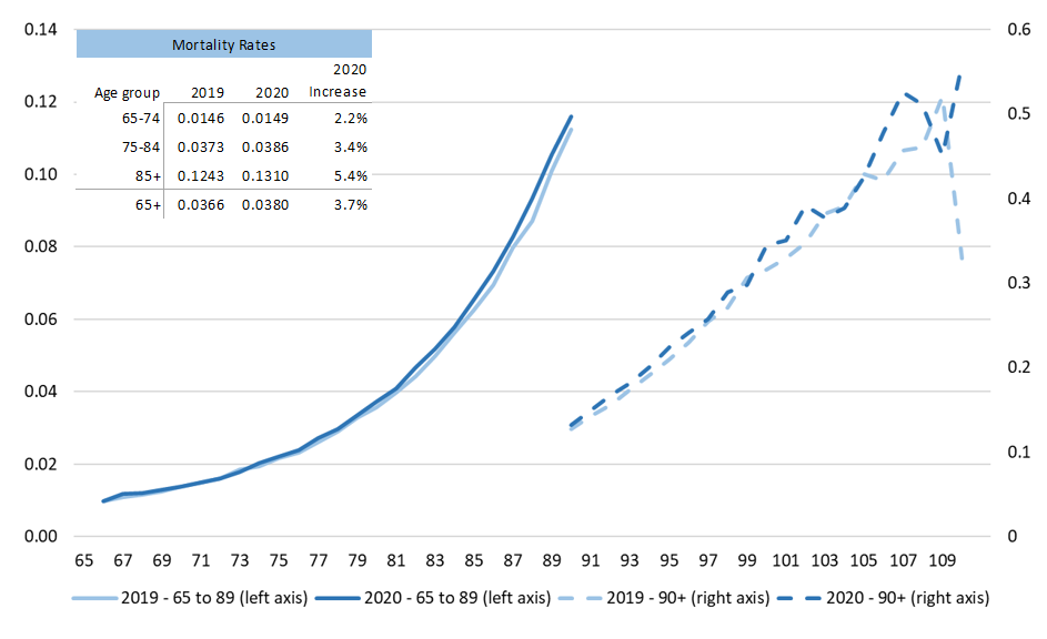
Chart Description
| Age group | 2019 | 2020 | 2020 Increase |
|---|---|---|---|
| 65-74 | 0.0146 | 0.0149 | 2.2% |
| 75-84 | 0.0373 | 0.0386 | 3.4% |
| 85+ | 0.1243 | 0.1310 | 5.4% |
| 65+ | 0.0366 | 0.0380 | 3.7% |
|
Line chart showing the evolution of mortality rates of OAS beneficiaries. There is one line for 2019 mortality rates and another line for 2020 mortality rates. Those are presented on two different axes, the first lines are presented for ages 65 to 89 and the second lines are presented for ages 90 to 110. X axis represents age. Y axis represents mortality rate. For the ages 65 to 89 the mortality rates start around 0.01 and go up to almost 0.12; for ages 90 and above the mortality rates start around 0.13 and go up to 0.55. The mortality rates for 2020 are higher than those for 2019, the difference is more noticeable as the age increases. Overlaid on the chart is a table showing the mortality rates by age group 65-74, 75-84, 85+, and 65+ for 2019 and 2020. The increase in mortality between 2019 and 2020 is also presented. For 2019, the mortality rates were 0.0146, 0.0373, 0.1243, and 0.0366 for age groups 65-74, 75-84, 85+, and 65+ respectively. For 2020, the mortality rates were 0.0149, 0.0386, 0.1310, and 0.0380 for age groups 65-74, 75-84, 85+, and 65+ respectively. This represents an increase from 2019 mortality rates of 2.2%, 3.4%, 5.4% and 3.7% for age groups 65-74, 75-84, 85+, and 65+ respectively. |
|||
- Image 1 Footnote *
-
Mortality rates consist of crude central death rates without graduation nor smoothing.
Period Life Expectancy at Ages 65, 75 and 85
In 2020, life expectancies without future improvements (period life expectancy) of OAS beneficiaries at ages 65, 75 and 85 decreased markedly for both sexes compared to 2019. As shown in the table below, the decreases in life expectancy in 2020 for males were 0.28 years at age 65, 0.25 years at age 75, and 0.19 at age 85. For females, decreases in life expectancy in 2020 were 0.24 years, 0.25 years and 0.23 years at ages 65, 75 and 85 respectively.
| Males | Females | |||||
|---|---|---|---|---|---|---|
| Age | 2019 | 2020 | 2020 - 2019 | 2019 | 2020 | 2020 - 2019 |
| 65 | 19.32 | 19.05 | -0.28 | 22.14 | 21.91 | -0.24 |
| 75 | 12.13 | 11.88 | -0.25 | 14.21 | 13.96 | -0.25 |
| 85 | 6.34 | 6.15 | -0.19 | 7.67 | 7.44 | -0.23 |
|
||||||
These decreases are a stark contrast when compared to experience preceding 2020. For illustration purposes, the graph below shows annual changes in period life expectancy at age 65 since 2010. For years preceding 2020, it can be seen that life expectancy at age 65 increased in all years except in 2015 (females only), in 2017 (both sexes) and in 2018 (females only). It can also be seen that the decreases in 2020 are much more significant.
Annual Changes in Period Life Expectancy at age 65 of OAS Beneficiaries (in months)
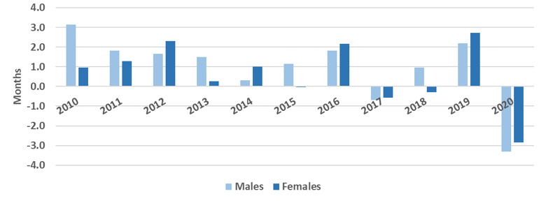
Chart Description
| Males | Females | |
|---|---|---|
| 2010 | 3.1 | 1.0 |
| 2011 | 1.8 | 1.3 |
| 2012 | 1.7 | 2.3 |
| 2013 | 1.5 | 0.3 |
| 2014 | 0.3 | 1.0 |
| 2015 | 1.1 | -0.0 |
| 2016 | 1.8 | 2.2 |
| 2017 | -0.7 | -0.6 |
| 2018 | 1.0 | -0.3 |
| 2019 | 2.2 | 2.7 |
| 2020 | -3.3 | -2.9 |
|
Bar chart showing the evolution of annual changes in period life expectancy at age 65 for OAS Beneficiaries by Gender. The X axis represents the year, from 2010 to 2020. The Y axis represents the annual change in months. The numbers are shown in the table above. |
||
Mortality Improvement Rates
An alternate way of observing changes in longevity is through changes in mortality rates over time, which are measured by mortality improvement rates (MIRs). The graph below shows MIRs for OAS beneficiaries by age group for 2019-2020 as well as the average annual MIRs for the three-year period ending in 2019 (before the pandemic). The positive MIRs for most age groups during the 2016-2019 period indicate that mortality rates decreased during the period, which in turn led to increased longevity. Consistent with what was observed in the previous section on life expectancy, there is a strong decrease in the average annual MIRs for all age groups in 2020.
Mortality Improvement Rates for OAS Beneficiaries by Age Group (%)
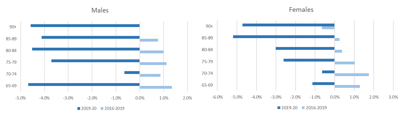
Chart Description
| Age Group | Males 2016-2019 | Males 2019-2020 | Females 2016-2019 | Females 2019-2020 |
|---|---|---|---|---|
| 65-69 | 1.3% | -4.7% | 1.3% | -1.1% |
| 70-74 | 0.9% | -0.6% | 1.8% | -0.6% |
| 75-79 | 1.1% | -3.7% | 1.0% | -2.6% |
| 80-84 | 1.1% | -4.5% | 0.4% | -3.0% |
| 85-89 | 0.8% | -4.1% | 0.3% | -5.2% |
| 90+ | +0.0% | -4.6% | -0.6% | -4.7% |
|
Succession of two horizontal bar charts showing mortality improvement rates of OAS beneficiaries by gender. Each horizontal bar chart is showing the mortality improvement rates for the period 2016-2019 and the period 2019-2020. Y axis represents the age groups and X axis represents the mortality improvement rates. The numbers are shown in the table above. |
||||
Data and Methodology: All calculations are based on the OAS program beneficiary database that was provided to the Office of the Chief Actuary by Service Canada which is the administrator of the OAS program. The historical average annual mortality improvement rates are derived using the best-fit log-linear method. (see chapter 4 of the SOA RP-2000 Mortality Tables Report).
Number of Deaths
The following graph shows the actual number of deaths of OAS beneficiaries in 2020 compared to the 2019 age-adjusted number of deaths. The 2019 age-adjusted number of deaths is calculated by applying 2019 OAS beneficiaries’ mortality rates to the 2020 population of OAS beneficiaries. In 2020, we observe an increase in total deaths as a result of the COVID-19 pandemic. The table on the chart shows a difference of 20,371 between the 2020 number of deaths and the 2019 age-adjusted number of deaths. According to Statistics Canada, there were 15,198 deaths due to COVID in 2020. The next section provides additional information on monthly deaths in 2020 and 2021 so far as compared to the three-year period ending in 2019.
Number of Deaths
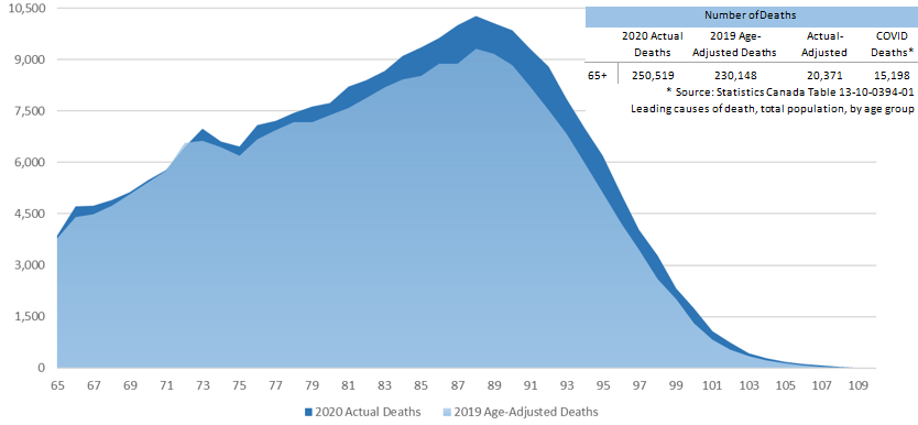
Chart Description
| 2020 Actual Deaths | 2019 Age-Adjusted Deaths | Actual-Adjusted | COVID DeathsTable 5 Footnote * | |
|---|---|---|---|---|
| 65+ | 250,519 | 230,148 | 20,371 | 15,198 |
|
||||
Area chart representing the 2020 actual number of deaths and the 2019 age-adjusted number of deaths. Y axis represents the number of deaths. X axis represents the age from 65 to 110.
For virtually all ages, the 2020 number of deaths was higher than the 2019 age-adjusted number of deaths. The difference between the two areas is more noticeable between ages 80 to 95. In 2020, the number of deaths steadily increase form 3,866 at age 65 to reach a maximum of 10,284 at age 88 and then starts decreasing rapidly to reach 1,750 at age 100.
Overlaid on the chart is a table showing the number of deaths. The 2020 actual number of deaths for ages 65 and over totaled 250,519 and the 2019 age-adjusted number of deaths was 230,148. The difference is 20,371 deaths. The table also presents the number of deaths due to COVID for 2020 based on data from Statistics Canada, which totals to 15,198.
Monthly Data on Number of Deaths
Looking at the number of OAS beneficiaries who died in 2020 in comparison with the average over the three-year period for 2017-2019, it is easily observed that the 2020 monthly deaths have been consistently higher since the beginning of the pandemic. Two peaks can also be observed, the first being April and May 2020 and the second starting in October 2020 up to December 2020. Those peaks are consistent with the first and second waves of the pandemic. As shown in previous sections, the pandemic has translated into higher than expected mortality rates in 2020 and resulted in reduced life expectancies and negative MIRs. The first five months of 2021 also show higher levels of OAS beneficiaries mortality when compared to pre-pandemic levels. This will have an impact on 2021 OAS beneficiaries’ mortality rates, life expectancies and MIRs.
Number of Deaths per Month for OAS beneficiaries Aged 65 and over
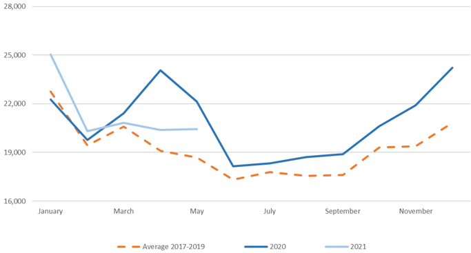
Chart Description
| Average 2017-2019 | 2020 | 2021 | |
|---|---|---|---|
| January | 22,747 | 22,268 | 25,048 |
| February | 19,445 | 19,770 | 20,323 |
| March | 20,590 | 21,420 | 20,830 |
| April | 19,101 | 24,070 | 20,384 |
| May | 18,693 | 22,145 | 20,433 |
| June | 17,313 | 18,150 | 19,904 |
| July | 17,800 | 18,335 | N/A |
| August | 17,550 | 18,711 | N/A |
| September | 17,614 | 18,899 | N/A |
| October | 19,303 | 20,614 | N/A |
| November | 19,391 | 21,919 | N/A |
| December | 20,829 | 24,218 | N/A |
|
Line chart showing the number of deaths per month for OAS beneficiaries aged 65 and over for 2021, 2020 and the average of the three-year period 2017-2019. Three lines are shown. The first line represents the average for the three-year period 2017-2019, the second line is 2020 and the third line is 2021. Y axis represents the number of deaths and X axis represents the month. The numbers are shown in the table above. |
|||
Note: The data received for the first five months of 2021 is incomplete and will be subject to retroactive revisions. Adjustments to the data were made based on historical adjustments between preliminary and completed number of deaths.
- Footnote 1
-
Prepared based on annual OAS program beneficiary databases provided to the Office of the Chief Actuary by Service Canada. Analysis is performed on domestic OAS beneficiaries and does not include international beneficiaries.